Floods are one of nature’s most powerful and destructive forces, shaping landscapes and civilizations throughout history. The impact of floods can be catastrophic, submerging cities, destroying homes, and altering entire ecosystems. But maps have become essential in our ability to understand, predict, and manage these floods. From ancient floodplain maps to modern digital flood hazard layers, maps help us visualize the risk areas and guide decisions that save lives and protect property. By analyzing patterns of rainfall, river flow, and land elevation, flood maps provide crucial insights into which regions are most vulnerable, whether it’s a sudden flash flood in an urban area or the slow, devastating rise of water in river valleys. These maps have evolved dramatically, from hand-drawn cartographic records to highly sophisticated GIS systems that offer real-time flood data, predictions, and flood mitigation strategies. They are invaluable to engineers designing levees and flood barriers, planners determining flood insurance rates, and emergency services executing evacuation plans. Flood maps don’t just illustrate risk; they tell the story of human resilience and our ongoing battle to understand and adapt to the ever-changing patterns of nature. Whether used to plan infrastructure, manage natural resources, or guide post-disaster recovery, flood maps are an indispensable tool in our efforts to protect lives and build a more resilient future.
Flood maps are crucial tools used to understand and manage the risks associated with flooding. These maps provide insight into areas most likely to be affected by floods, helping communities and authorities make informed decisions about evacuation plans, infrastructure development, and emergency preparedness. From historic flood events to modern, high-tech digital maps, flood maps have become a central component in disaster planning and climate resilience efforts. This list presents the top 10 flood maps, ranked by their size, significance, and contribution to flood management and research.
#1: The FEMA Flood Insurance Rate Map (FIRM), 100,000,000 Acres
The FEMA Flood Insurance Rate Map (FIRM) covers approximately 100,000,000 acres and is one of the most widely recognized flood maps in the United States. Developed by the Federal Emergency Management Agency (FEMA), the FIRM is used to identify flood-prone areas across the country, helping communities assess flood risks for property owners, urban planners, and local governments. The map classifies areas based on their risk of flooding, with zones that include low-risk areas, high-risk areas, and those with special flood hazards. An interesting aspect of the FIRM is how it is used to determine eligibility for flood insurance, as homeowners in high-risk zones are required to purchase flood insurance. Over the years, the map has been instrumental in guiding local zoning and construction codes to prevent flood damage and reduce flood risk. The FIRM’s coverage spans large urban and rural areas alike, providing critical information for emergency response teams during flood events. One of the most famous anecdotal stories about the FIRM comes from New Orleans during Hurricane Katrina, where the map was used to guide evacuation efforts and post-disaster recovery.
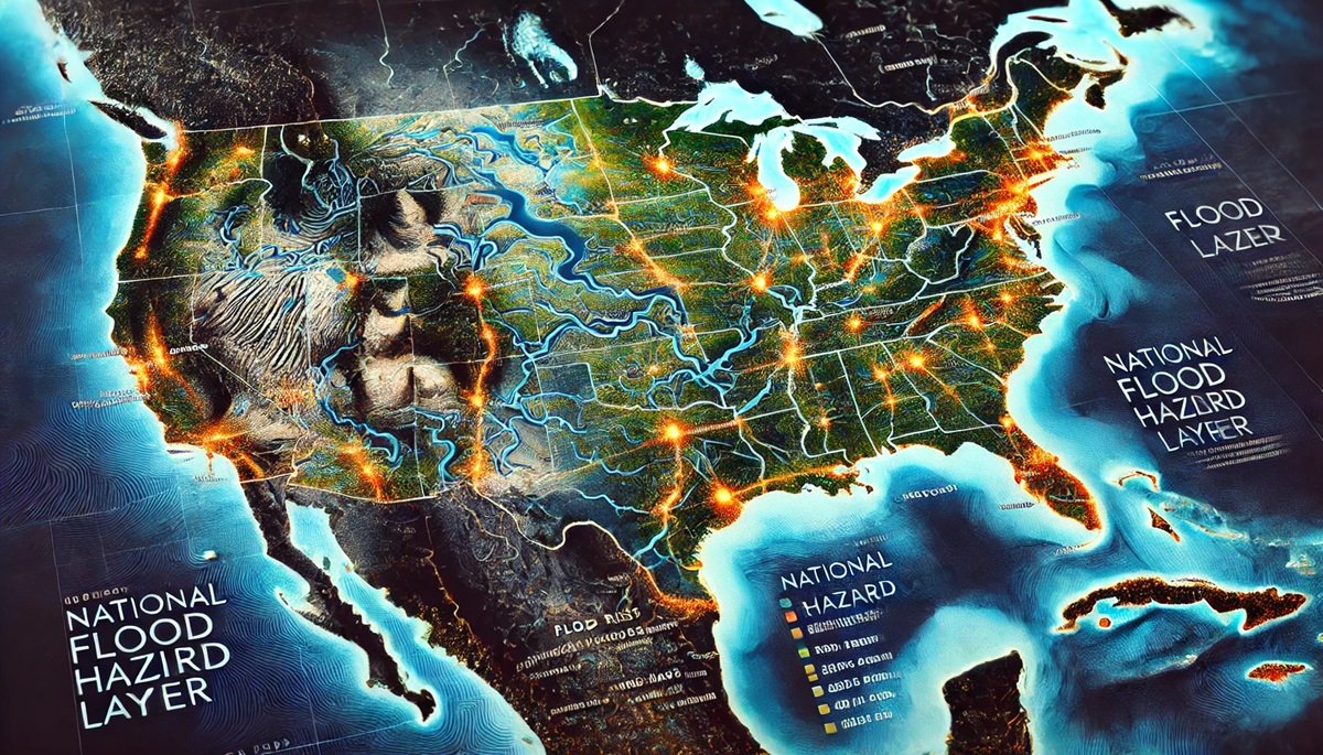
#2: The National Flood Hazard Layer (NFHL), 80,000,000 Acres
The National Flood Hazard Layer (NFHL), covering 80,000,000 acres, is an essential tool used by FEMA to track and update flood hazards across the United States. The NFHL is a combination of digital flood maps, which are integrated with the latest flood hazard data, and serves as a critical resource for understanding flood risks in real-time. This map includes detailed information about flood zones, floodways, and coastal flood risks. One of the most notable features of the NFHL is its integration with geospatial data, allowing for easy visualization of flood-prone areas through GIS software. It has been used by federal, state, and local agencies to better prepare for and respond to flood events, especially in areas where flooding is a recurrent problem. An interesting story about the NFHL relates to the integration of new mapping technology. Following the devastating floods in 2017 caused by Hurricane Harvey, the NFHL was updated to reflect new data that included changed floodplain boundaries, allowing the city of Houston to better plan for future events. The NFHL is widely used in urban planning, real estate development, and environmental science.

#3: The European Flood Awareness System (EFAS), 50,000,000 Acres
The European Flood Awareness System (EFAS) is a flood monitoring and forecasting tool that covers approximately 50,000,000 acres of Europe. EFAS provides real-time flood hazard maps and forecasts, helping authorities predict flood events across the continent and issue early warnings to residents. The system uses both satellite and meteorological data to identify areas at risk of flooding and to track rising water levels in rivers and coastal areas. One of the most interesting aspects of the EFAS is its ability to issue flood warnings with up to ten days of advance notice, which helps emergency responders mobilize quickly and saves lives. The EFAS has been instrumental in addressing the challenges of cross-border floods in Europe, where water levels in rivers like the Danube or Rhine can affect multiple countries simultaneously. The system has been credited with improving international cooperation in flood management, especially during events like the 2002 floods in Central Europe, where it provided key data to help coordinate a multi-nation flood response.
#4: The Mississippi River Floodplain Map, 40,000,000 Acres
The Mississippi River Floodplain Map covers 40,000,000 acres and is one of the most important flood maps in the United States, given the Mississippi River’s size and significance in American geography. This map illustrates the areas at greatest risk of flooding from the river’s annual spring floods, which have shaped the landscape for centuries. The floodplain map is used by state and federal agencies to manage flood risks, design levee systems, and plan flood mitigation strategies. One of the most interesting features of this map is its historical significance; the Mississippi River has had a long history of devastating floods, including the infamous 1927 Great Mississippi Flood. This flood led to the development of major flood control projects along the river, such as the construction of dams and levees, which are reflected on the floodplain map. The map is used extensively in disaster response planning, guiding flood evacuation efforts and flood insurance assessments. Anecdotal stories from local residents often describe how the Mississippi River Floodplain Map has been vital in preparing for seasonal floods and how it has influenced the development of flood-resistant infrastructure in cities like New Orleans and St. Louis.
#5: The 1993 Great Flood of the Midwest Map, 35,000,000 Acres
The 1993 Great Flood of the Midwest was one of the most catastrophic flood events in U.S. history, affecting over 35,000,000 acres across several states. This map provides a detailed representation of the flood’s extent, showing the areas impacted by the swollen Mississippi, Missouri, and other major rivers. The map is a historical document, illustrating the devastating impacts of the flood and helping to inform future flood management strategies. It highlights the flood zones, flood levels, and areas that were particularly vulnerable during the 1993 disaster. One interesting fact about this map is its role in influencing future flood control projects, such as the construction of more robust levees and river management systems. The 1993 flood was one of the driving factors behind the expansion of the National Flood Insurance Program, as it revealed the inadequacies of previous floodplain management practices. Anecdotal stories about the 1993 flood map often focus on the resilience of communities that used it to plan evacuations and rebuild after the disaster.
#6: The 2005 Indian Ocean Tsunami Map, 30,000,000 Acres
The 2005 Indian Ocean Tsunami Map, covering about 30,000,000 acres, is a crucial map for understanding the impacts of the 2004 tsunami, which devastated coastal areas in Indonesia, Sri Lanka, Thailand, and India. While primarily focused on coastal flooding, this map helps illustrate the widespread damage caused by the tsunami and serves as a reference for future disaster preparedness in the region. The map was developed with the help of satellite imagery, which provided real-time data on the extent of the tsunami’s reach and the areas most at risk. The Indian Ocean Tsunami Map has been credited with informing the development of early warning systems and disaster management protocols across the region. An interesting aspect of the map is how it has been used to track the long-term recovery of affected areas, providing critical data for rebuilding efforts. Anecdotal stories often mention how the map helped communities understand the scale of the disaster and plan better for future tsunamis.
#7: The 2007 UK Flood Map, 25,000,000 Acres
The 2007 UK Flood Map covers 25,000,000 acres and shows the areas affected by the severe flooding that struck the United Kingdom during the summer of 2007. This map is particularly notable for its real-time data, which helped authorities understand the flood’s progression and plan evacuation and rescue operations. The map also played a vital role in helping to assess flood damage and prioritize areas for recovery. The 2007 floods were among the worst the UK had experienced in years, and the map became a central tool in the government’s response. One interesting feature of this map is the overlay of rainfall data, which helped track how different regions were impacted by the heavy rains. Anecdotal stories from local residents often reference how this map was used by emergency teams to navigate flooded streets and provide assistance. The 2007 UK Flood Map has since become a model for future flood mapping and has influenced the development of the country’s flood management systems.
#8: The 2011 Thailand Flood Map, 20,000,000 Acres
The 2011 Thailand Flood Map, covering 20,000,000 acres, was developed to track the devastating floods that affected much of central Thailand, including the capital city of Bangkok. The map was created to help identify flood-prone areas and assess the extent of damage caused by the seasonal monsoon rains, which were intensified by Typhoon Nesat. The map was used by emergency responders, businesses, and government agencies to plan for evacuations, assess infrastructure damage, and identify areas in need of immediate aid. One interesting aspect of this map is its use in predicting future flood risks and improving flood management strategies. Thailand’s 2011 flood was one of the costliest in history, and the map played a key role in shaping flood mitigation strategies for the country. Anecdotal stories often describe how the map helped local businesses protect their assets and minimize damage during the flooding.
#9: The 2014 South Carolina Flood Map, 18,000,000 Acres
The 2014 South Carolina Flood Map covers around 18,000,000 acres and was developed to help track the impact of the heavy rains and flooding that affected the state during the 2014 autumn storms. This map was critical for understanding which areas were at highest risk and for guiding response teams during the crisis. It also included details about local infrastructure, such as roads, bridges, and dams, which were crucial for planning evacuations and resource distribution. One interesting feature of the 2014 map was its integration with local weather data, helping to predict the direction and intensity of the storm system. Anecdotal stories from residents and emergency responders focus on how the map guided rescue efforts and helped authorities quickly identify areas where floodwaters were rising. The map is often credited with helping the state minimize flood-related damage and casualties.
#10: The 2019 Amazon Rainforest Flood Map, 15,000,000 Acres
The 2019 Amazon Rainforest Flood Map, covering 15,000,000 acres, tracks the seasonal flooding that occurs in the Amazon River basin, one of the world’s largest and most biodiverse regions. The map is used to monitor environmental changes in the region, particularly those related to climate change and deforestation. It highlights areas where floods are most likely to occur, based on water levels in the Amazon River and its tributaries. One interesting aspect of this map is its role in helping researchers study the effects of flooding on the rainforest’s delicate ecosystems. An anecdotal story about the 2019 map involves its use by conservation groups working to mitigate the impact of deforestation and illegal logging on the region’s floodplains. The map has been crucial for understanding how flooding affects the region’s biodiversity and for developing strategies to protect the Amazon.
Flood maps are essential tools for understanding, managing, and mitigating the risks of flooding. They have evolved over time, becoming more accurate and accessible, helping communities prepare for and respond to flood events. Whether tracking riverine floods, coastal surges, or the effects of extreme weather, these maps provide invaluable insights into the dynamic forces of nature and the human impact on the environment. As the effects of climate change continue to grow, flood maps will remain a cornerstone in our efforts to safeguard lives, property, and ecosystems.