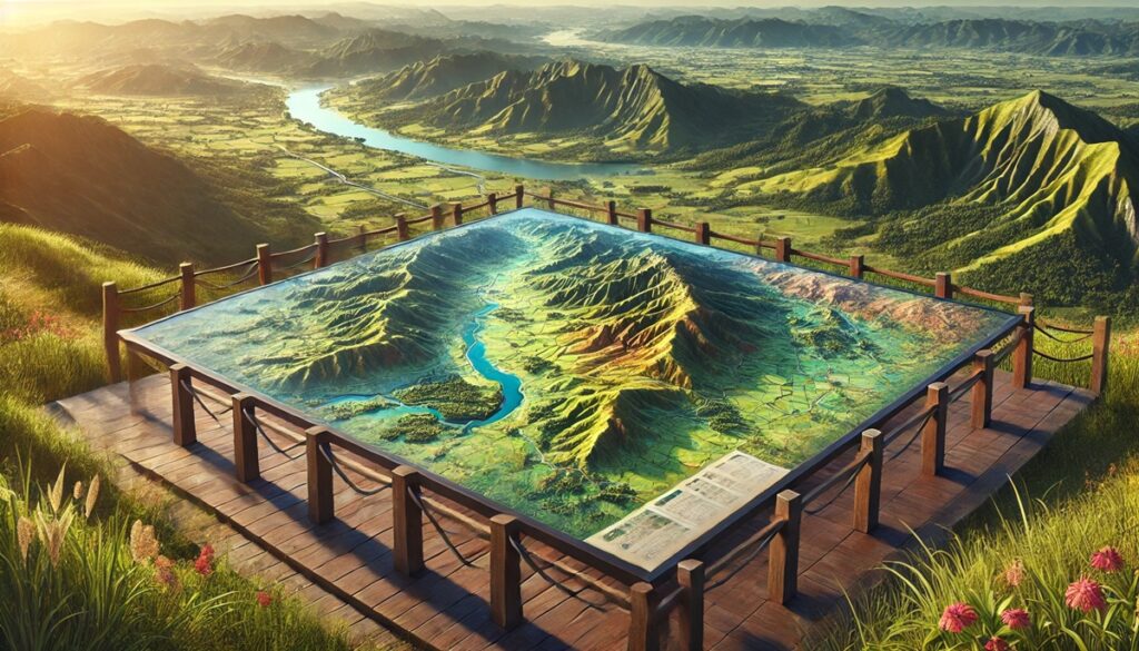
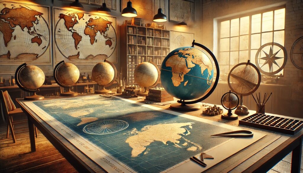
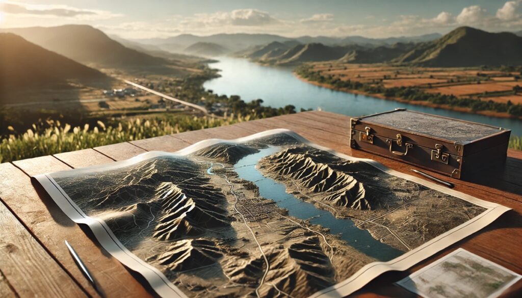
The world is vast and endlessly diverse, and maps have always served as the bridge between the unknown and the known. From the earliest sketches of uncharted territories to the highly detailed digital maps of today, cartography has allowed humanity to explore, understand, and connect with the Earth in profound ways. Maps are more than just practical tools for navigation—they are reflections of our curiosity, our need to organize and make sense of the complexity of the world around us. They help us trace the paths of explorers who ventured into the unknown, mark the boundaries of nations, and chart the natural features that define our landscapes, like mountains, rivers, and oceans. Each map tells a unique story, shaped by the perspective of the time and the knowledge available to those who created it. Whether it’s a hand-drawn map from the 15th century, showing the world as a flat and limited space, or a modern satellite map that offers a bird’s-eye view of the entire planet, maps offer both a historical record and a vision of the future. They shape our understanding of geography, but they also shape our imagination, allowing us to dream of places we’ve never been and to plan journeys to new frontiers. Today, maps not only guide travelers but also play a key role in scientific research, climate studies, urban planning, and disaster management. Through every twist of geography and every change in political boundaries, maps help us navigate the complexities of the world, making the vastness of our planet seem just a little bit smaller, a little more connected. In a way, maps are not just representations of the Earth—they are stories of how we interact with our world, told in lines, colors, and symbols.
Maps of the Earth are more than just representations of geographical features; they are tools that help us understand our world, track changes, and explore places we may never visit. From the earliest world maps drawn by ancient civilizations to the high-tech, digital models of today, Earth maps have been vital in shaping how we view our planet. These maps serve various purposes: they guide explorers, help governments plan resources, enable scientists to study environmental changes, and even offer a glimpse into the cultural beliefs of different societies. Below is a list of the top 10 Earth maps, ranked by their size, historical significance, and impact on geography.
#1: The 1890 Globe Map, 25,000 Miles in Circumference
The 1890 Globe Map, with a circumference of approximately 25,000 miles, is a classic representation of the Earth that reflects the state of geographical knowledge in the late 19th century. At this time, many parts of the world were still being explored, and the map shows a mix of accurately charted regions alongside areas that were not yet fully understood. This globe map is notable for its stunning detail, featuring continents, countries, and bodies of water, and it reflects the Western perspective of the time. What makes the 1890 Globe particularly interesting is how it captures the Earth during the height of the Age of Exploration, just as many territories were being carved out by colonial powers. An anecdotal story surrounding the map involves explorers who would often consult such globes to plan their expeditions to unknown territories. The map has historical significance because it captures the world as it was transitioning into the modern geopolitical landscape. Although many places in Africa, South America, and the Pacific were still somewhat mysterious to Westerners, this map was an essential tool for navigation and exploration, cementing the importance of cartography during the late 1800s.

#2: The 1973 Earth Atlas Map, 22,000 Miles in Circumference
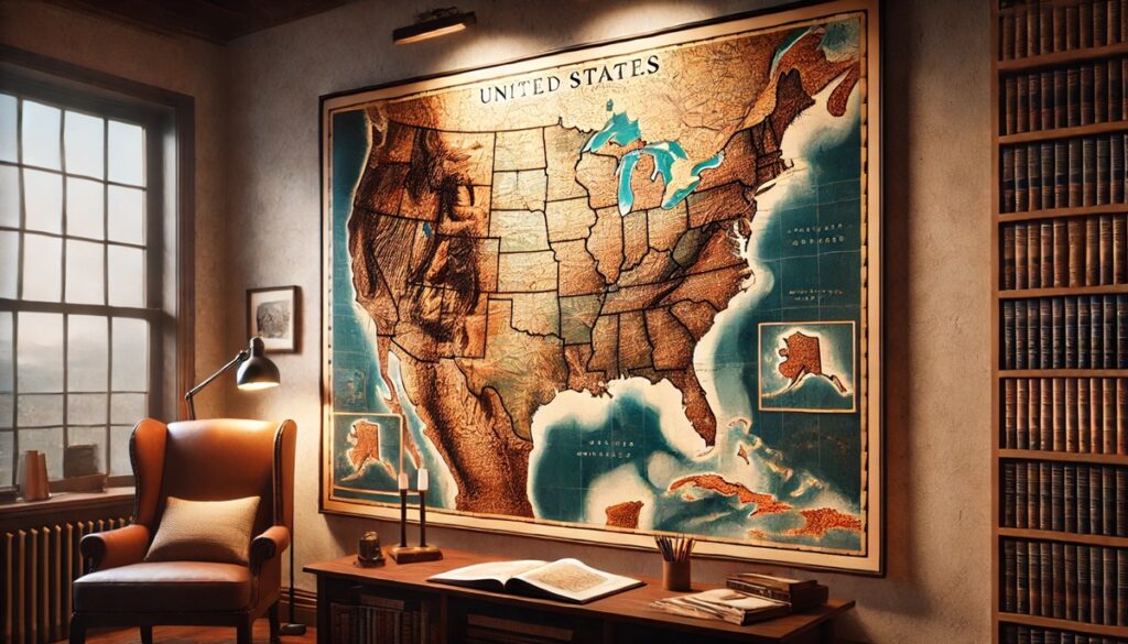
The 1973 Earth Atlas Map spans 22,000 miles in circumference and offers a more modern and accurate representation of the planet compared to earlier maps. The map features clearer delineations of country borders, population centers, and natural features, showcasing the progress made in cartography by the mid-20th century. By this time, the world had been extensively mapped, and satellite imagery was beginning to influence the way maps were created. The 1973 Earth Atlas Map is notable for its scale and precision, marking a shift from traditional globe-based maps to more detailed, high-resolution representations. This map is also significant because it reflects a period of geopolitical tension during the Cold War, with the alignment of countries like the United States, the Soviet Union, and various allied nations clearly depicted. One interesting aspect of the map is its inclusion of major environmental features, including mountain ranges, rivers, and oceans. An anecdotal story often associated with this map is how it was used in classrooms and government offices as an educational tool to teach geography and international relations during the height of the Cold War.

#3: The Mercator Projection Map, 20,000 Miles in Circumference
The Mercator Projection Map, with a circumference of 20,000 miles, is one of the most famous and widely used maps in history. Created by the Flemish cartographer Gerardus Mercator in 1569, this map revolutionized navigation and cartography by presenting a flat, rectangular projection of the Earth. While it distorts the sizes of landmasses near the poles, it was particularly useful for sailors and navigators because it allowed for straight-line courses to be plotted, making oceanic navigation far easier. The Mercator projection map shows the world with Europe at its center, a reflection of the Western worldview during the Age of Exploration. The map became the standard for nautical charts and was widely adopted by explorers and traders throughout the 16th century and beyond. An interesting fact about the Mercator map is that its distortions—particularly the exaggerated size of the polar regions—have sparked debate and criticism in modern times, but it was an essential tool for over 400 years. One anecdotal story involves how the map helped explorers like Christopher Columbus and Vasco da Gama plan their sea voyages across the Atlantic and Indian Oceans. Today, the Mercator projection is still used for various purposes, including world maps and digital navigation.
#4: The Robinson Projection Map, 15,000 Miles in Circumference
The Robinson Projection Map, created in 1963 by Arthur H. Robinson, is a more accurate and visually appealing alternative to the Mercator map. Spanning approximately 15,000 miles in circumference, the Robinson projection reduces distortion in size and shape, offering a more balanced representation of the Earth’s continents and oceans. This map is often used in modern classrooms and atlases because it presents a realistic depiction of the world without the exaggerated distortions found in older maps. The Robinson projection focuses on preserving the overall visual appearance of the planet, which makes it a popular choice for educational and reference materials. One interesting fact about this map is that it was developed in response to the growing need for more accurate world maps, particularly in light of the United Nations’ increasing global presence. An anecdotal story about the Robinson map is that it was widely praised for its ability to offer a more realistic perspective of Earth, especially in contrast to the Mercator projection, which had been the standard for centuries. The map is a staple in contemporary cartography, symbolizing a shift toward more scientifically accurate representations of our planet.
#5: The Goode’s Homolosine Map, 12,000 Miles in Circumference
The Goode’s Homolosine Map, covering 12,000 miles in circumference, is a unique map projection that combines elements of both the Mollweide and Sinusoidal projections. Developed by J. Paul Goode in 1923, this map is designed to minimize distortion while maintaining the overall shape of continents and their relative proportions. The map is particularly known for its “interrupted” appearance, where the Earth’s oceans are divided into sections to reduce distortion over large areas. Goode’s Homolosine map is especially useful for visualizing global data, such as climate patterns and population distribution, because it offers a more accurate representation of size and shape compared to traditional projections. The map has been widely used in scientific research, environmental studies, and geography textbooks. One of the interesting facts about this map is how it strikes a balance between the ease of use of other projections and the need for geographical accuracy. Anecdotal stories from cartographers often highlight Goode’s Homolosine as one of the more innovative projections of the 20th century, offering a more realistic portrayal of the world than previous maps.
#6: The Winkel Tripel Projection Map, 10,000 Miles in Circumference
The Winkel Tripel Projection Map, spanning 10,000 miles in circumference, is a compromise projection that seeks to reduce both size and shape distortion across the world. Developed by Oswald Winkel in 1921, this map is widely used for general-purpose world maps, particularly in educational and scientific settings. The Winkel Tripel projection aims to balance the features of the Earth, offering a visually pleasing map that is accurate enough for everyday use. The projection is particularly noted for its minimal distortion of continents, oceans, and shapes. One interesting feature of the Winkel Tripel projection is its combination of two other map projections, the Aitoff and the Equirectangular, which gives it its unique appearance. Anecdotal stories from map enthusiasts often focus on how the Winkel Tripel has become one of the most popular projections used in global mapping, being chosen by the National Geographic Society for its world maps since 1998. Its ability to combine ease of understanding with minimal distortion makes it a top choice for modern cartography.
#7: The Polar Projection Map, 8,000 Miles in Circumference
The Polar Projection Map, covering approximately 8,000 miles in circumference, focuses on the Earth’s polar regions, offering a top-down view of the Arctic and Antarctic. This map is commonly used for studying polar climates, flight routes, and other data that is specific to the poles. The map’s distinctive feature is its circular shape, which places the North Pole at the center, with countries and continents radiating outward. The Polar Projection is often used in navigation and meteorology, where understanding the Earth’s polar regions is crucial. One interesting fact about the Polar Projection is that it is ideal for plotting air travel routes, as the shortest distance between two points on a sphere is often along a path that passes over the poles. Anecdotal stories often recount how this projection was a game-changer for early aviation, with pilots using it to chart quicker routes across the globe. Today, the Polar Projection is widely used for scientific purposes, helping researchers better understand the Earth’s climate, environment, and geography.
#8: The Sinusoidal Projection Map, 7,000 Miles in Circumference
The Sinusoidal Projection Map, spanning about 7,000 miles in circumference, is a map projection that shows the Earth’s surface in a simple, continuous format. The projection is known for its straightforwardness and efficiency, offering accurate representations of areas around the equator. This map is often used for regional studies, particularly in areas like Africa and South America, where the projection accurately depicts shapes and sizes. One interesting feature of the Sinusoidal Projection is its ability to preserve area relationships, making it particularly useful for cartographic applications like population studies or resource management. Anecdotal stories from mapmakers often discuss the simplicity of the Sinusoidal Projection, as it allows for easy representation of spatial data. Its relatively low distortion in areas around the equator makes it a useful tool for global mapping, particularly in a scientific context.
#9: The Mollweide Projection Map, 6,500 Miles in Circumference
The Mollweide Projection Map, covering around 6,500 miles in circumference, is an equal-area map projection known for its elliptical shape and accuracy in depicting the size of continents and oceans. Created by the German mathematician and astronomer Karl Mollweide in 1805, this map is widely used in scientific studies that require precise area representation. One of the most interesting aspects of the Mollweide projection is that it preserves area at the expense of distorting shapes, making it particularly useful for visualizing global data such as climate zones, population distribution, and ecological patterns. Anecdotal stories often focus on how the Mollweide projection has been used in climate science, helping researchers better understand global temperature patterns and other environmental factors. While not commonly used for everyday maps, the Mollweide projection remains a vital tool for scientific cartography.
#10: The Equirectangular Projection Map, 5,000 Miles in Circumference
The Equirectangular Projection Map, spanning approximately 5,000 miles in circumference, is one of the simplest map projections, with each grid of latitude and longitude being represented by evenly spaced vertical and horizontal lines. This map offers a straightforward, if somewhat distorted, view of the world, with equal spacing between the latitude and longitude lines. The Equirectangular projection is often used in applications where simplicity is preferred over accuracy, such as in video games or virtual environments. An interesting fact about this map is that it is also known as the Plate Carree projection and has been used for centuries in various forms of mapping. Anecdotal stories often highlight its role in early navigation and mapping, especially in the era before more advanced projections became available.
Maps of the Earth provide us with the tools to navigate, study, and understand our world. From ancient maps to modern digital representations, these maps reflect humanity’s curiosity, innovation, and desire to explore the unknown. Whether it’s studying the physical features of the planet or mapping the political landscape, Earth maps remain essential in shaping how we interact with the world around us. Each map is a reflection of both the scientific knowledge and cultural perspectives of the time in which it was created.