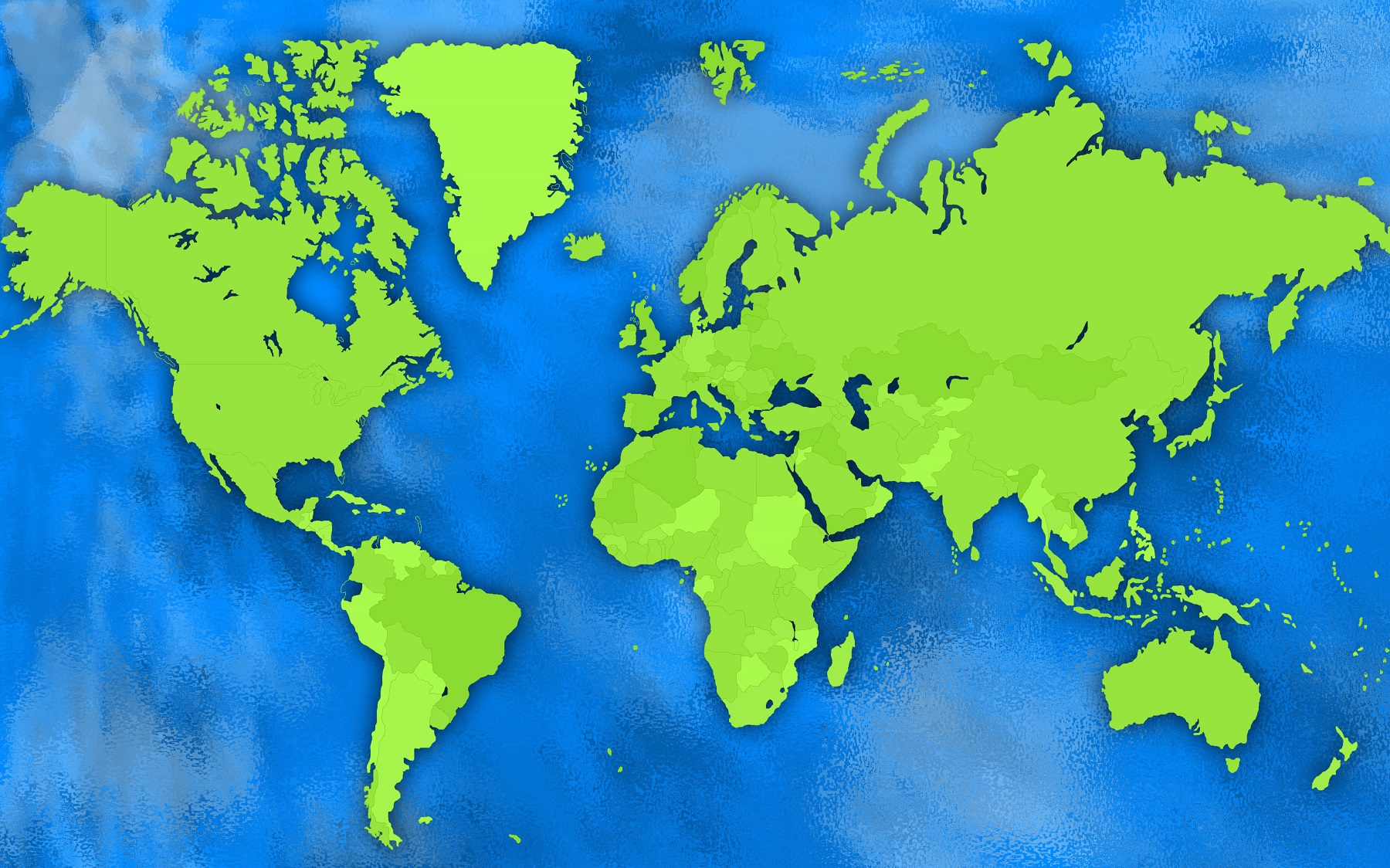
A cartogram map is a type of map that depicts data using relative areas or sizes of geographic regions rather than the traditional geographic location or distance. Cartogram maps use cartographic techniques to represent data using distorted or resized geographic shapes. These maps can be used to display a wide range of information such as population density, election results, GDP, and environmental conditions. Cartogram maps are used in many different fields including politics, economics, and environmental studies.
Types of Cartogram Maps
Cartogram maps are a type of map that uses the relative size or area of geographic regions to represent data, rather than their actual location or distance. There are several different types of cartogram maps, each with their own unique features and uses.
- Contiguous Cartograms: Contiguous cartograms use a continuous boundary to preserve the neighborhood relationships between regions. In other words, regions that are adjacent in the real world will also be adjacent on the map. This type of map is useful for displaying data that is geographically concentrated, such as election results or population density. One example of a contiguous cartogram is the rectangular cartogram, which resizes each region to fit within a rectangular grid. This type of map is often used to display data on a national or global scale.
- Non-Contiguous Cartograms: Non-contiguous cartograms are made by breaking geographic units into non-contiguous polygons and then resizing those polygons based on data. Unlike contiguous cartograms, non-contiguous cartograms do not preserve neighborhood relationships between regions. This type of cartogram map is useful for displaying data that is dispersed across multiple regions, such as environmental conditions or resource distribution. One example of a non-contiguous cartogram is the hexagonal cartogram, which resizes each region to fit within a hexagonal grid. This type of cartogram is often used to display data on a local or regional scale.
- Dorling Cartograms: Dorling cartograms are a special type of non-contiguous cartogram that use circles to represent data instead of polygons. In a Dorling cartogram, each region is replaced by a circle that is resized based on data. The circles are then placed together to create a map. This type of cartogram map is useful for displaying data that is geographically dispersed but needs to maintain a sense of scale and proportion. One example of a Dorling cartogram is the bubble cartogram, which uses bubbles to represent data on a map. This type of cartogram is often used to display data on a national or global scale, such as economic indicators or disease prevalence.
- Value-by-Alpha Cartograms: Value-by-alpha cartograms are a relatively new type of cartogram that use a combination of color-coding and alpha blending to represent data. In a value-by-alpha cartogram, each region is colored according to its data value, and the alpha channel of the color is adjusted to reflect the size of the region. This type of cartogram map is useful for displaying data that has a wide range of values, such as income or education levels. One example of a value-by-alpha cartogram is the Glow map, which uses color and alpha blending to create a glowing effect that highlights areas with high data values. This type of cartogram is often used to display data on a national or global scale.
Uses of Cartogram Maps
Cartogram maps can be used for a variety of purposes in different fields. In politics, these maps are used to display election results, showing the relative number of votes by geographic region. In economics, these maps can display the distribution of wealth or income, showing the relative size of regions based on economic data. In environmental studies, cartogram maps can show the distribution of wildlife or plants in a specific area. Additionally, cartogram maps can be used to visualize the spread of disease, the distribution of resources, and more.
Features of Cartogram Maps
Cartogram maps use a variety of features to represent data, including resizing, color-coding, and labeling. Resizing is the most prominent feature of cartogram maps, where the size of geographic regions is adjusted according to data values. Color-coding is also used to display data, where different colors represent different values. Additionally, these maps use labeling to help identify geographic regions and display specific data values.
Benefits of Cartogram Maps
One of the main benefits of cartogram maps is that they allow for the easy visualization of data. By using the relative size of geographic regions, cartogram maps make it easy to see patterns and trends in data. Additionally, these maps can be used to compare data across different geographic regions, making it easy to identify areas that need attention or further study. Cartogram maps are also useful for communicating complex data to a broad audience in a simple and straightforward way.
Learn more about Maps
- Topographical Maps: Representation of the physical features of a region or area.
- Contour Maps: Representation of the contours of the land surface or ocean floor.
- Raised Relief Maps: Representation of land elevations with raised features indicating landforms.
- Terrain Maps: Representation of the physical features of a terrain or landmass.
- USGS Topographic Maps: Representation of topographic features and land elevations based on USGS data.
- USGS Historical Topographic Maps: Representation of historical topographic maps created by the USGS.
- Watershed Maps: Representation of the areas where water flows into a particular river or lake.
- Elevation Maps: Representation of land and water elevations with high precision.
- Physical Maps: Representation of physical features of the Earth’s surface such as landforms, oceans, and plateaus.
- Bathymetric Maps: Representation of the topography and features of the ocean floor.
- NOAA Maps: Representation of atmospheric, oceanographic, and environmental data by NOAA.
- Nautical Maps: Representation of the underwater features and depth of an area for navigation purposes.
- Geologic Maps: Representation of the geologic features of an area such as rock types, faults, and folds.
- Satellite Maps: Representation of earth from high-definition satellite imagery.