World map projections are essential tools in cartography, enabling the representation of Earth’s three-dimensional surface on a two-dimensional plane. However, no projection is perfect, as each comes with compromises in area, shape, distance, or direction. Over centuries, cartographers have developed numerous projections tailored to specific needs, from navigation to education. These projections not only reveal the complexity of mapping but also provide fascinating insights into the history of exploration, science, and cultural understanding. Here are the top 10 world map projections, ranked by their significance and influence.
#1: Mercator Projection – 16th Century Classic
The Mercator projection, created by Gerardus Mercator in 1569, is one of the most recognized and widely used map projections. Its primary advantage is its ability to preserve accurate angles and straight-line navigation, making it indispensable for sailors during the Age of Exploration. This projection stretches the poles significantly, distorting the sizes of landmasses; for example, Greenland appears almost as large as Africa, despite being much smaller.
The Mercator projection’s legacy extends beyond navigation, influencing worldviews by overemphasizing certain regions. Critics have pointed out how its distortions reinforce Eurocentric perspectives. Despite these controversies, the projection remains valuable for certain applications, especially maritime and aeronautical charts. Its historical significance and mathematical ingenuity make it a cornerstone of cartography.

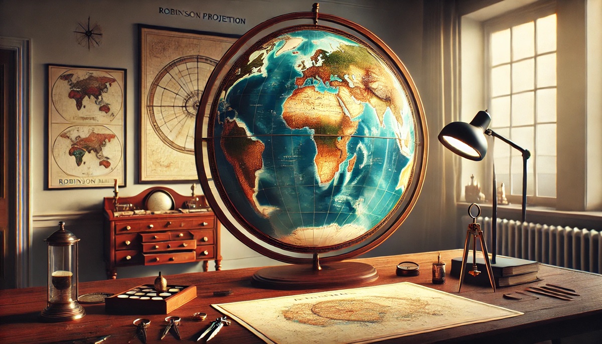
#2: Robinson Projection – Balancing Aesthetics
The Robinson projection, introduced in 1963 by Arthur Robinson, was designed to create a visually appealing and balanced view of the world. Unlike many projections that prioritize mathematical precision, the Robinson projection aims to minimize distortion across all attributes—shape, area, distance, and direction—while sacrificing perfect accuracy in any single aspect.
Adopted by institutions like the National Geographic Society, the Robinson projection became a popular choice for educational maps. It’s praised for its smooth, elliptical appearance, which provides a sense of proportionality without the harsh distortions seen in other projections. Stories of its development highlight Robinson’s trial-and-error process, showcasing the artistry in cartography.
#3: Winkel Tripel Projection – A Modern Favorite
Developed by Oswald Winkel in 1921, the Winkel Tripel projection has become a modern favorite, particularly for world maps in classrooms and atlases. This projection strikes a compromise between the Robinson projection’s aesthetics and the Mercator projection’s practicality, minimizing distortion in shape, area, and distance.
The name “Tripel” reflects its goal of reducing three types of distortion simultaneously. National Geographic adopted this projection in 1998, citing its balance of functionality and elegance. Anecdotes from educators and cartographers often praise its ability to present a realistic view of the world, making it a top choice for modern cartography.
#4: Peters Projection – Controversially Equal-Area
The Peters projection, introduced by Arno Peters in 1974, sparked heated debates among cartographers for its bold emphasis on equal-area representation. By accurately depicting landmass sizes, this projection challenges perceptions shaped by the Mercator projection. Africa and South America, for instance, appear much larger, correcting historical distortions.
While some criticized the Peters projection for sacrificing shape accuracy, others applauded its focus on fairness and equity, particularly in educational and political contexts. Stories of its adoption by advocacy groups underscore its role in promoting a more balanced worldview.
#5: Goode’s Homolosine Projection – Interrupted Ingenuity
Developed by John Paul Goode in 1923, the Goode’s Homolosine projection is an interrupted equal-area projection that minimizes distortion by “cutting” the map along specific meridians. This technique preserves the relative sizes of continents, making it ideal for thematic maps focusing on landmasses rather than oceans.
Often nicknamed the “orange-peel map,” Goode’s projection is celebrated for its innovative approach to distortion. It’s frequently used in studies of climate, vegetation, and population distribution, offering a unique perspective on global patterns.
#6: Azimuthal Equidistant Projection – Centered Perspective
The Azimuthal Equidistant projection is a planar map centered on a specific point, preserving accurate distances from that point to any other location on the map. This projection has been used in radio transmission maps, airline route planning, and even the emblem of the United Nations, which centers on the North Pole.
Its history includes use in ancient navigation, as it provides a straightforward way to measure distances. The projection’s ability to highlight specific regions makes it versatile for both practical and symbolic purposes.
#7: Mollweide Projection – Oval Accuracy
The Mollweide projection, introduced by Karl Mollweide in 1805, is an equal-area projection often used for thematic and astronomical maps. Its elliptical shape and emphasis on proportionality make it a popular choice for displaying global data such as population density or climate patterns.
Despite some distortion near the edges, the Mollweide projection’s aesthetic appeal and mathematical rigor ensure its continued relevance. It represents a shift toward thematic mapping in the 19th century, showcasing cartography’s expanding applications.
#8: Sinusoidal Projection – Simplicity in Representation
The Sinusoidal projection, developed in the 16th century, is an equal-area projection notable for its simplicity. It accurately represents the size of landmasses while distorting shapes toward the poles. This projection is often used for mapping tropical regions or global phenomena like rainfall distribution.
Its straightforward design and mathematical elegance make it a favorite among scientists and educators. Historical anecdotes highlight its use in early efforts to understand Earth’s climate and ecosystems.
#9: Albers Equal-Area Conic Projection – Regional Focus
The Albers Equal-Area Conic projection, introduced by Heinrich Albers in 1805, is ideal for mapping mid-latitude regions like the United States or Europe. By using two standard parallels, it minimizes distortion in area and shape within the mapped region.
This projection’s focus on regional accuracy has made it a staple for state and national maps. Its historical development reflects the growing need for specialized projections tailored to specific areas.
#10: Dymaxion Projection – Fuller’s Unique Vision
Invented by Buckminster Fuller in 1943, the Dymaxion projection is a unique, unfolded icosahedron map that minimizes distortion while emphasizing the interconnectedness of Earth’s landmasses. It presents the world as a single island in a single ocean, challenging traditional perceptions of geography.
The Dymaxion projection’s innovative design has inspired discussions about global unity and sustainability. Fuller’s vision of Earth as a “Spaceship” underscores the projection’s philosophical and practical impact.
World map projections reveal the challenges and creativity involved in representing a spherical Earth on a flat surface. Each projection has its strengths and weaknesses, reflecting the diverse needs and perspectives of cartographers throughout history. From navigation to education, these top 10 projections showcase the enduring importance of maps in understanding and shaping our world.