
Planning Flat-Cut Metal Letters
Flat-cut metal letters are shaped from sheet material, so their identity comes from the face silhouette, selected thickness, edge visibility, spacing, and mounting relationship. Those choices can produce a nearly flush graphic treatment or a more dimensional line with visible shadow and stand-off.
Plan Flat-Cut Letters
Prepare artwork that can become individual metal shapes
The production layout should resolve every letter and symbol before mounting locations are marked.
Vector outlines
Supply clean paths for the exact characters, punctuation, and logos rather than a low-resolution image.
Minimum features
Narrow strokes, sharp points, and small interior openings should be checked at finished size.
Line arrangement
Overall width, baselines, line spacing, and logo relationships belong in one dimensioned elevation.
Template needs
Identify whether an installation pattern or another positioning aid is required for field placement.
Decide how much edge should be visible
A thin letter reads primarily as a face graphic. More thickness makes the edge visible from oblique angles and can create a stronger shadow line, especially with stand-off mounting. The correct choice depends on character height, viewing distance, desired appearance, and the selected metal option.
Edge color may match the face, remain visually distinct, or be less noticeable in a flush arrangement. Review face and edge together under the expected light. A finish description should be supported by a sample or approved reference so words such as brushed or satin do not carry all the burden.
See how flat-cut letters respond to different walls
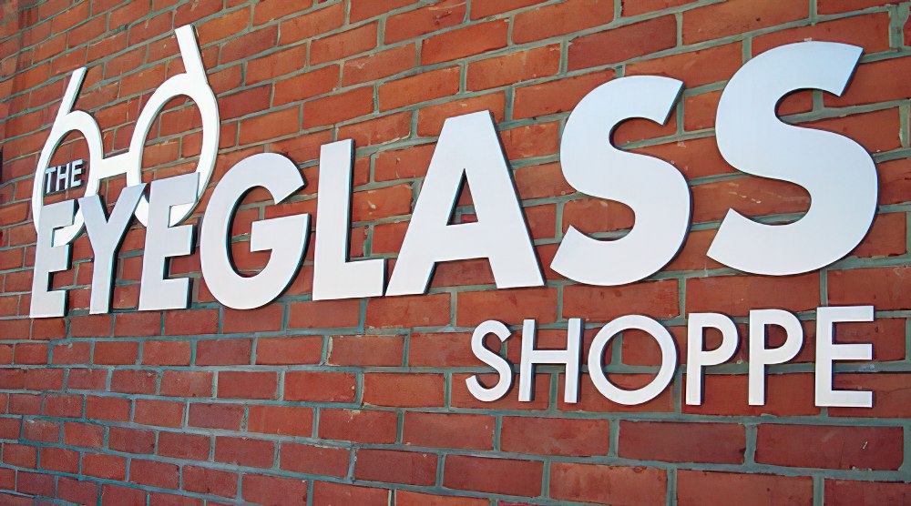
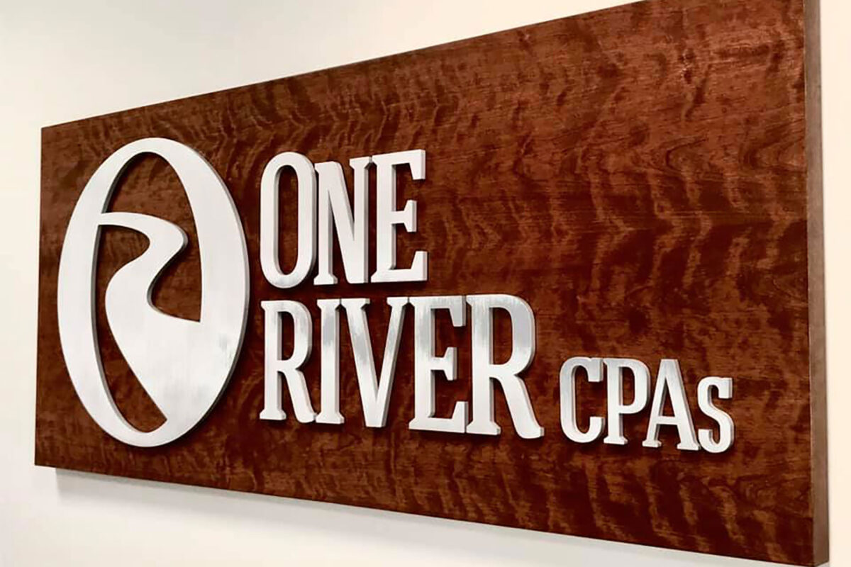
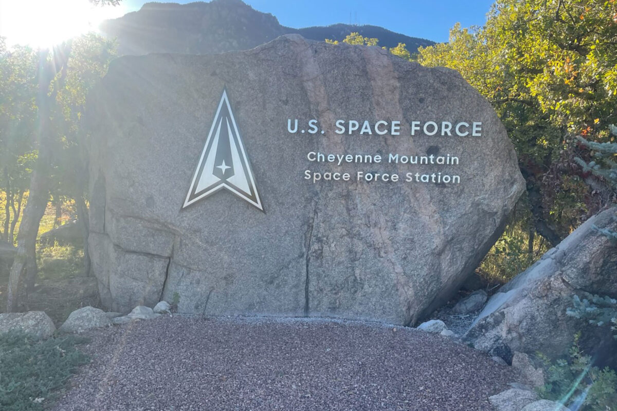
The retained source images show gold-tone, silver, black, and white face directions across storefront, masonry, and broad facade settings. All are completed flat-cut letter installations. Their layouts illustrate spacing choices without supplying undocumented hardware or environmental claims.



Set the relationship between letters and wall
Letters may appear close to the mounting surface or project forward to create a deliberate gap and shadow. Define the desired face-to-wall distance and provide wall construction, surface condition, and access information. A textured wall can make consistent spacing and alignment more demanding than a smooth panel.
Mark the installation height, centerline, usable area, and nearby architectural features. If a logo accompanies the wording, dimension it within the same layout. Curved walls, panel joints, concealed utilities, restricted lift access, or installer requirements should be documented before the mounting plan is finalized.
Build a reliable flat-cut letter request
Accurate artwork and wall information reduce ambiguity in both fabrication and installation planning.
- Vector wording and logo files
- Finished character height
- Total layout width
- Metal and thickness preference
- Face and edge finish references
- Flush or stand-off appearance
- Wall photos, dimensions, and access
- Delivery or installation deadline
Request pricing for flat-cut metal letters
Provide the vector layout, character size, thickness and finish direction, stand-off preference, wall material, site measurements, installation location, and schedule. Include close and wide site photographs so the letters can be evaluated against the real mounting surface.