
Freestanding words
Useful when the message must sit on a floor, stage, platform, or open site without depending on an existing wall.
Large letters can carry a company name, short message, place name, or campaign phrase into a physical environment. The effective format depends on where the wording sits, how people move around it, and whether the display is temporary, mobile, wall-mounted, or built for repeated use.
Plan a Letter Display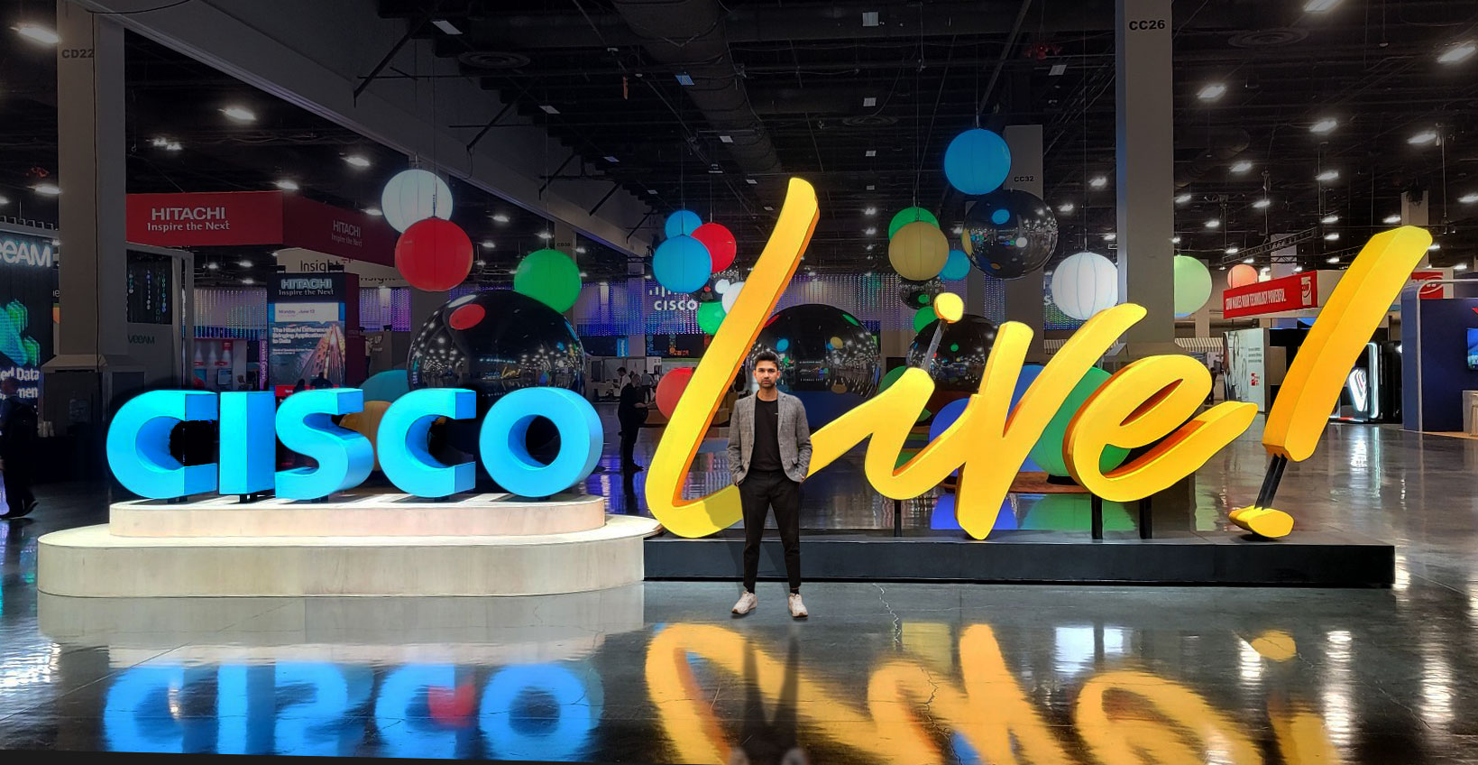
A physical letter display works best when the message can be read in the available space. Confirm the exact wording, capitalization, logo relationship, and the farthest useful viewing point before deciding height or depth. Long phrases may need tighter spacing or multiple lines, while short words can support deeper returns and wider gaps.
Provide vector artwork and brand colors when they exist. If a typeface has narrow strokes, internal counters, or small punctuation, those details may need adjustment at the proposed scale. The goal is to preserve the approved identity while producing a stable, buildable display.
Business branding can take several physical forms. Select the format around duration, attachment method, access, and whether the message needs to move between locations.
Useful when the message must sit on a floor, stage, platform, or open site without depending on an existing wall.
Plan attachment points, wall construction, standoff depth, electrical access if needed, and the condition of the mounting surface.
Combine typography and a logo mark when the full identity needs to read as one coordinated physical piece.
Break a message into manageable sections, with packing and repeat assembly considered from the beginning.
Discuss power, cable routing, brightness, viewing conditions, and service access as separate scope items.
Location, attachment, exposure, code, and engineering requirements must be reviewed for the specific site.
These completed WhiteClouds projects compare exhibit-scale lettering, showroom branding, floating typography, and a permanent public-space installation. Use them to discuss sightlines, spacing, support, and available floor or wall area.
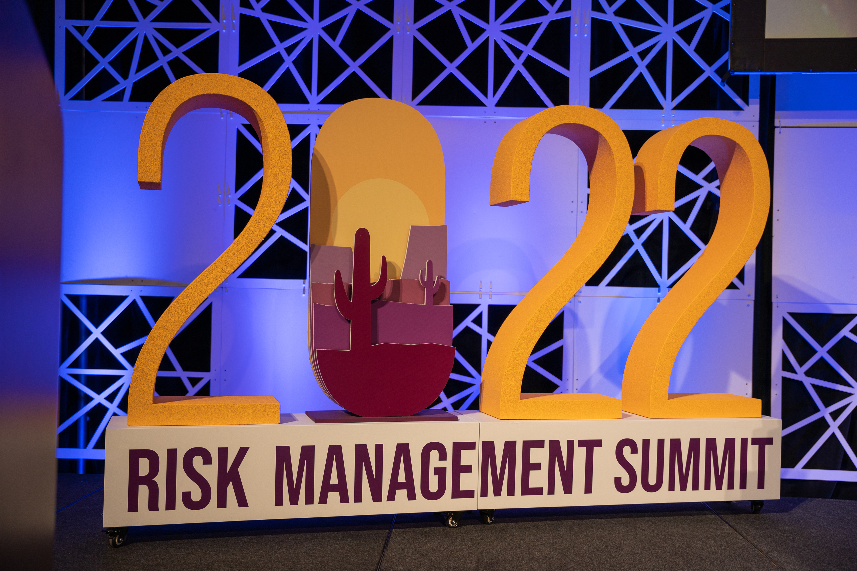
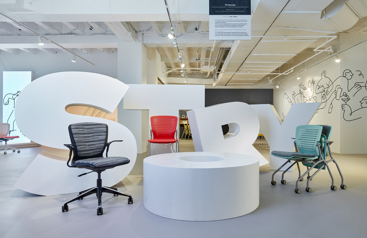
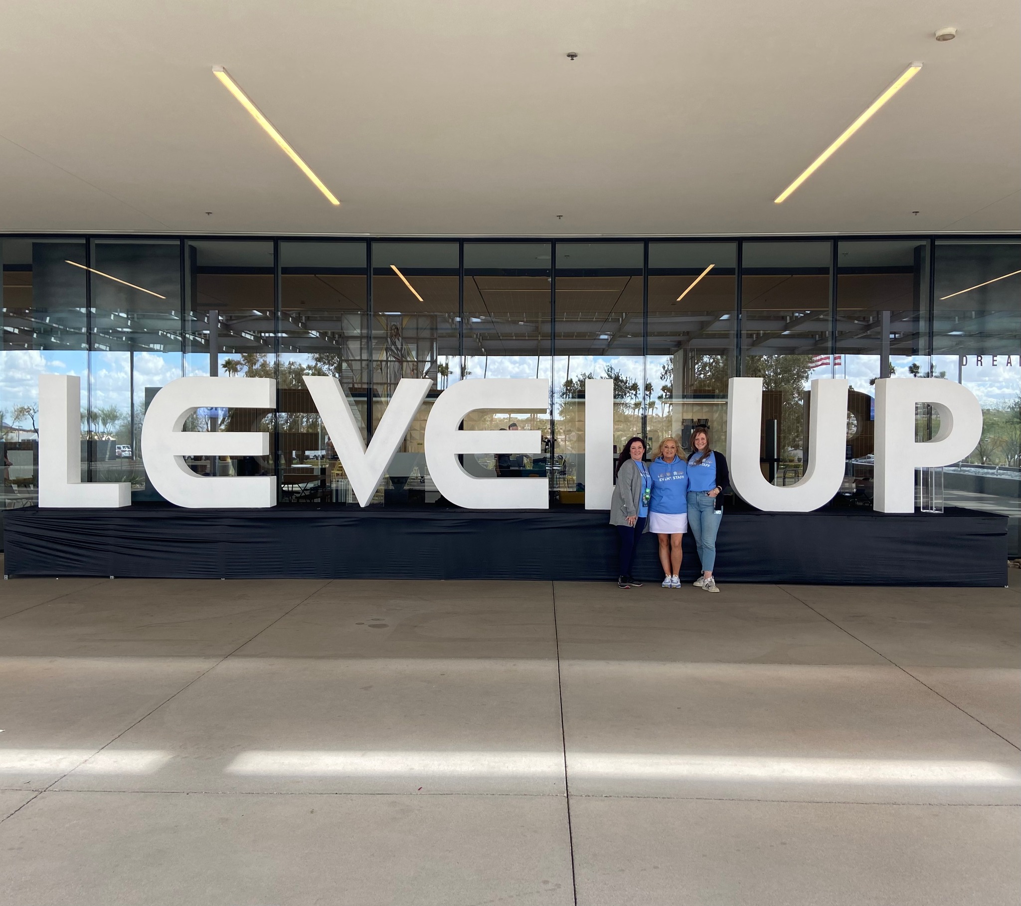
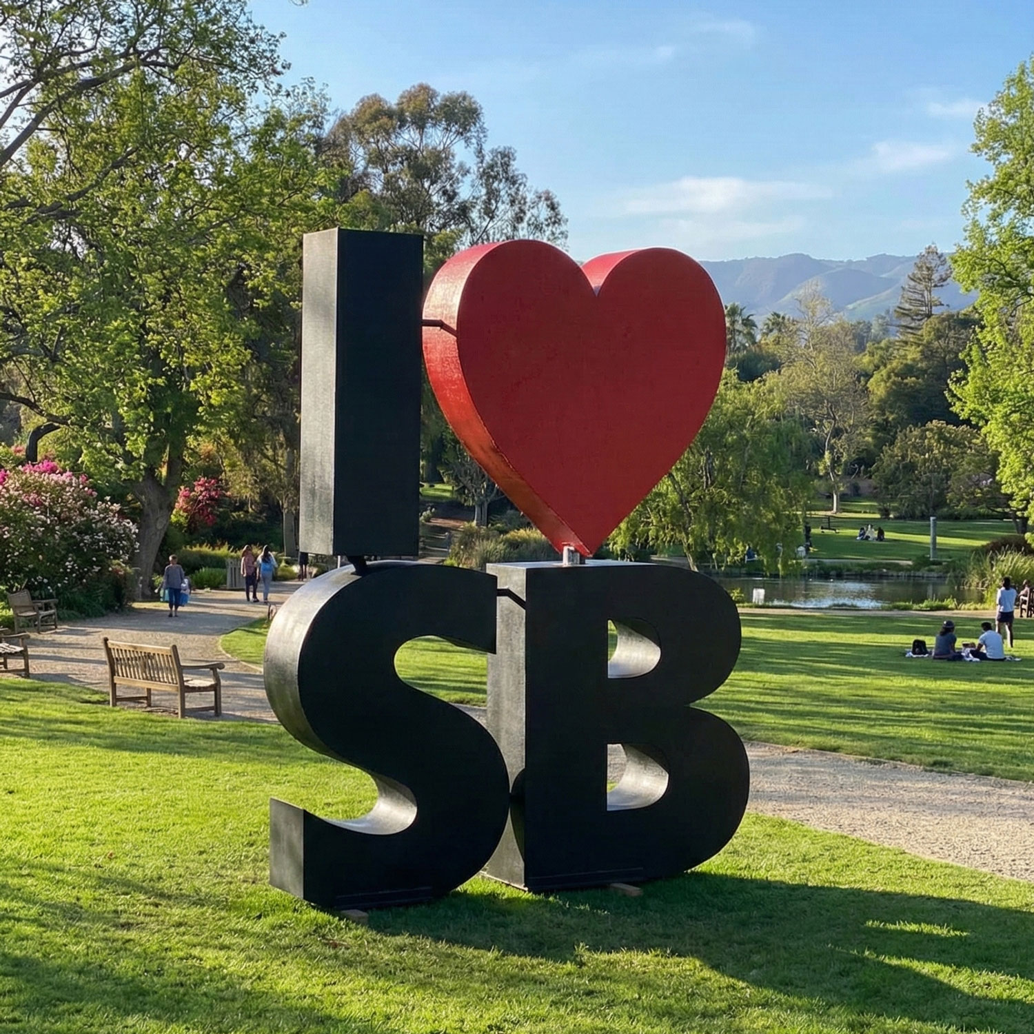
Mark the available footprint and any keep-clear zones. A display placed behind a reception desk is read differently from one people can approach from all sides. In retail or exhibit environments, nearby products and graphics also affect letter height and color contrast.
If people may lean on, sit within, or touch the display, state that explicitly. Interactive use changes structural and stability requirements and cannot be assumed from a reference image. For overhead or elevated placement, identify rigging points and venue restrictions before pricing.
For messages used at several locations, provide the smallest planned footprint and the narrowest loading route. A connected word may align quickly but require a larger crate; separate letters may pack more efficiently but need a repeatable spacing guide. That operational choice belongs in the initial scope.
A useful request combines brand artwork with physical site information.
The service page covers the wider letter offering. The gallery provides additional references for formats, finishes, mounting approaches, and scale.
Share the approved wording, artwork, site dimensions, intended use, and deadline. Include photos or drawings of the installation area when the letters must fit around existing architecture, products, or visitor routes.