
Planning Cast Metal Letters
Cast metal letters have a substantial dimensional profile and a finish vocabulary that differs from thin flat-cut lettering. The design begins with exact artwork, character size, depth, alloy and appearance direction, then moves into spacing and the mounting conditions of the real wall or monument.
Discuss Cast Metal Letters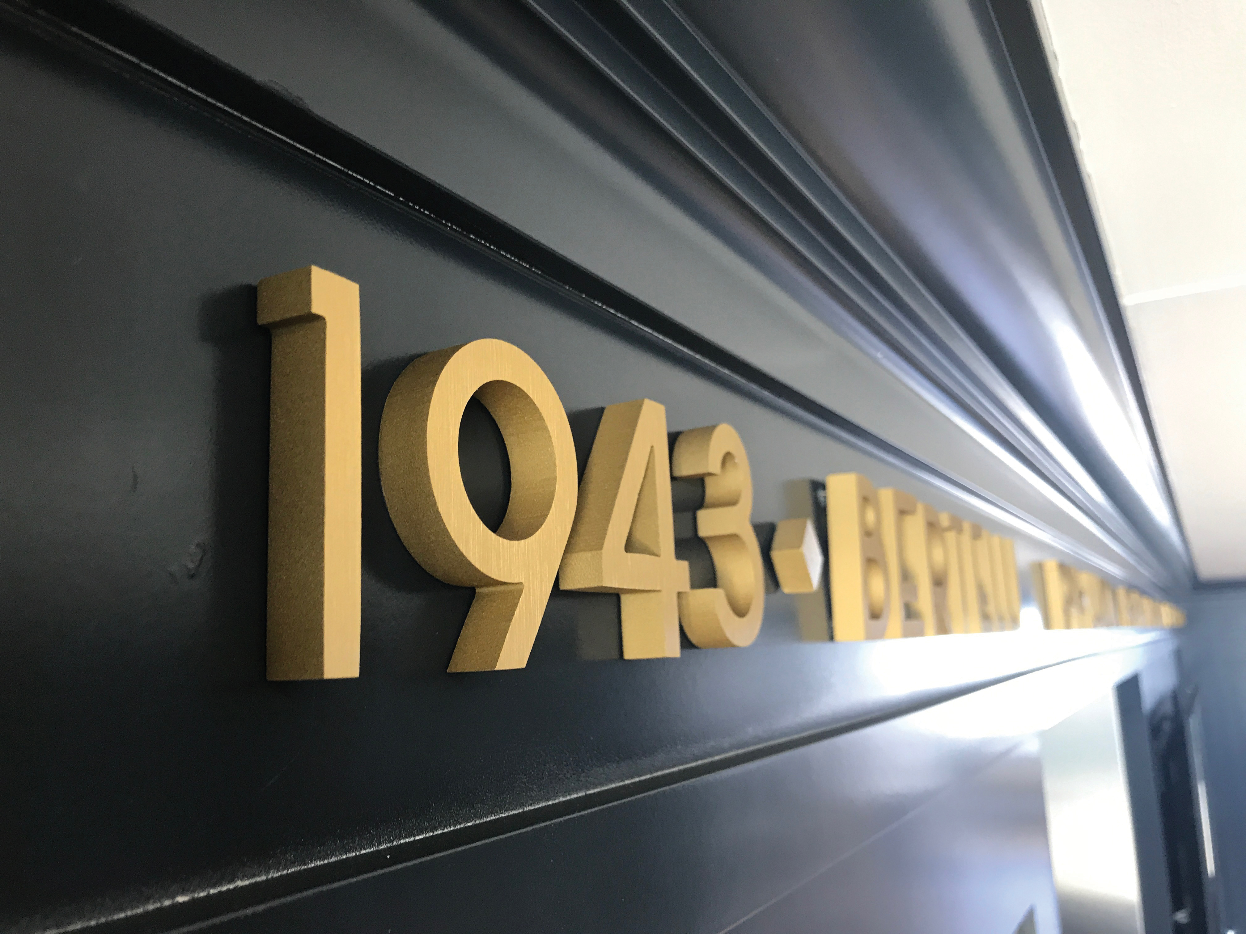
Finalize the letterforms before selecting a finish
Provide vector artwork for the exact wording, capitalization, punctuation, and logo elements. Cast letters may be available in established styles or developed from custom artwork, but the final shapes need adequate stroke width and interior openings at the requested height. Very fine serifs or narrow counters should be reviewed at scale.
A dimensioned layout should show total line width, individual character height, and spacing. If the copy must fit an existing facade or monument panel, supply that usable area and any fixed centerline. Do not rely on a font name alone when brand standards include modified characters.
Compare character detail with an installed line
The close view and building installation are completed cast-metal examples from the source page. One clarifies face, edge, and depth; the other shows how character spacing reads across a wall. They support planning without asserting an undocumented alloy, dimension, or mounting system.

Coordinate metal and finish direction
Color samples and physical finish references are more useful than broad terms that can be interpreted several ways.
Metal family
Identify the preferred metal or visual family and any project standard that governs the selection.
Face appearance
Polished, brushed, oxidized, painted, or other requested looks should be tied to an approved sample.
Edges and returns
Clarify whether side surfaces should match, contrast, or retain a distinct metal appearance.
Aging expectations
State the placement conditions and maintenance goals so appearance questions can be discussed accurately.
Design the spacing around the actual installation
Wall material, thickness, access behind the surface, and any stand-off distance affect the mounting discussion. Provide straight-on and angled site photographs plus dimensions between edges, joints, trim, and other obstructions. For curved or uneven surfaces, include a measured profile when available.
Decide whether letters should sit flush, project from the wall, or attach to a separate raceway or panel. Installation height, lift access, electrical conflicts, local requirements, and responsibility for field installation should be identified early. These inputs are more reliable than choosing hardware from an image.
For an existing sign system, document neighboring letter depth, baseline, finish, and stand-off with measurements rather than asking a new line to match by photograph alone. When appearance approval is sensitive, identify the sample size, review contact, and decision deadline before the production schedule is set.
Details needed for a cast-letter quote
A complete request joins the graphic layout with the mounting environment.
- Exact vector artwork
- Character height and total line width
- Desired dimensional depth
- Metal and finish direction
- Wall material and site photographs
- Flush or projected appearance
- Installation address and access
- Required delivery or install date
Request pricing for cast metal letters
Send the artwork, dimensions, depth, metal and finish direction, wall details, spacing plan, installation location, access information, and schedule. Include any required samples or approval milestones so the letters can be quoted against the correct visual standard.