
Modern vs. Rustic Metal Letters: What Fits Your Brand?
A design guide for aligning metal letter shape, finish, depth, lighting, and mounting with a brand and physical setting
Modern and rustic are not single metal finishes. They are combinations of typography, proportion, surface, edge detail, lighting, and context. A useful choice translates brand attributes into physical decisions that can be sampled and fabricated.
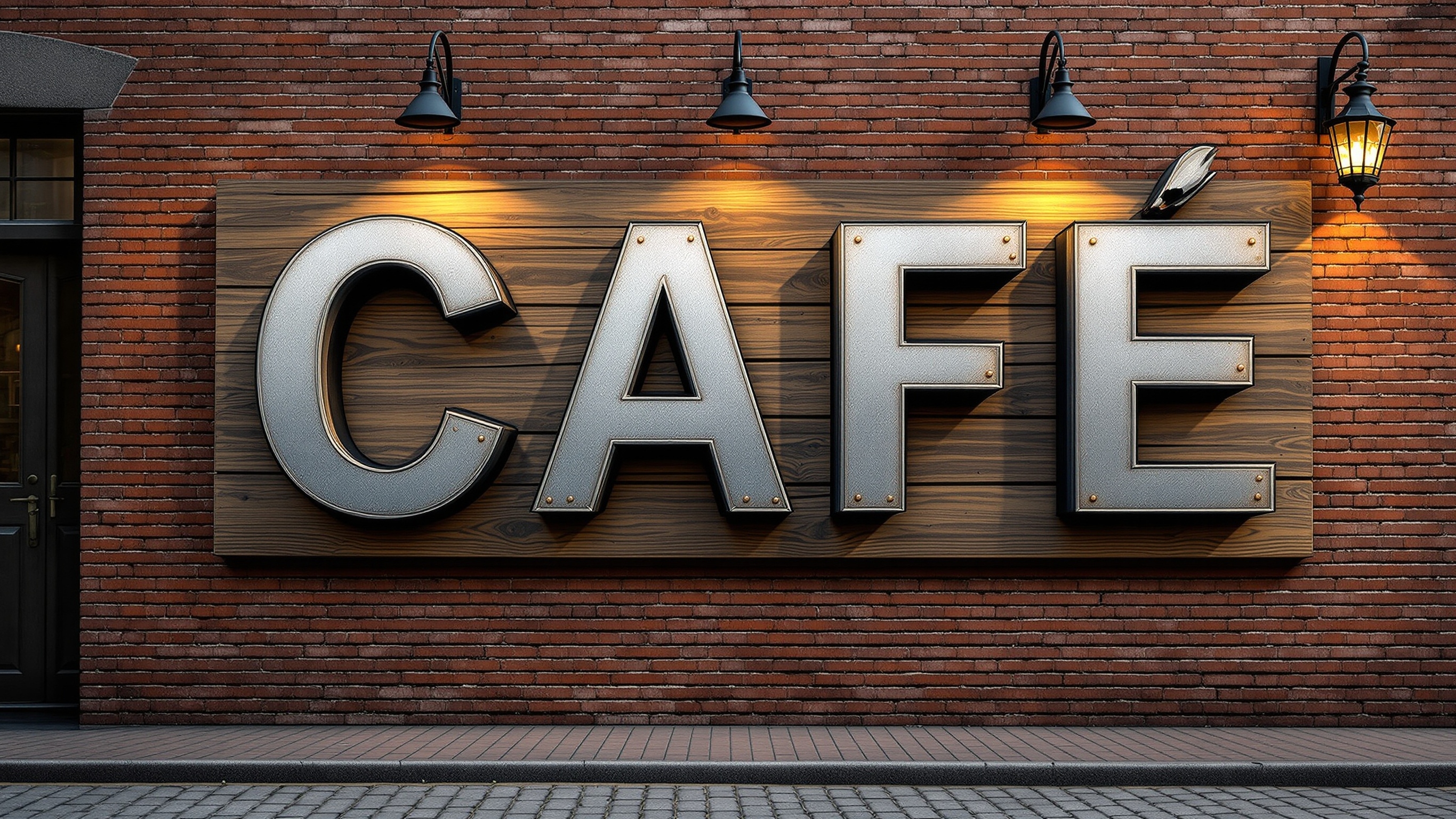
Technical Overview
Define the Brand Attributes First
Words such as modern, rustic, industrial, refined, or heritage can point designers in a direction, but they do not specify a letter. Identify the qualities the installation should communicate and the architectural materials it needs to complement or contrast.
Collect examples of type, finish, color, and environment separately. This helps distinguish a preference for a weathered surface from a preference for an informal typeface, since those choices can be combined in more than one way.
Use Typography to Set the Character
Modern treatments often use restrained geometry, controlled spacing, and clean transitions, while rustic treatments may use heavier forms, irregular references, or typography associated with handcrafted and historical settings. These are tendencies rather than fixed rules.
The approved mark must still work as a physical object. Thin strokes, sharp serifs, counters, script connections, and floating elements should be reviewed at finished size so the visual character does not depend on geometry that cannot be supported or mounted cleanly.
Build the Look Through Finish
Brushed, polished, painted, darkened, aged, patinated, and faux-weathered surfaces each reflect light and reveal texture differently. A rustic appearance can be controlled and repeatable, while a modern appearance can still use visible texture when it supports the surrounding design.
Finish samples are more reliable than descriptive names alone. Review color, sheen, directional brushing, variation, edge treatment, and any protective top layer under lighting similar to the installation environment.
Coordinate Depth, Lighting, and Background
Letter depth and standoff determine the visibility of returns and cast shadows. A slim profile may feel quiet and architectural, while deeper forms create stronger side views. The same letter can read differently against wood, masonry, painted drywall, glass, or a freestanding base.
Integrated face or halo lighting, spotlights, and ambient illumination emphasize different surfaces. Power, wall color, fixture position, reflection, and service access should be considered with the finish rather than after the letter form is approved.
Choose Mounting That Supports the Style
Visible fasteners and brackets may suit an intentionally industrial or rustic installation, while concealed pins or a carefully detailed raceway may support a cleaner appearance. The substrate and access determine which details are practical.
Freestanding letters and signs also need a base whose scale and finish belong with the design. Stability, audience access, wind exposure, and transport remain technical requirements even when the desired appearance is informal or aged.
Prepare a Material and Style Brief
Provide vector artwork, dimensions, desired depth, brand references, installation photographs, substrate information, finish examples, lighting intent, mounting preferences, viewing distances, exposure, and installation responsibility.
WhiteClouds can use those inputs to translate a broad modern or rustic direction into specific metal letter geometry, finish, mounting, and lighting decisions that suit the brand and location.
Compare metal letter styles and finishes
Review custom metal letter services, completed installations, and the broader 3D letter planning guide.
Tell us what your model needs to communicate
Share the intended audience, approximate size, level of detail, available source files, and project timeline.