
Giant Letter Props as Scenic Display Objects
Giant letter props treat words, initials, and numbers as pieces of scenery rather than ordinary signage. Scale shifts, dramatic depth, lighting cues, decorative outlines, and deliberate grouping can give each character a role while the complete composition still reads from the audience position.
Develop a Giant Letter Prop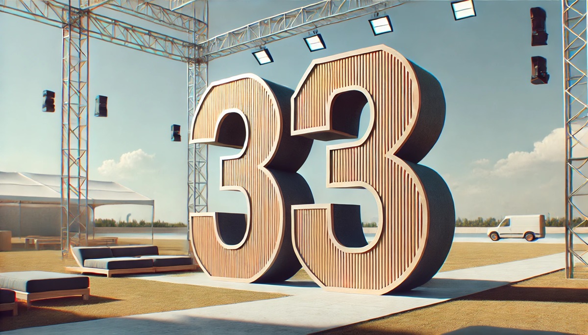
Compare number, word, and ornamental letter concepts
The three scenes illustrate different roles for giant characters: a number as a stage anchor, a bulb-lit word as an event feature, and one ornate initial as a sculptural object. They are design concepts rather than commissioned project evidence, so they establish questions about composition instead of fixed specifications.


Decide what the letters do beyond spelling
A scenic word may frame a performer, conceal equipment, establish a location, support a reveal, or define a camera background. Choose the function first, then determine which letters need the strongest silhouettes and which may carry secondary decoration.
If the characters will move, rotate, separate, or appear in more than one scene, document each configuration. A single front view cannot show the floor area, side finish, rear visibility, or clearance required during a transition.
Give the characters depth without losing the message
Each visual device should support the specific scene instead of accumulating as generic decoration.
Scale contrast
Varying character size can create hierarchy when the reading order remains obvious from the audience or camera.
Light as punctuation
Bulbs or other requested lighting can emphasize selected letters, outlines, or moments when power and viewing context are defined.
Decorative relief
Raised motifs and edge detail can turn an initial into an object, but fine ornament should match the nearest useful view.
Depth and shadow
Deeper forms create stronger side planes and shadows, which should be evaluated against the stage lighting and camera angle.
Information for a giant letter prop estimate
A useful package connects the typography to the running show or display plan.
- Exact characters, reading order, and approved font or artwork
- Scene purpose and required visual moment
- Maximum height, width, depth, and floor area
- Audience, camera, and performer sightlines
- Lighting request and available power information
- Moving, rotating, separating, or reuse requirements
- Stage access, storage, setup, and strike limits
- Destination, schedule, and required date
Block the full composition before fixing dimensions
Place the proposed character group on a scaled plan with screens, scenery, entrances, performers, cameras, and audience edges. The letters should not block a required path or disappear against a similar background. Include the widest configuration as well as the final front view.
Then test the longest reading distance and the closest camera view. Broad shape and spacing control the distant read; edge quality, graphics, and surface detail become more important up close. The final brief should identify which view has priority when those needs compete.
Request pricing for a giant scenic letter composition
Send the exact letters or numbers, scenic artwork, target envelope, grouping, audience and camera views, stage plan, lighting intent, movement needs, access and setup limits, destination, schedule, and required date.