
Flower Metal Letters as Sculptural Word Displays
A flower-themed metal letter display can express the idea through the word itself, an embedded secondary word, petal-like spacing, color, or the relationship between several letter sizes. The composition should remain readable as typography while functioning as one sculptural object.
Develop a Flower Letter Concept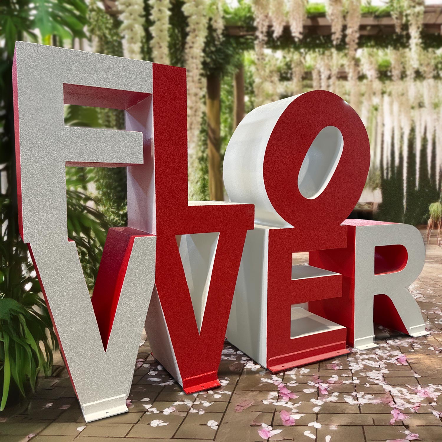
Build the floral idea into the typography
The concept can feel botanical without attaching literal flowers to every character.
Primary word
Choose the message that must read first and give it the clearest overall silhouette.
Secondary reading
A shorter word may emerge through color or position, but it should not make the full phrase difficult to understand.
Scale rhythm
Varying character heights can add movement when baseline, overlap, and spacing remain deliberate.
Open silhouette
Use negative space between characters so planting, architecture, or sky does not turn the composition into one dense block.
Make the full word clear before revealing the visual surprise
Test the display first in one color and at the longest expected viewing distance. If the main word is not clear in silhouette, a second color or embedded message will add confusion. Once the primary reading works, color can guide the eye toward a secondary sequence or focal group of letters.
The arrangement should also survive angled views. Overlaps that work straight on may hide entire strokes from the side. Share the important approach directions and identify whether visitors will walk around the display or mainly view it from one face.
Specify the message before styling the metal display
A concise word plan keeps the visual concept tied to the actual site and audience.
- Primary word, secondary word, and intended reading order
- Capitalization, font direction, and character hierarchy
- Color assignment by face, side, character, or word
- Maximum height, overall width, depth, and footprint
- Overlap, spacing, and open-area preferences
- Front view and any important side or rear views
- Freestanding base or mounting direction
- Site conditions, access, destination, and required date
Use the background as part of the composition
A flower-themed display may sit near planting, water, masonry, storefronts, or event scenery. Provide photographs with the proposed position marked and include the main camera or arrival point. Similar greens or reds in the background can weaken a letter face that looked strong on a white design proof.
Note the nearest visitor position and whether people are expected to stand beside or in front of the letters. The base area, gaps, and overall height should be evaluated with that interaction in view rather than treated only as a distant sign.
Resolve outdoor, mounting, and access needs from the site
Metal-letter projects are developed for their intended location. Share the placement surface, available footprint, public reach, expected duration, and who will be responsible for site engineering and installation. Do not rely on a photograph of another project to set dimensions or support requirements.
Delivery information should include the destination, loading approach, smallest opening, lifting or staging limits, and required completion date. Those constraints can influence how a multi-character composition is divided and handled.
Request pricing for a custom flower-themed metal display
Send the exact wording and reading order, font or artwork, color hierarchy, target envelope, site photographs, important viewing sides, base or mounting preference, placement conditions, access information, destination, and required date.