
Designer Large Letters with Custom Graphic Surfaces
Designer large letters use the face of each character as a deliberate graphic field. Illustration, photography, patterns, typography, and color blocks must be composed across real letter outlines while the side treatment, depth, and base keep the full display coherent.
Develop a Graphic Letter Display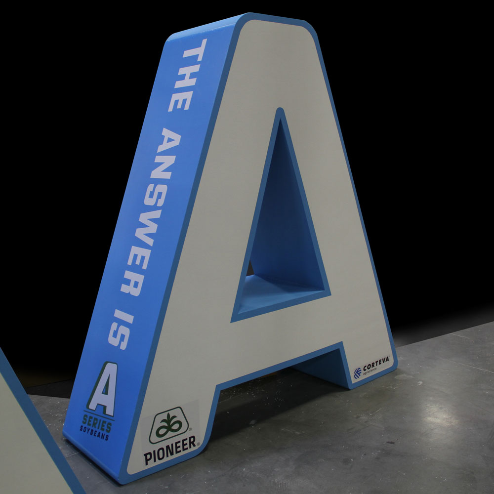
Treat every character as both type and display surface
The word still has to read before the artwork can reward a closer look. Begin by testing the approved letter outlines at the farthest important viewing distance. Wide faces can hold photographs or illustrations, while narrow strokes may need simpler color or pattern so the letter does not become visually fragmented.
Decide whether the artwork should flow across the whole phrase or reset inside each character. A continuous scene can connect the word, but every counter and gap interrupts it. Character-by-character art offers more control, though color and visual weight still need a common rhythm.
See artwork resolved on one letter and across a word
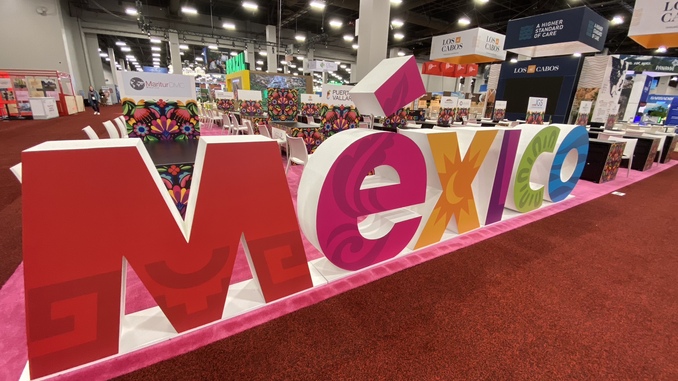
The large A uses its face and side as separate graphic areas. The MEXICO display coordinates different imagery and color across multiple characters. These examples show why final art should be reviewed on the actual outlines rather than approved only as a rectangular layout.
Align the outline, artwork, edges, and base
Four linked decisions determine whether a graphic letter display remains readable from more than one angle.
Character silhouette
Keep the outer letter shape recognizable before adding small visual detail or low-contrast imagery.
Artwork crop
Mark faces, people, logos, dates, and text that cannot be cut by counters, joins, or narrow strokes.
Dimensional side
Choose whether the side should be quiet, continue the artwork, or provide a deliberate contrasting color from oblique views.
Display foundation
Coordinate any base with the composition so it supports the word without creating an unrelated graphic band.
What to include in a design-forward letter brief
Organize the artwork and physical constraints in one review package.
- Exact letters, numbers, symbols, and reading order
- Vector character outlines or approved font files
- Print-ready artwork and brand color references
- Critical image areas, text, logos, and no-crop zones
- Face, side, back, and base treatment
- Target height, total width, depth, and footprint
- Primary view, angled views, and viewing distance
- Placement, access, destination, and required date
Review the graphics on final letter outlines
A useful proof shows the complete word at scale and a closer view of each character. Check that small text remains appropriate for the viewing distance, important imagery is not split awkwardly, and neighboring letters do not create accidental shapes. Include the side treatment in an angled view when depth is part of the presentation.
If the display will be photographed, share the likely camera height and background. Strong patterns can behave differently against a busy booth or stage than they do on a white proof. The final composition should be evaluated in context before the artwork and dimensions are treated as fixed.
Request pricing for large letters with custom graphics
Send the exact wording, vector outlines, print-ready art, protected image zones, target dimensions, side and base direction, viewing distance, placement photographs, access limits, destination, and required date.