Large Letter A

Large Letter A

We Build Custom 3D Large Letter "A"s

Did you know we make

custom

large letters?

Large Foam Letter A

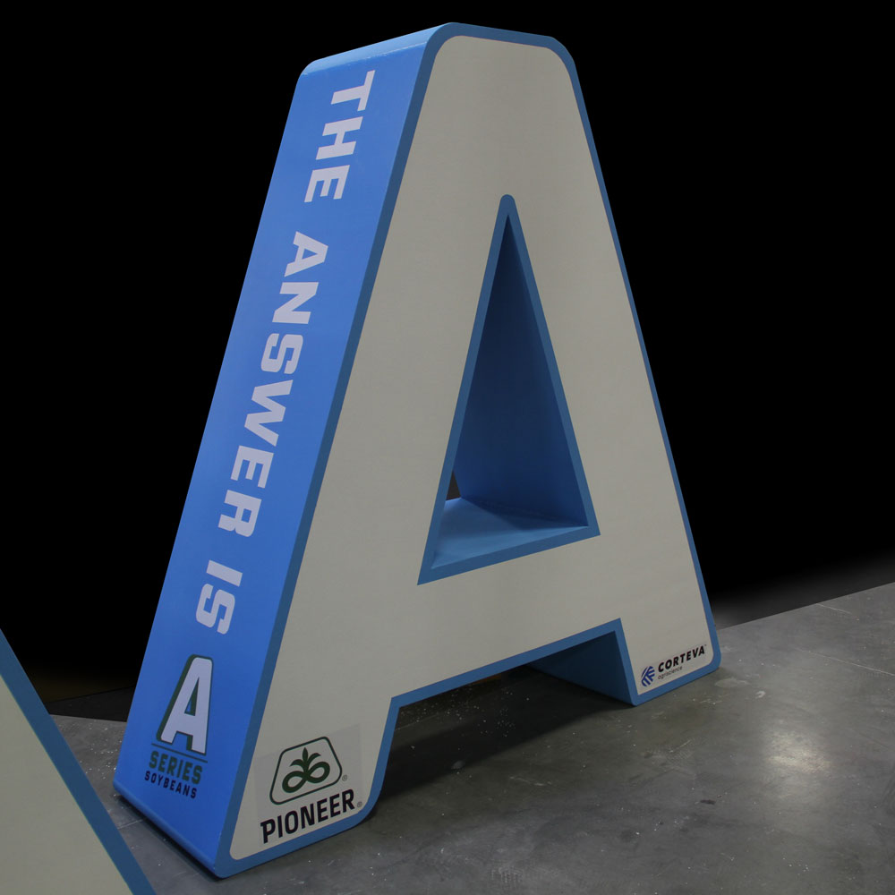
The Majestic Marvel of the Large Letter “A”

The large letter “A” stands as an icon in the realm of typography—a singular symbol that commands attention and sparks the imagination.  At the heart of the alphabet, this elegant character transcends mere utility, evolving into a work of art, a symbol of meaning, and a cornerstone of design. 

From ancient origins to modern expressions, the letter “A” has a story as enduring as language itself.  As we dive into the depths of its significance and explore the intricate craft of its creation, we’ll uncover the rich tapestry of the large letter “A” and its profound impact on the way we communicate, express, and perceive the world around us.   Join us as we embark on a voyage of letters, where the seemingly ordinary transforms into the extraordinary, where typography transcends the page to become a visual language of its own, and where the letter “A” takes its rightful place as a symbol of artistic and communicative splendor.

Large Foam Letter A

Design and Aesthetics of Large Letter “A”

The large letter “A” is a typographic masterpiece, celebrated for its elegant design and aesthetic appeal.  Its visual characteristics and stylistic nuances have made it a favorite among designers, typographers, and artists alike.  In this section, we will explore the design and aesthetics of the large letter “A,” shedding light on what makes it an enduring symbol of beauty and balance in typography.

  • Geometric Precision:  At the heart of the large letter “A” lies a remarkable geometry—a triangular shape with two diagonal strokes that converge at an apex.  This geometric precision gives the letter “A” a sense of balance and symmetry.  The angles and proportions are meticulously crafted to create a visually pleasing and harmonious character that can seamlessly integrate into various design compositions.
  • Symmetry and Harmony:  The horizontal crossbar of the large letter “A” adds an extra layer of symmetry and harmony to its design.  This crossbar divides the character into two distinct parts, balancing the upper and lower portions.  The symmetry inherent in the letter’s structure instills a sense of stability and order, making it a versatile choice for a wide range of design applications.
  • Variations in Serifs:  The presence or absence of serifs—the small decorative strokes at the ends of the main strokes—plays a significant role in the aesthetics of the large letter “A.”  Serif fonts, such as Times New Roman, feature these embellishments, giving the “A” a classical and timeless appearance. In contrast, sans-serif fonts, like Arial, lack serifs, resulting in a cleaner and more contemporary look.  Designers carefully consider the choice of serifs to align with the desired aesthetic and message of their design.
  • Stylistic Expressions:  The large letter “A” is remarkably adaptable, appearing in a wide array of stylistic expressions.  It can range from bold and assertive forms that convey strength and authority to delicate and ornate scripts that exude elegance and sophistication.  The ability to tailor the “A” to suit the specific mood and tone of a design allows for endless creative possibilities.
  • Contrast and Legibility:  The large letter “A” excels in achieving a fine balance between contrast and legibility.  Its well-defined triangular shape and horizontal crossbar ensure that it remains easily distinguishable, even at varying sizes and in different typefaces.  This balance of form and function makes the letter “A” a reliable choice for both decorative and informative purposes.
  • Versatility in Applications:  Due to its aesthetic appeal and versatility, the large letter “A” finds its way into an array of design applications.  It graces book covers, headlines, signage, and logos, adding a touch of sophistication and visual interest.  Its timeless design allows it to transcend trends, making it a timeless choice for designers seeking to create enduring and impactful visuals.

The large letter “A” is a triumph of design, characterized by its geometric precision, balance, and adaptability.  Its harmonious form and timeless appeal ensure that it remains a cherished and versatile character in the world of visual communication.


The Art and Craft of Creating Large Letters: A Multifaceted Journey

The creation of large letter “A”s is a captivating journey that combines artistry, craftsmanship, and innovative technology.  These iconic characters come to life through a variety of materials and techniques, each offering a unique visual language and aesthetic. From the versatility of foam to the enduring elegance of metal, the adaptability of plastic, the meticulous fabrication process, the illumination of LED, the nostalgia of marquee elements, and the fantastical world of Steampunk, let’s dive deep into the fascinating process of crafting large letter “A”s.

Foam Letters:  Versatile and Lightweight Creations

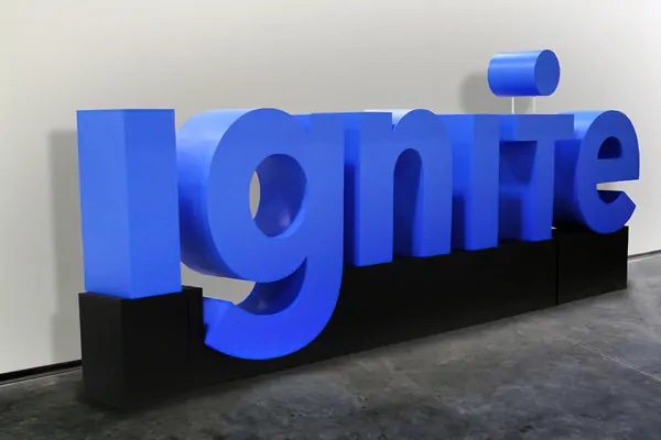
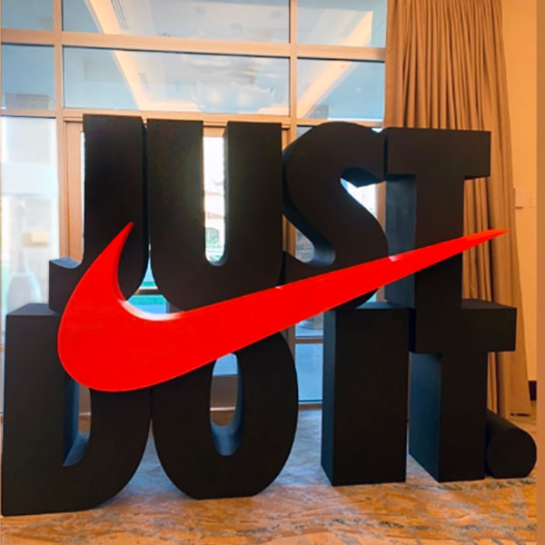
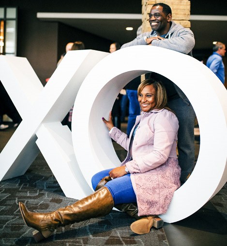
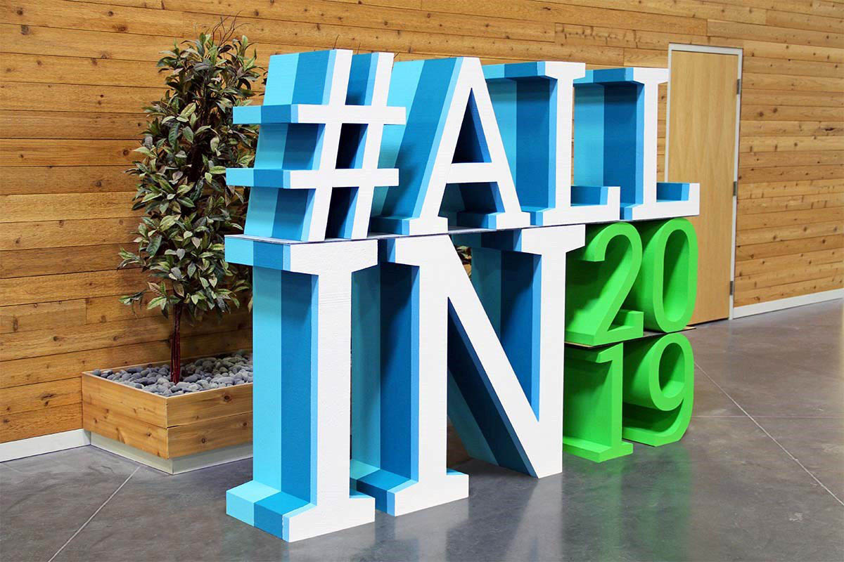
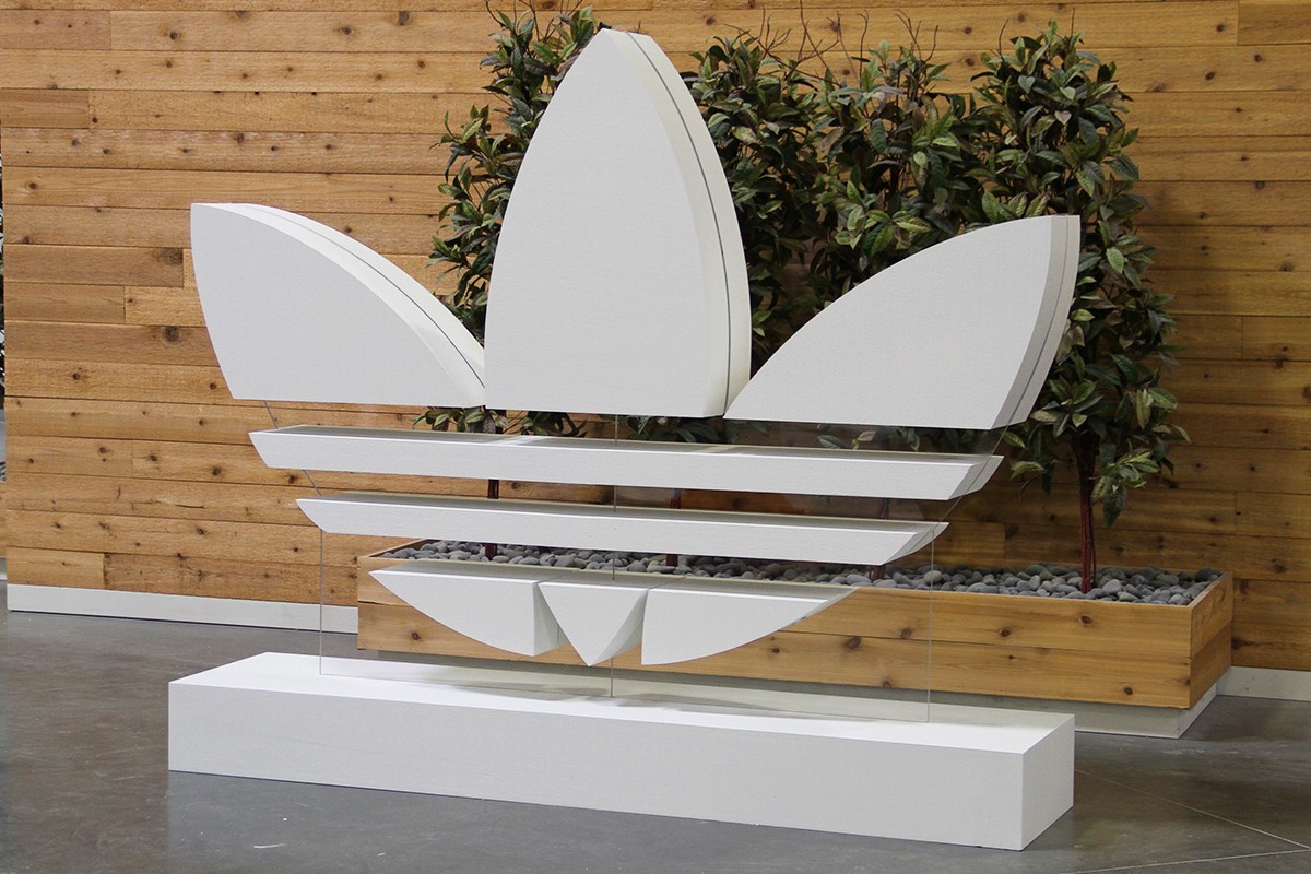
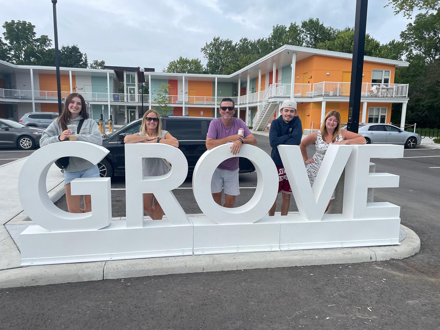
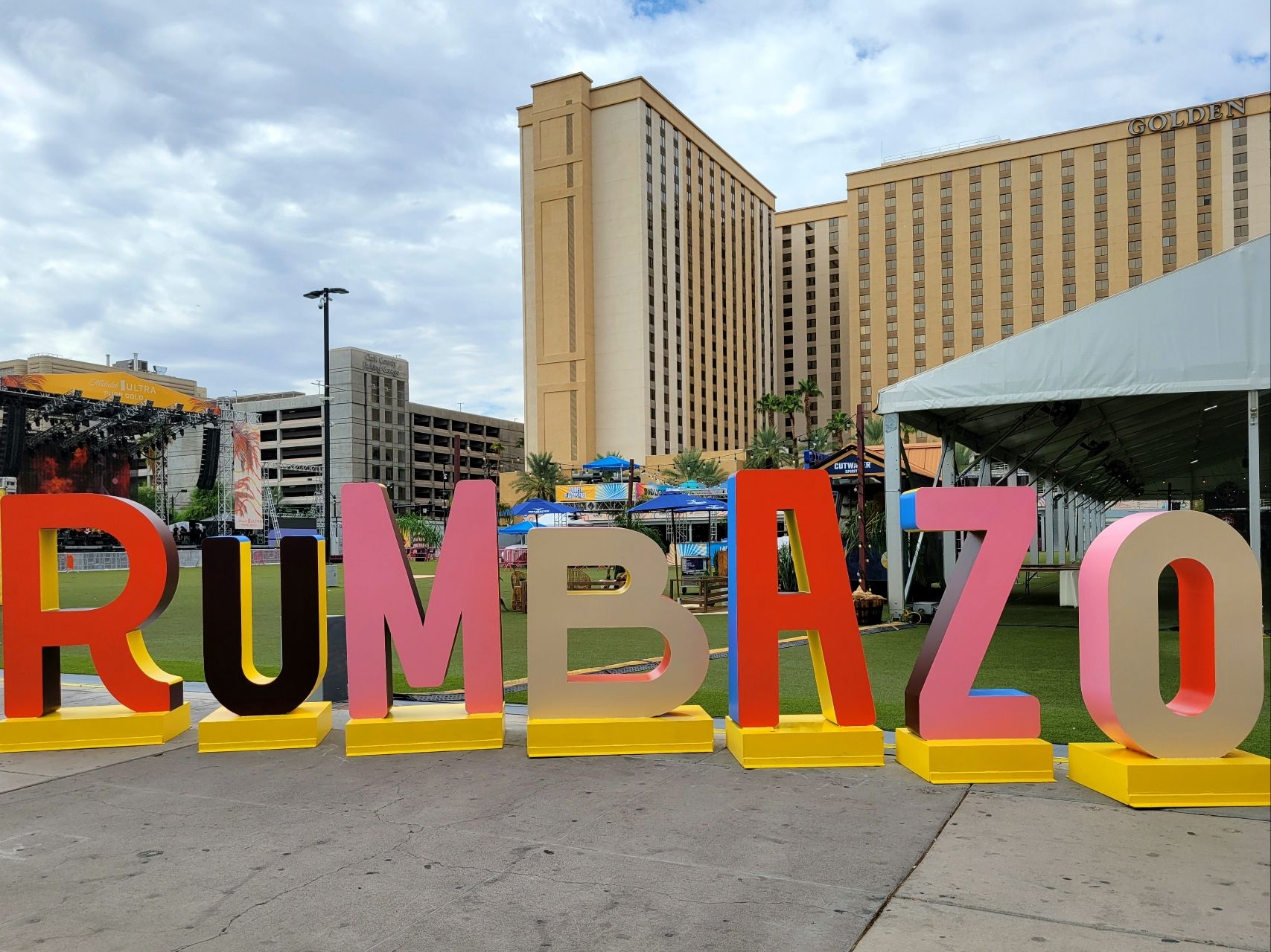
Foam large letters are celebrated for their versatility and affordability.  The process commences with expanded polystyrene (EPS) foam sheets, which serve as the raw material.  CNC (Computer Numerical Control) cutting machines precisely shape the foam into the desired “A” form, ensuring clean edges and accurate dimensions.  In cases where intricate detailing or curves are required, artisans may employ handcrafting techniques to sculpt the foam.

Once the letter “A” takes its shape, the surface undergoes treatment.  This typically involves coating with materials such as acrylic paint, epoxy resin, or polyurethane foam coatings. These coatings enhance the aesthetics, durability, and weather resistance of the foam letter.  The final result is a lightweight yet visually striking large letter “A,” ideal for various applications including signage, event decorations, theatrical displays, and more.

Camping World Grand Opening Large Stacked Foam Letters

Metal Letters:  Timeless Elegance and Durability

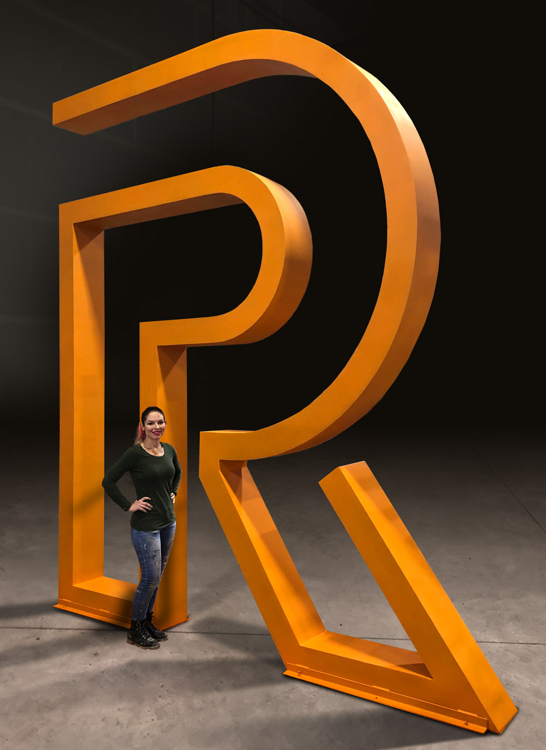
Metal large letters exude timeless elegance and durability.  The process begins with the selection of the appropriate metal, which can include stainless steel, aluminum, brass, or copper, depending on the desired aesthetic and application.  Precision cutting techniques such as laser cutting and waterjet cutting are employed to shape the metal, ensuring clean edges and dimensional accuracy.

The letter “A” is then formed into its three-dimensional structure.  This often involves the use of hydraulic or mechanical presses to bend and shape the metal.  Welding techniques are employed to assemble multiple components or to fuse intricate details together. Surface finishing methods such as polishing, brushing, or the application of coatings like powder coating or electroplating add texture and a refined appearance.

The result is a robust and enduring large letter “A” that can withstand the test of time. These metal characters find their place in architectural signage, corporate branding, and decorative elements that demand both elegance and resilience.

Plastic Letters:  Adaptable and Customizable Designs

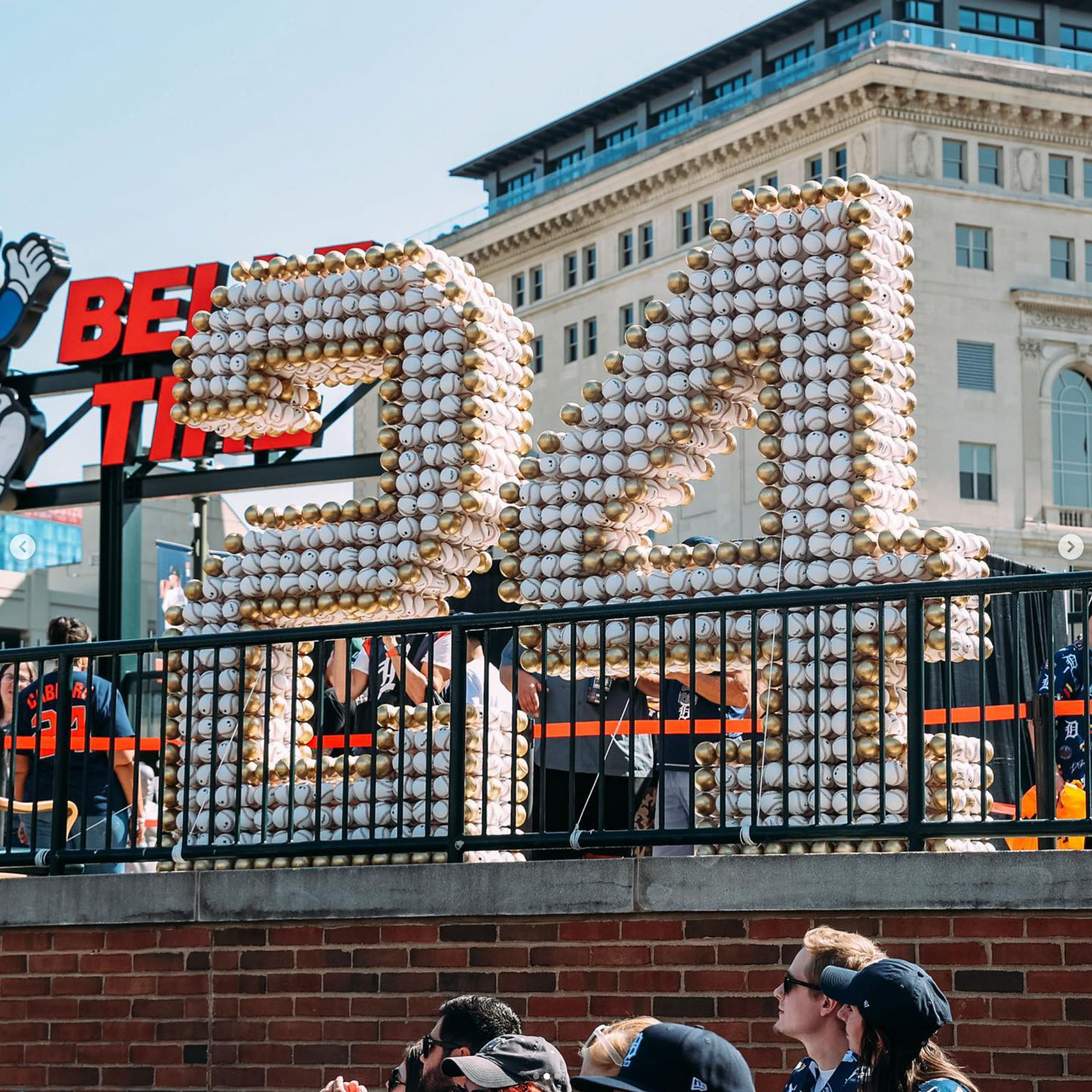
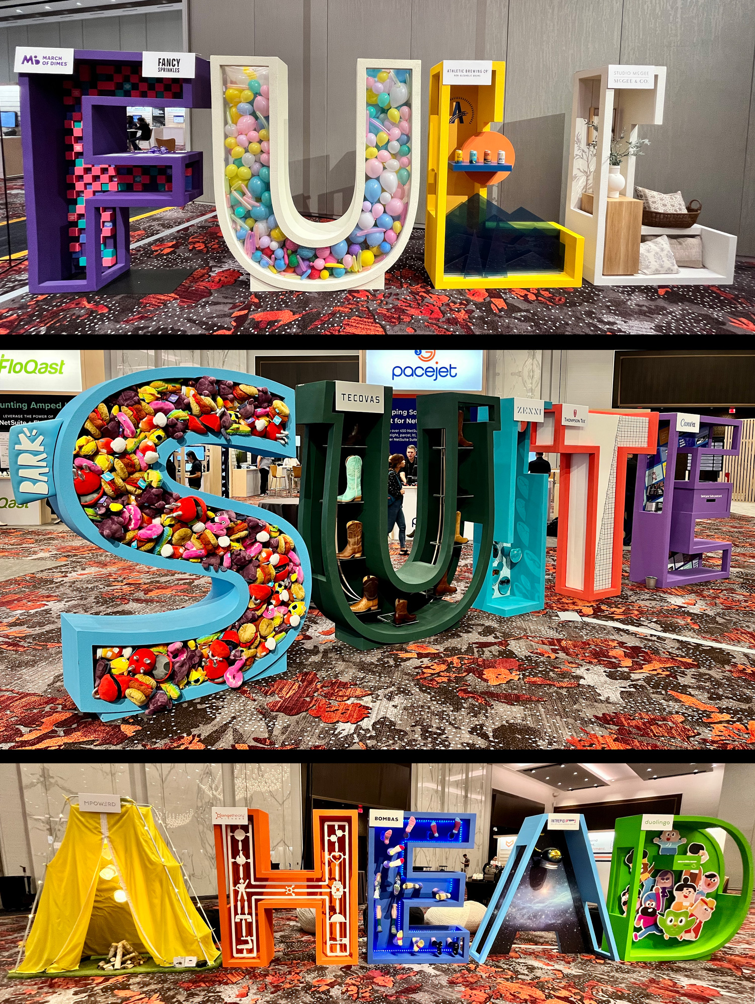
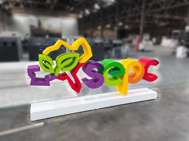
Plastic large letters offer adaptability and a wide range of customization options.  These letters can be fabricated from various plastics, including acrylic, PVC, polycarbonate, and more.  The creation process typically involves CNC cutting machines or mold shaping techniques to craft the desired form.

What sets plastic large letter “A”s apart is the level of customization they afford.  Designers and artisans can choose from a vast palette of colors, finishes, and thicknesses, allowing for letters that perfectly align with specific design concepts, branding guidelines, or thematic requirements.  Plastic letters are favored for their ease of installation, lightweight nature, and resilience to environmental factors.

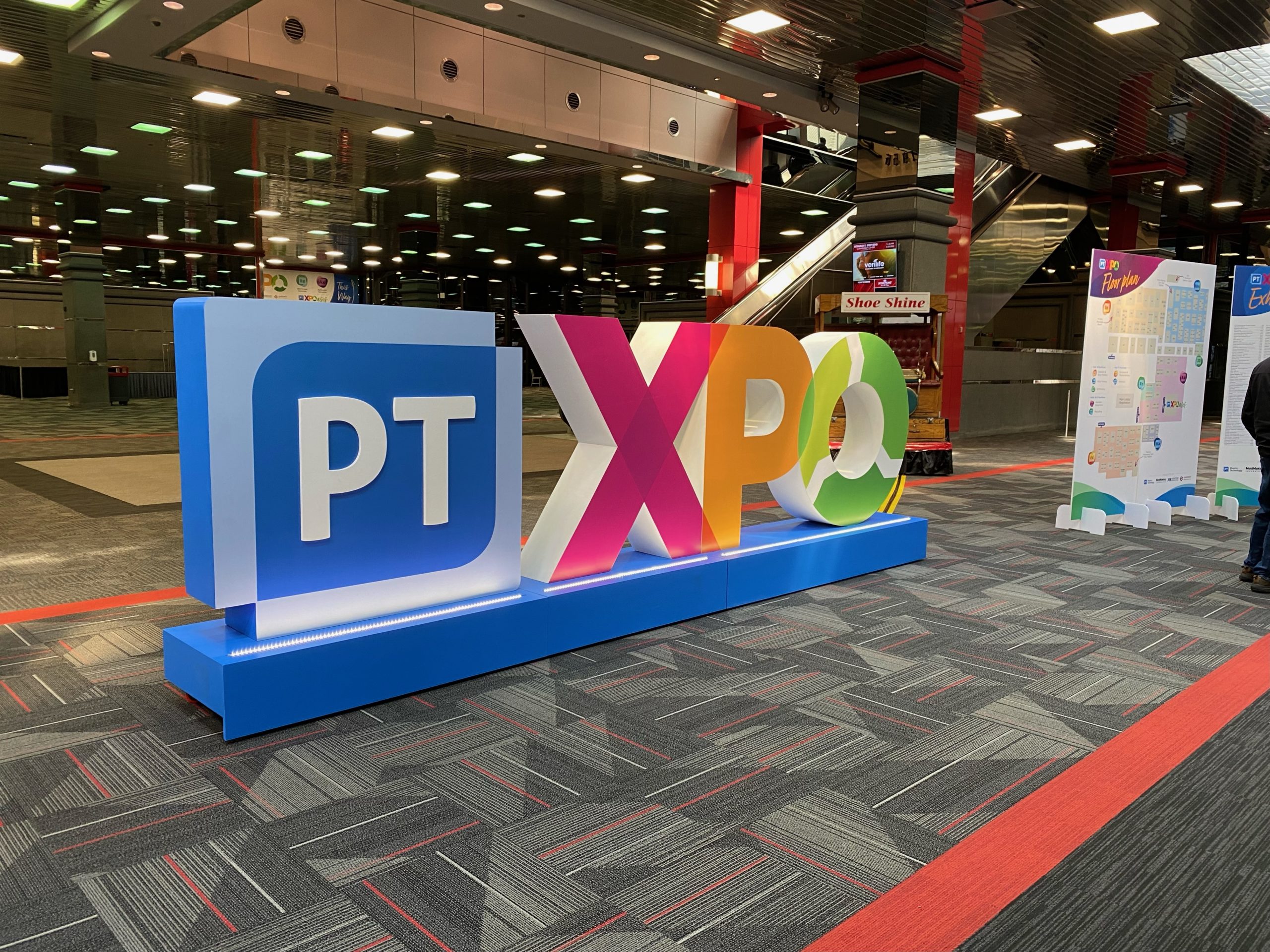
Fabricated Letters:  The Intersection of Art and Technology

Fabricated large letters represent the intersection of art and technology.  Designers select materials such as acrylic, metal, or wood, and then employ CNC machines or traditional handcrafting techniques to shape the letter into the desired form.  Fabricated letters are often customized to align with specific design concepts, offering limitless possibilities for creative detailing and integrated features.

These large letter “A”s can incorporate textured finishes, unique lighting elements, or complex multi-material constructions, making them ideal for architectural signage, corporate branding, artistic installations, and other projects that demand both artistic expression and precision craftsmanship.

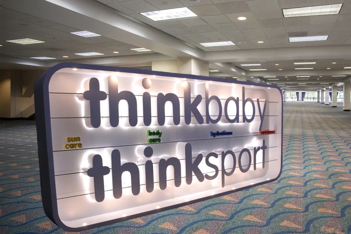
LED Letters:  Dynamic Illumination for Visual Impact

LED large letters are defined by their illuminated features, offering dynamic visual impact. These letters typically begin with a sturdy base material, which can be metal or acrylic, serving as the framework for the letter.  LED lighting strips or modules are meticulously installed within the letter “A” to create an even, vibrant illumination.

The process extends to wiring and controls, which are integrated to power and manage the lighting system.  LED large letter “A”s are favored for their ability to capture attention, making them suitable for eye-catching signage, interior and exterior displays, and branding applications.

Love Marquee Letters

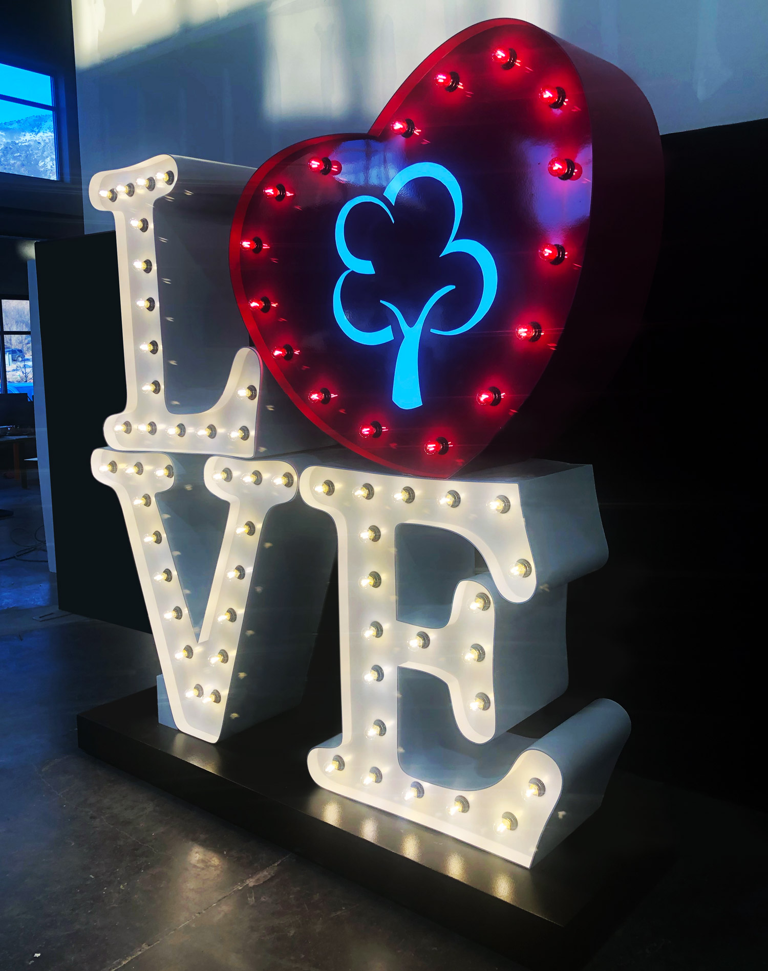
Marquee Letters: Nostalgia and Iconic Appeal

Marquee large letters evoke nostalgia and iconic appeal, often reminiscent of vintage theaters and glamorous events.  These characters are typically crafted using materials such as wood, metal, or acrylic, and they feature an internal lighting system that defines their iconic glowing effect.

The lighting system often employs LED bulbs or neon tubing, carefully installed to create an even and captivating illumination.  Wiring and controls ensure proper functionality. Marquee letters frequently feature weathered finishes, intricate detailing, and vintage design elements, adding to their retro charm.  They find their place in various applications, including event signage, themed décor, and environments where a touch of nostalgia is desired.

Steampunk Letters:  Victorian Elegance Meets Industrial Innovation

Steampunk large letters emerge from the Steampunk subculture, which draws inspiration from the 19th-century Victorian era and industrial innovation.  These letters are a captivating blend of elegance and ruggedness, and their creation process is meticulous.

Materials such as brass, copper, wood, and leather take center stage in Steampunk designs. Artisans incorporate intricate gears, cogs, rivets, and other mechanical embellishments to create the characteristic Steampunk look.  Vintage lighting elements, such as Edison-style filament bulbs or gaslight-inspired fixtures, are integrated to emit a warm, nostalgic glow.

The result is a large letter “A” that transports us to an alternate Victorian era infused with steam-powered innovation, making Steampunk letters ideal for themed events, artistic installations, and environments where a touch of fantasy is desired.

The Journey of Craftsmanship

Regardless of the chosen material or style, the creation of large letter “A”s follows a similar journey marked by craftsmanship and meticulous attention to detail:

  • Design and Conceptualization:  Designers sketch or digitally render the letter “A” in the desired style, considering factors like size, shape, and finishing options.
  • Material Selection:  The choice of material sets the tone for the final product, whether it’s metal, foam, plastic, or wood.
  • Cutting and Shaping:  Precision techniques, such as laser cutting, CNC machining, or handcrafting, are used to shape the material into the letter “A.”
  • Finishing Touches:  Surface finishes, including polishing, sanding, painting, coating, or weathering, enhance aesthetics and durability.
  • Lighting Integration:  For LED and marquee letters, the installation of lighting elements is pivotal, involving wiring, controls, and vintage-style bulbs or neon tubing.
  • Customization:  Large letter “A”s often undergo customization to match specific themes, color schemes, or branding guidelines, allowing for details like texture, color, or integrated logos.
  • Mounting and Installation:  Mounting options are considered, and the letter “A” may come equipped with brackets, hooks, or other mechanisms for secure attachment to walls, signs, or stands.
  • Quality Assurance:  Each large letter “A” undergoes quality checks to ensure it meets design specifications and functional requirements before leaving the workshop.
  • The Artistry of Creation:  Large letter “A”s are more than mere characters; they are artistic expressions that convey messages, set atmospheres, and leave lasting impressions. The journey of creating these characters is a testament to human creativity and craftsmanship, spanning centuries of innovation and artistic evolution.

Whether they are bold and timeless in metal, versatile and lightweight in foam, dynamic and illuminated in LED, or nostalgic and ornate in marquee and Steampunk styles, large letter “A”s continue to captivate our imagination.  These iconic characters not only communicate words but also stories, emotions, and the enduring power of design in the ever-evolving landscape of visual communication.

Gallery of Large Letters

Symbolism and Significance of the Large Letter “A”

Beyond its aesthetic appeal and design prowess, the large letter “A” carries profound symbolism and cultural significance across various contexts.  It serves as a potent symbol, often evoking deep emotions and associations that extend beyond its typographic form.  In this section, we will dive into the symbolism and significance of the large letter “A,” exploring the diverse meanings it conveys in different realms of human expression.

  • The First of All Letters:  The large letter “A” occupies a unique position as the inaugural character of the alphabet in many languages.  As the first letter, it symbolizes beginnings, origins, and the essence of commencement.  This symbolism is deeply ingrained in human consciousness, making the letter “A” a universal symbol of initiation and the start of a journey.
  • Alpha and Omega:  In various religious and philosophical traditions, the letter “A” is associated with the concepts of the “Alpha” and “Omega.” “Alpha” signifies the beginning, while “Omega” represents the end.  Together, they encompass the entirety of existence, from inception to conclusion.  This duality endows the letter “A” with a sense of transcendence and completeness.
  • Religious and Mythological Significance:  In many cultures, the letter “A” is linked to deities and higher powers.  In Christianity, for example, it is often used to symbolize the divine as seen in the “Alpha and Omega” reference in the Book of Revelation.  In Hinduism, the “Om” symbol, which incorporates the sound “A,” holds spiritual significance, representing the ultimate reality and the source of all existence.
  • The Scarlet Letter:  Nathaniel Hawthorne’s classic novel, “The Scarlet Letter,” employs the letter “A” as a central symbol.  In the story, the letter adorns the clothing of Hester Prynne as a mark of shame and punishment for her perceived sin.  Here, the letter “A” takes on a dual role, symbolizing both the sin and the strength of the character who bears it.  This literary example highlights the multifaceted nature of the letter’s symbolism.
  • Initiation and Exploration:  In language and literature, the letter “A” often signifies initiation and exploration.  It is the first step in forming words and narratives, representing the commencement of communication and storytelling.  Whether in the word “Adventure,” “Aspiration,” or “Awakening,” the letter “A” serves as a gateway to uncharted territories and new horizons.
  • Modern Symbolism:  In contemporary culture, the letter “A” continues to be a symbol of aspiration, ambition, and achievement.  It frequently appears in branding and advertising, where it conveys messages of excellence and leadership. Companies, from Apple to Amazon, use the letter “A” in their logos to signify innovation and global reach.

The large letter “A” is far more than a mere character in the alphabet; it is a symbol laden with profound meanings and cultural significance. Its association with beginnings, transcendence, and exploration makes it a powerful emblem in religion, literature, and modern branding. 

Typography and Typefaces of Large Letters

Typography is an art form that extends far beyond mere letters and words; it encompasses the visual expression of language.  Within this realm, the large letter “A” takes center stage as a fundamental element in countless typefaces and fonts.  The design of this single character can vary greatly, allowing for a vast array of creative expression.  In this section, we explore the typography and typefaces of large letter “A”s, examining how they contribute to the richness and diversity of visual communication.

  • Typeface Families:  Large letter “A”s are found in various typeface families, each characterized by a unique set of design principles.  Serif typefaces, like Times New Roman, feature decorative strokes, or serifs, at the ends of the main strokes.  These serifs lend a classical and timeless quality to the letter “A.”  Sans-serif typefaces, such as Helvetica, omit serifs, resulting in a clean, modern look.  Slab serif typefaces, like Rockwell, feature thick, block-like serifs that give the letter “A” a bold and sturdy appearance.  Script typefaces, such as Brush Script, mimic handwritten lettering and can vary widely in style, from elegant and flowing to casual and playful.
  • Weight and Style Variations:  Within each typeface family, designers can select from a range of weight and style variations for the letter “A.”  These variations affect the thickness and design characteristics of the letter.  For instance, a “bold” weight will make the letter “A” thicker and more prominent, while an “italic” style will slant it for added emphasis.  These options allow designers to fine-tune the overall look and feel of their typography.
  • Decorative and Display Fonts:  Large letter “A”s are often used prominently in decorative and display fonts.  These fonts are designed to be eye-catching and impactful, making them ideal for headlines, logos, and branding.  In these fonts, the letter “A” may be adorned with decorative elements, flourishes, or intricate details, amplifying its visual appeal.
  • Serif vs. Sans-Serif “A”s:  The choice between a serif and a sans-serif large letter “A” can significantly impact the overall tone of a design.  Serif typefaces often convey tradition, sophistication, and formality.  In contrast, sans-serif typefaces tend to be perceived as modern, clean, and approachable.  Designers consider the message they wish to convey and the context in which the typography will be used when selecting between these options.
  • Custom Letterforms:  In addition to standard typefaces, designers and typographers often create custom letterforms for specific projects.  These custom large letter “A”s are meticulously crafted to align with the unique vision of the design.  They may incorporate personalized details, proportions, and stylistic elements that harmonize with the overall design concept.
  • Digital Typography:  The advent of digital typography has revolutionized the creation and use of large letter “A”s.  Designers can now access an extensive library of fonts and typefaces for various digital applications.  Digital tools also allow for precise control over the size, spacing, and positioning of the letter “A,” ensuring optimal legibility and visual impact.

Typography and typefaces play a pivotal role in visual communication, with the large letter “A” serving as a prominent character in this intricate world. The diversity of typeface families, style variations, and creative possibilities allows designers to select the perfect large letter “A” to convey their intended message, evoke emotions, and capture the essence of their design. 

History of Large Letter “A”

The history of the large letter “A” is an intricate tapestry woven through the annals of human civilization, tracing its evolution from ancient symbols to contemporary typography. This single character has witnessed the rise and fall of empires, the development of writing systems, and the evolution of design aesthetics.  In this section, we embark on a journey through time to explore the fascinating history of the large letter “A.”

  • Ancient Origins:  The roots of the letter “A” can be traced back to the ancient Phoenician alphabet, which dates to around 1200 BCE.  In this early script, the letter “A” was represented by a symbol resembling an ox’s head, known as “aleph.”  Over time, this symbol evolved through the Greek and Etruscan civilizations, eventually reaching the Romans.
  • Roman Refinement:  The Romans made significant contributions to the design of the letter “A” as we know it today.  They refined its form, shaping it into the characteristic triangular structure with a horizontal crossbar.  This design offered both functionality and aesthetics, contributing to the letter’s enduring appeal.
  • Medieval Manuscripts: Throughout the Middle Ages, large letter “A”s were a prominent feature in illuminated manuscripts.  Scribes and illuminators painstakingly crafted ornate and decorative “A”s to begin paragraphs and chapters, often embellishing them with intricate patterns and colorful designs.  These illuminated letters were not just functional but also works of art in their own right.
  • Gothic and Blackletter Typography:  The Gothic and Blackletter scripts of the medieval period featured large, bold letterforms, including the letter “A.”  These scripts, characterized by their complex and angular shapes, were widely used for manuscripts, inscriptions, and signage in Europe.  The letter “A” in Blackletter typography often featured elaborate embellishments and serifs, giving it a distinctively ornate appearance.
  • The Printing Revolution:  The invention of the printing press by Johannes Gutenberg in the 15th century transformed the way large letter “A”s and other characters were reproduced.  With the mass production of printed materials, standardized typefaces and fonts emerged, making the letter “A” accessible to a broader audience.
  • Modern Typography:  The industrial and technological advancements of the 19th and 20th centuries ushered in the era of modern typography.  Large letter “A”s became integral elements in a wide range of typefaces, from classic serifs to sleek sans-serifs.  The Bauhaus movement, in particular, emphasized simplicity and functionality, influencing the design of the letter “A” and other characters.
  • Digital Age and Beyond:  In the digital age, typography entered a new dimension. The versatility of the letter “A” in various typefaces, its adaptability to digital interfaces, and its use in branding and advertising have solidified its role as a pivotal character in modern visual communication.

The history of the large letter “A” is a confirmation to the enduring nature of typography and design.  From its humble origins as an ox’s head symbol to its prominence in illuminated manuscripts and modern digital interfaces, the letter “A” has evolved and adapted alongside human culture and technology. Today, it stands as a symbol of the written word, artistic expression, and the ever-evolving landscape of visual communication.

Celebrating the Enduring Beauty of Large Letters

The large letter “A” has taken on countless forms, from the ornate embellishments of medieval manuscripts to the sleek and minimalistic designs of modern typefaces.  It has played a pivotal role in conveying messages, telling stories, and marking new beginnings. As the first character in many alphabets, it symbolizes initiation, origin, and the essence of commencement.

In the world of design, the large letter “A” serves as a canvas for artistic expression. Designers and typographers carefully craft its form, experimenting with style, weight, and texture to convey a multitude of emotions and messages.  It can be bold and authoritative, elegant and refined, or whimsical and playful, adapting to the diverse needs of various design contexts.

In the modern era, the large letter “A” continues to shine as a focal point in branding, advertising, signage, and digital interfaces. Its versatility, adaptability, and cultural resonance make it an indispensable element in the world of visual communication. Whether gracing a book cover, illuminating a marquee, or adorning a company logo, the large letter “A” captivates our attention and evokes emotions, reminding us of the boundless possibilities of design and language.

Get a Free Quote