
Approach
Decide which sides people should see and how close they may come. A walk-around display needs a different rear treatment and support plan from letters intended to face one direction.
Large letters can become a landmark, photo opportunity, or gathering point when their scale and placement are planned around the people who will use the space.
Plan Your Letter Installation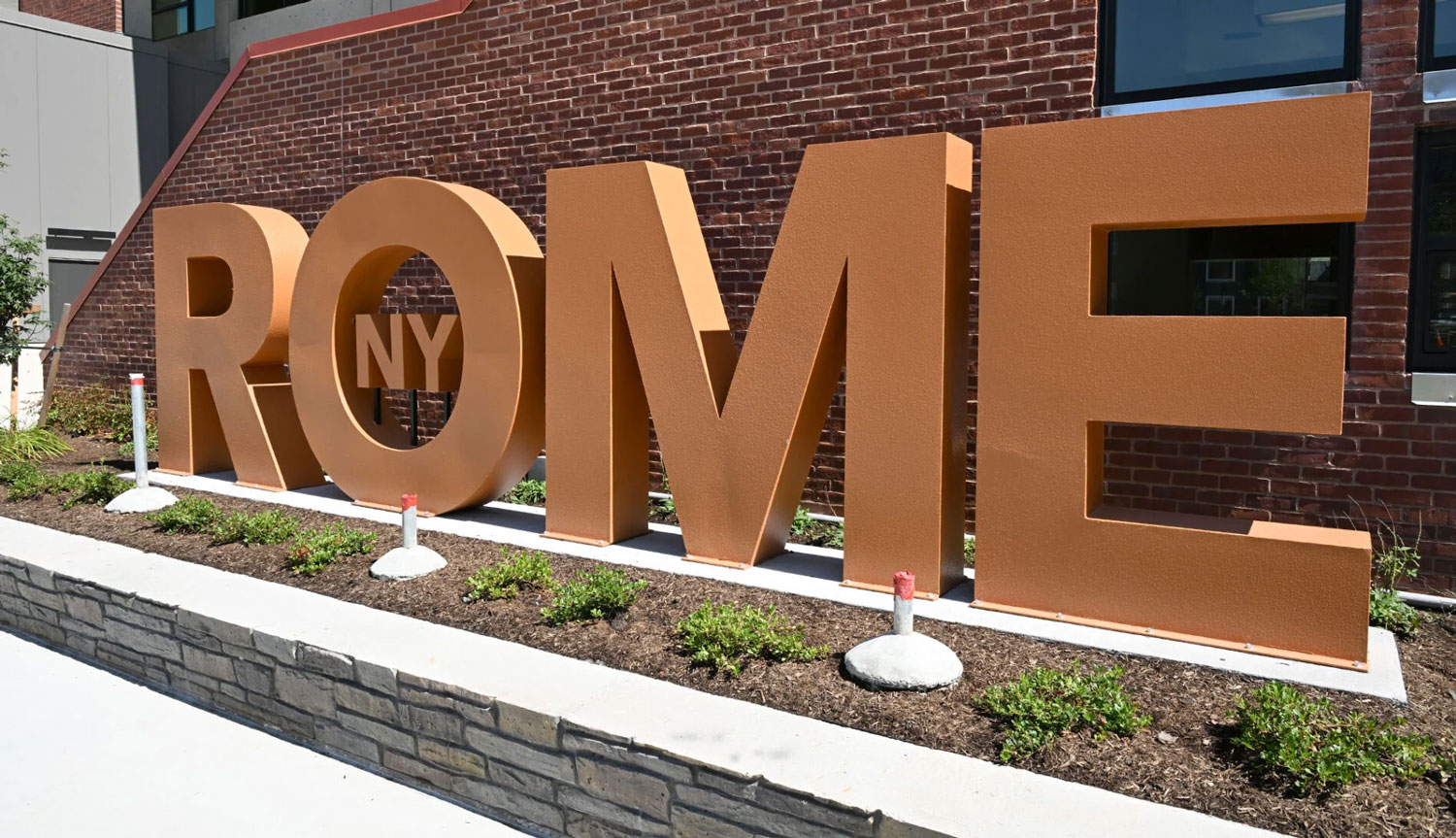
Interactive public art works best when the physical design begins with a clear visitor behavior: approach, photograph, read, touch, walk around, or gather nearby. That behavior affects the letter depth, edges, spacing, surface, base, and the clear area around the piece.
Decide which sides people should see and how close they may come. A walk-around display needs a different rear treatment and support plan from letters intended to face one direction.
Mark the intended camera positions and the number of people in the frame. The letters should remain recognizable from the distances that matter to the site.
If the piece is meant to be a meeting point, leave room for circulation, waiting, staff access, and the surrounding landscape or architecture.
The Rome, NY and Gatlinburg SkyPark displays show two different ways large metal letters can establish a physical identity in a public setting. Their value here is as planning context: the site, viewing distance, background, and visitor path all change the right proportions.

Choose the overall height and width after measuring the approach, the important viewing distance, and the surrounding visual field. A letter installation can feel lost in an open civic space or crowded in a tight courtyard if the scale is chosen without the site plan.
Public-space letters should be detailed with the site conditions in view. Coordinate clear routes and usable space with the applicable site requirements, and define how the finish, edges, anchoring, lighting, and cleaning plan support the intended use.
Keep the route around the piece usable for visitors and maintenance. The final dimensions should be checked against the actual paving, grade, doors, and nearby obstacles.
Select material, finish, anchoring, and inspection access for the exposure and maintenance expectations of the site. Avoid treating one finish as right for every location.
Contrast, letter spacing, lighting, and surrounding color all influence how the display reads. Decide which message must remain legible from the farthest important view.
A useful fabrication conversation can start with the artwork and the site plan. WhiteClouds can help translate the intended interaction into a practical letter display when the physical and scheduling constraints are clear.
Compare the supporting hub, service capabilities, and completed display examples before the final dimensions are set.
Share the artwork, intended setting, approximate dimensions, visitor interaction, access route, and schedule. The more clearly the site is described, the more useful the first fabrication conversation will be.