
Planning a Giant Letter Z Display
A single giant letter can operate as an initial, monogram, directional landmark, stage object, or abstract graphic form. For a letter Z, the long diagonals, pointed corners, stance, depth, and viewing angle determine whether the character reads cleanly and stands with the intended visual weight.
Plan a Giant Letter Z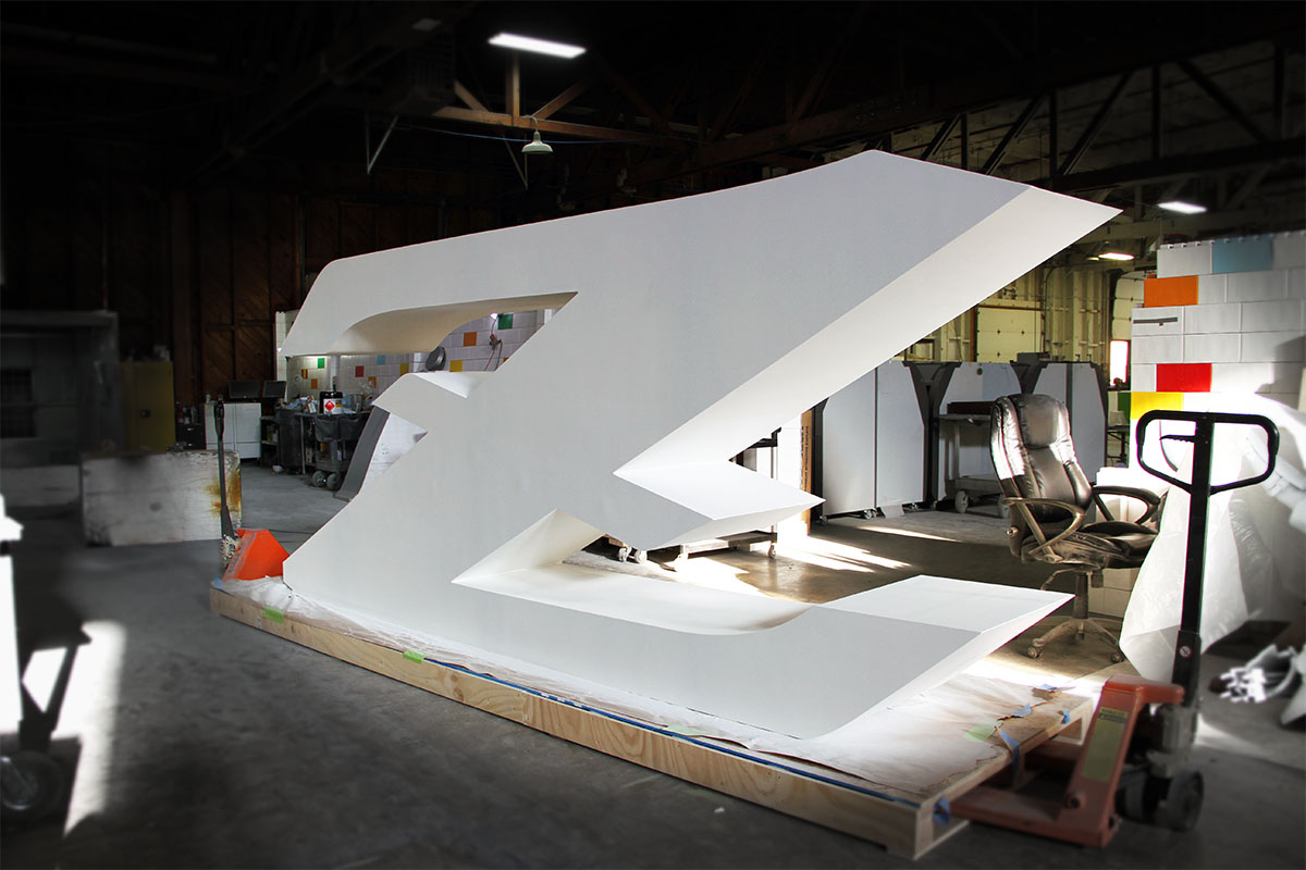
Give the Z one clear job in the environment
A solitary letter has no neighboring characters to explain its scale or baseline. Decide whether it represents a name, place, team, campaign, product, or purely visual motif. That purpose guides how literal the font must remain and whether the character needs supporting graphics or context.
Mark the point where the Z should first become recognizable. A broad geometric style can read across a room, while a decorative outline may reward a closer view. If the letter will share the scene with people, products, or a screen, include those elements in the scale reference.
Resolve diagonals, corners, stance, and depth together
The character should be reviewed as a three-dimensional form instead of a flat glyph enlarged by percentage.
Upper and lower bars
Their length controls the apparent width, floor contact, and amount of open space around the diagonal.
Central diagonal
Stroke thickness and angle determine how forceful the character feels and how much unsupported visual span it creates.
Corner treatment
Square, softened, clipped, or stylized corners change both the font identity and the way the object occupies nearby clearance.
Side profile
Depth, lean, base relationship, and off-axis appearance should be considered from the actual route through the space.
Compare an exact Z workshop view with a graphic X display
The Z image documents the shape during production without establishing a customer, final installation, or exact fabrication specification. The separate WhiteClouds X project shows a finished single character with graphic faces. Both make the same planning point: diagonal letters need to be judged from the front, side, and intended floor or mounting relationship.

Define the one-letter display precisely
Small differences in the source glyph become large physical differences at display scale.
- Exact font file or vector outline for the Z
- Target height, maximum width, depth, and floor area
- Vertical, leaning, suspended, or mounted orientation
- Face graphics, side color, and back-view expectations
- Primary view and any required side views
- People, products, screens, or scenery sharing the composition
- Doorways, elevators, dock, and setup limits
- Destination and required date
Coordinate the letter with its base, wall, or scenic support
Share whether the support should disappear visually, become part of the design, or connect the Z to another element. A clean front rendering may hide the depth and footprint required by the real setting, so include a plan view and an angled view when the letter stands away from a wall.
For public or outdoor placement, provide the site conditions and identify the parties responsible for installation and engineering. The project can then be scoped around the actual environment rather than assigning unsupported dimensions or support details from a legacy photo.
Request pricing for a custom giant letter Z
Send the exact Z artwork or font, target dimensions, stance, face and side treatment, viewing directions, base or mounting preference, site photographs, access limits, placement conditions, destination, and required date.