Dreaming Big: The Vision Behind the Letters
When Texas State Technical College (TSTC) planned its new Power and Mechanical Center, the project was never just about constructing another facility. It was about building a space that embodied the college’s energy, technical prowess, and bold identity. To achieve that vision, administrators and designers wanted something iconic, something that would not only mark the building but also define it. The answer came in the form of massive illuminated letters—an idea that combined artistry, engineering, and branding into one unforgettable installation. From the very beginning, the letters were imagined as more than signage. They would stand tall as a beacon of innovation, welcoming students, staff, and visitors with presence and pride. They would represent a bridge between tradition and future, embodying TSTC’s commitment to technical excellence while projecting an image of modernity. This idea sparked a collaboration with WhiteClouds, a company known for transforming bold visions into architectural realities. Together, the concept of 8-foot illuminated letters began to take shape.
Designing Identity in Three Dimensions
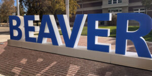
Turning a logo into a three-dimensional landmark is no small task. Fonts are designed for screens and print, but when scaled up to eight feet in height and two feet in depth, proportions and legibility become critical. For TSTC, the design challenge was to remain faithful to the college’s custom font while adapting it into something that could stand as a monumental structure. Every curve, edge, and angle of the typeface had to be carefully studied and modeled so the letters retained their character while being magnified to architectural scale. Adding to the complexity was the distinctive TSTC logo style, which incorporates floating internal elements. To replicate this effect in a physical build, designers introduced black accent areas within the letters. This created the illusion of suspended shapes, a detail that made the letters feel dynamic and authentic to TSTC’s brand.
Color was another critical decision. The interiors of the letters were painted in bold red, a hue that represented TSTC’s vibrant energy and institutional colors. In contrast, the exteriors, fronts, and backs were finished in clean white, a choice that emphasized clarity and made the letters pop against the building’s surroundings. This red-and-white palette, framed by subtle black accents, struck the perfect balance between boldness and precision.
Engineering Strength That Lasts
Design alone would not make the letters successful. These were to be permanent outdoor installations, subject to Texas weather, blazing sunlight, and the test of time. Structural strength was paramount. Each letter was constructed from durable aluminum sheets, chosen for their ability to resist corrosion while remaining relatively lightweight. Beneath the visible surfaces, an internal support framework was carefully engineered to ensure that the letters would never bow, warp, or weaken.
To further enhance longevity, the entire structure was coated in polyurea, a protective layer known for its resilience against impact, UV exposure, and moisture. This coating transformed the letters into fortified symbols, ready to endure decades of environmental challenges without losing their pristine appearance. Every weld, seam, and joint was executed with precision. The engineering was invisible to most observers, yet it was the foundation that allowed the letters to appear effortless in their strength. While students and visitors would admire their glowing faces, the hidden framework ensured they could withstand storms, heat, and constant exposure without compromise.
Illuminating the Night with LED Brilliance
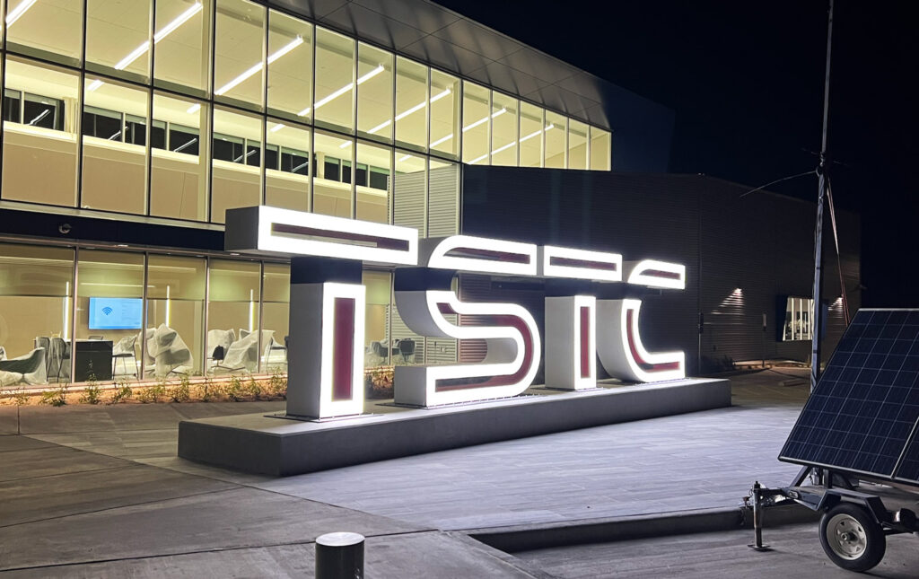
A monumental sign becomes even more powerful when it transforms after dark. For TSTC’s letters, integrated LED lighting was not an afterthought but a defining feature. The goal was to create letters that didn’t simply exist by day but glowed as beacons at night.
The lighting was designed to evenly illuminate the front faces of the letters, producing a crisp, radiant glow without shadows or hotspots. LEDs were chosen for their energy efficiency, long lifespan, and ability to maintain consistent brightness. With the red-painted interiors subtly complementing the glowing white exteriors, the letters created an unmistakable impression once illuminated. At night, the letters embody more than function. They symbolize aspiration. They become a landmark visible across the campus and beyond, reinforcing TSTC’s brand and mission. They also serve as a gathering point—an illuminated canvas where students take photos, celebrate milestones, and create memories that tie them to their school’s identity.
From Fabrication Floor to Campus Grounds
The process of fabrication was as monumental as the letters themselves. Sheets of aluminum were carefully cut, shaped, and welded into form. Every panel had to align perfectly, every edge polished, every surface prepared for paint and finish.
Once the structural shells were complete, the interiors were painted bold red while the exteriors received their clean white finish. The black accent areas required meticulous craftsmanship to achieve the illusion of floating shapes. This wasn’t simply painting; it was artistry executed on a massive canvas.
The LED lighting systems were then integrated, carefully fitted into the letters to maximize glow while maintaining accessibility for maintenance. Finally, the letters were welded onto metal base plates, engineered for strength and simplicity. These plates allowed the letters to be anchored securely into their foundations during installation without compromising their aesthetic.
Transporting and installing the letters required logistical precision. At eight feet tall and two feet deep, each letter was a massive object that had to be moved with care and lifted into position with heavy equipment. Once secured, the letters transformed the Power and Mechanical Center, giving it an identity as bold as the technical work happening inside.
A Symbol of Pride and Progress
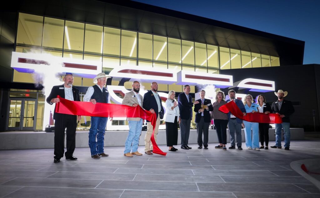
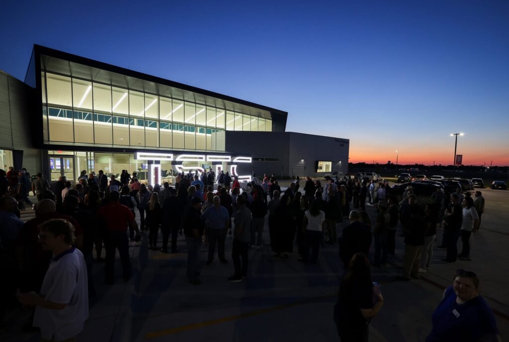
When the first letter was illuminated, it was more than just a design milestone. It was the moment TSTC’s new Power and Mechanical Center gained its voice. The letters became symbols of pride, visible expressions of the college’s commitment to education and innovation.
Students now pass by these monumental signs daily, seeing in them the strength and brilliance of their institution. Visitors encounter them as a statement of professionalism and scale, instantly recognizing the school’s dedication to technical excellence. For faculty and alumni, the letters embody progress and continuity, tying past traditions to future aspirations. The emotional impact of such signage cannot be overstated. They are more than metal, paint, and lights. They are touchstones of identity, anchors for memories, and icons of belonging. TSTC’s letters now stand as a landmark on campus, destined to appear in countless graduation photos, celebrations, and social media posts.
The Broader Impact of Monumental Signage
What TSTC achieved with its illuminated letters is part of a larger trend in higher education. Colleges and universities across the country are discovering that monumental signage plays a pivotal role in campus branding. It distinguishes one institution from another, creates iconic landmarks, and fosters pride in students and alumni alike. Architectural signage is more than wayfinding; it is storytelling. It transforms buildings into landmarks, pathways into experiences, and campuses into brands with presence and permanence. At TSTC, the illuminated letters demonstrate how custom signage can capture the essence of an institution and broadcast it boldly, day and night.
From Concept to Completion: The Lasting Legacy
The journey from idea to installation at TSTC tells a story of vision, collaboration, and craftsmanship. It began as a concept: to create something monumental that would elevate a new building into an icon. It grew into a design that blended TSTC’s brand identity with architectural scale. It became a fabrication process rooted in precision and durability. And it culminated in installation, where eight-foot glowing letters now stand as symbols of progress and pride. These letters are more than structures. They are legacy installations that will inspire generations of students, faculty, and alumni. They represent the power of merging design with engineering, artistry with strength, and vision with execution. TSTC’s illuminated letters stand as proof that signage, when elevated to architectural art, can transform a building into a symbol, a campus into a landmark, and an idea into a lasting identity.
Check out WhiteClouds’ Metal Letters for more information.
Contact us today to learn more about our 3D services and how we can help you achieve your goals.