
Planning 4-Foot Foam Letters
At four feet tall, letters behave like freestanding objects rather than ordinary signage. Typeface width, stroke thickness, depth, spacing, and the shape of each character determine whether a word can stand as a unit, needs a base, or should be divided into practical groups for setup and transport.
Plan Four-Foot Letters
Start with the exact word and typeface
Character count is only part of the footprint. A four-foot W can be much wider than an I, and a script face can create narrow connections that need different support than a bold block alphabet. Provide the exact capitalization, punctuation, and approved font file or vector artwork rather than relying on a typed approximation.
Ask for a scaled line drawing that shows total width as well as letter height. If the word must fit a stage, booth, wall, or vehicle, define that available span first. Kerning can be adjusted within the approved design, but squeezing letters late can make the phrase uneven or difficult to read.
Choose how the four-foot characters will be arranged
The intended setup controls depth, grouping, and the relationship between letters.
Individual letters
Separate characters allow flexible spacing but require a clear placement plan and handling sequence.
Connected word
A shared base or concealed connection can preserve alignment when the complete phrase moves as one display.
Stacked lines
Multiple rows reduce total width and introduce decisions about overlap, support, and reading order.
Wall presentation
Mounted letters need wall dimensions, attachment constraints, stand-off distance, and installation access.
Use side surfaces as part of the design
Four-foot letters are often seen from an angle, making depth and side color visually important. A deeper character can feel more object-like and may provide a broader standing footprint, while a shallower letter is easier to fit against a wall. The practical depth depends on the letter shapes, arrangement, and approved support concept.
Front and side treatments may match or contrast. Supply accurate color values, logo standards, and a reference for matte, satin, metallic-looking, glittered, printed, or other requested appearances. These are visual directions, not assumptions about a particular coating or performance rating.
Review completed stacked, separate, and linear displays
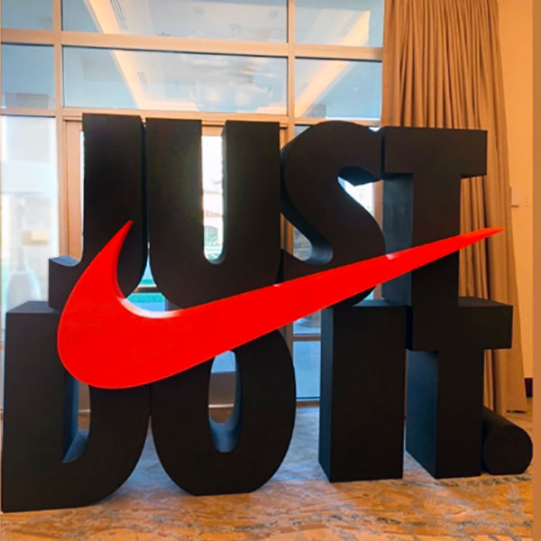
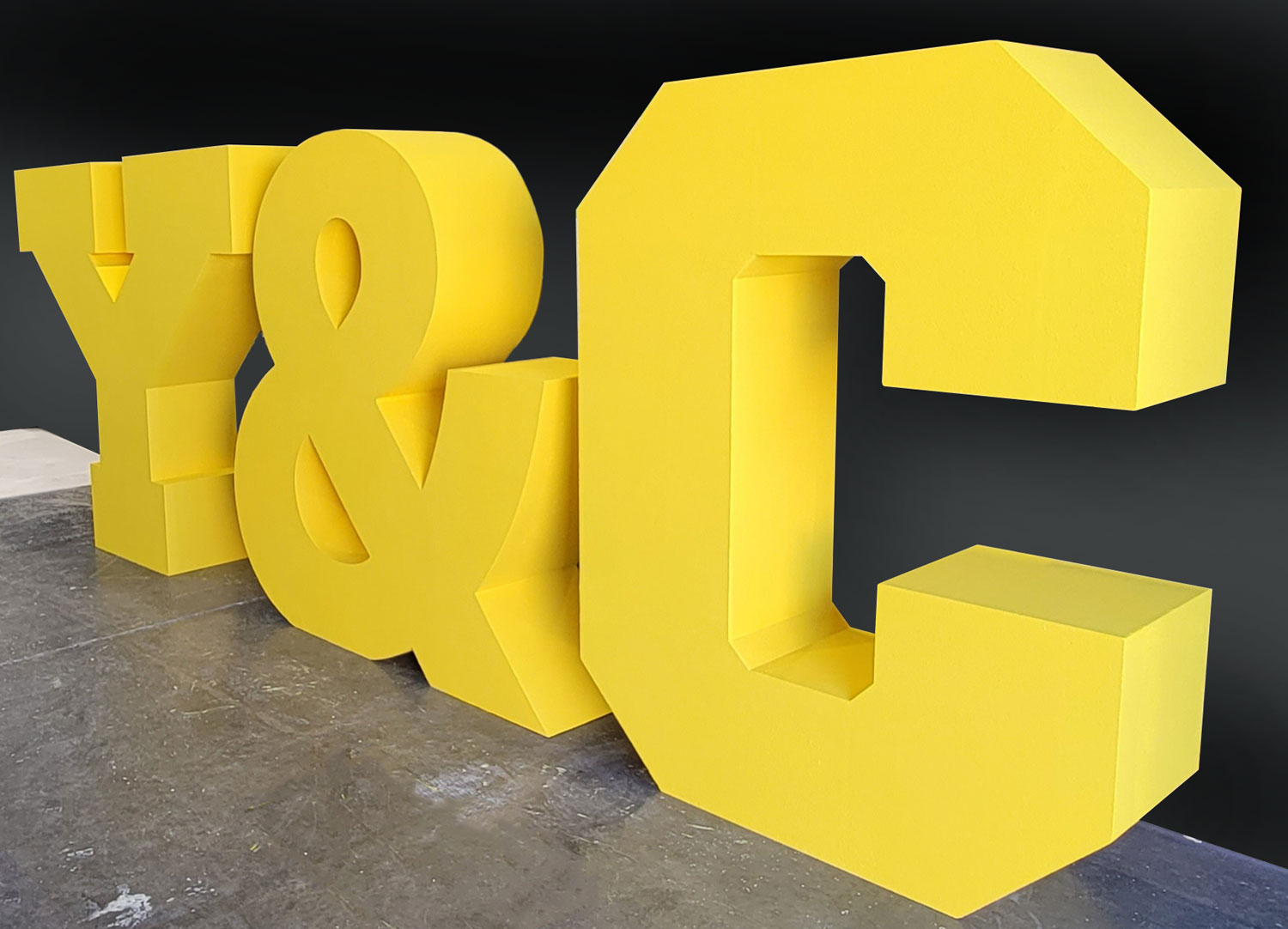
The retained WhiteClouds examples show three useful arrangements: stacked copy, individual initials, and a straight word backdrop. They demonstrate composition and scale while leaving the new phrase, typeface, color, depth, and support to be defined for its own setting.

Prepare a clear four-foot letter request
The first estimate benefits from finished artwork and real site dimensions.
- Exact wording and capitalization
- Vector logo or approved font
- Four-foot height confirmation
- Maximum total width
- Preferred character depth
- Individual, connected, stacked, or mounted layout
- Setup and access constraints
- Ship-to location and completion date
Request pricing for 4-foot foam letters
Send the exact phrase, artwork, target width, letter depth, arrangement, front and side colors, standing or mounting preference, access information, destination, and deadline. Note how often the letters will be moved so the quote can account for the intended handling pattern.