
Where Every Letter Tells a Story of Learning and Belonging
Walk into any great library or cultural center, and the experience begins before you even open a book. The architecture, colors, and signage all whisper one message—this is a place where ideas live. Foam letters have become an unexpected yet powerful part of that storytelling, transforming walls, entrances, and reading areas into visual celebrations of knowledge. Foam letters may sound simple, but in the hands of designers and curators, they become striking sculptural tools. They can spell out quotes that inspire, define the identity of a space, or mark themed exhibits with grace and creativity. They embody the very spirit of literacy—making words not just read, but felt. From historical archives to modern children’s libraries, foam lettering adds warmth, clarity, and artistry. Its versatility, affordability, and endless design potential make it a favorite medium for curators and architects seeking to blend form with function. It’s a quiet revolution in public space design—where foam becomes both canvas and message.
Why Libraries and Cultural Centers Love Foam Letters
Libraries and cultural centers have always balanced two missions: preservation and inspiration. They safeguard history, art, and ideas, but they also invite communities to explore and connect. Foam letters fit this dual purpose beautifully—they’re practical enough for wayfinding, yet expressive enough for storytelling. Unlike metal or wood, foam can be shaped into virtually any form, making it ideal for everything from clean modern typography to ornate, decorative scripts. It’s lightweight, easy to mount, and can be finished to mimic everything from marble to brushed aluminum. That means institutions can achieve a high-end look without the high-end cost—or the installation challenges heavy materials often bring.
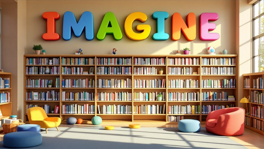
Moreover, foam signage feels human. It’s approachable, tactile, and full of character—qualities that align perfectly with the inclusive mission of libraries and cultural spaces. When a child walks into a reading area and sees giant foam letters spelling “IMAGINE,” or a visitor spots a glowing quote above an art exhibit, those words invite participation rather than intimidation. Foam lettering allows these spaces to speak visually in the same tone they speak intellectually: welcoming, creative, and endlessly curious.
From Quiet Corners to Grand Halls
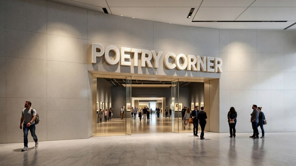
One of the most remarkable things about foam letters is their adaptability across scales and settings. In small community libraries, they can serve as cheerful decorations for reading nooks, spelling words like STORYTIME or IMAGINE in bright, friendly fonts. In grand cultural institutions, large-format foam letters can define an entire space—hovering above exhibit entrances or forming dimensional wall quotes that seem carved from stone. Many libraries use foam letters as temporary or semi-permanent installations for rotating themes—“POETRY MONTH,” or “LOCAL VOICES.” Because foam is easy to repaint or reconfigure, staff can update messaging throughout the year without expensive renovations.
In cultural centers, foam letters often become sculptural art themselves. A gallery might feature words like UNITY or HERITAGE suspended midair, painted in museum-grade finishes and illuminated with subtle lighting. The letters become interactive design features, inviting visitors to walk among them, photograph them, and reflect on their meaning. Whether they’re towering in an atrium or nestled on a bookshelf, foam letters command attention without overwhelming their surroundings. They embody the balance that defines the best public spaces: bold yet thoughtful, expressive yet respectful.
The Beauty of Material: Why Foam Works So Well
Foam’s magic lies in its combination of lightness, versatility, and finish quality. Expanded polystyrene (EPS) and extruded polystyrene (XPS) are the most common types used for signage, and both can be cut with precision to achieve clean lines and smooth surfaces.
In libraries, this lightness is a practical advantage. Letters can be easily mounted to walls without heavy anchors, suspended from ceilings with minimal rigging, or even placed on shelves or floors as freestanding pieces. Maintenance staff can rearrange or refresh displays without special equipment, keeping the space dynamic and alive.
But foam’s true secret is its transformability. Through coatings, paints, and finishing techniques, it can mimic everything from polished granite to soft velvet. A cultural center can have foam letters that look like sculpted bronze yet weigh less than a paperback. This flexibility allows each institution to express its unique character—whether that means sleek contemporary design or timeless heritage aesthetics.
Design Possibilities: Words That Define Spaces
Foam letters open a design vocabulary as rich as the collections they accompany. In children’s areas, they might burst with primary colors, playful fonts, and textures that encourage touch. In archival exhibits, they might appear refined, neutral, and dignified—echoing the gravitas of the materials displayed.
Modern libraries often combine foam letters with technology, backlighting them with LEDs or integrating them into interactive displays. Imagine a wall that spells out “READ” in glowing letters that shift colors as visitors pass, or foam words layered over transparent panels with historical photos behind them. These integrations blur the line between décor and experience, making the written word a visual event.
Typography itself becomes an art form. A serif font might evoke classical scholarship, while a sans-serif design feels modern and minimal. Oversized capitals convey confidence; gentle lowercase lettering feels friendly and inclusive. Foam brings these choices to life in physical form—each curve and contour reinforcing the message.
Educational and Cultural Impact
Beyond aesthetics, foam letters carry educational and cultural significance. They serve as visual anchors that support wayfinding, literacy, and engagement. For young readers, large foam letters can spark curiosity about language—helping them associate words with joy and discovery. For adults, thematic lettering creates connections between visual art, literature, and history. Cultural centers frequently use foam letters to promote inclusivity and community identity. Words like TOGETHER, HERITAGE, or BELONGING become powerful design elements that also communicate institutional values. Because they’re customizable, foam letters can incorporate multiple languages, bridging cultural divides and making spaces accessible to diverse audiences. Public art installations made of foam lettering have even been used to commemorate local authors, celebrate languages, or display poetry in open spaces. When people encounter their culture reflected not just in words, but in sculptural form, the experience becomes deeply emotional. Foam letters help transform language into landscape.
The Sustainable Choice
Libraries and cultural centers are increasingly conscious of environmental impact, and foam letters align well with this commitment when responsibly produced. Many fabricators now use recyclable foam or offer take-back programs to ensure minimal waste. Water-based coatings and low-VOC paints make installations safe for indoor public spaces, including children’s areas.
Because foam letters are lightweight, transportation and installation produce a smaller carbon footprint compared to metal or wood alternatives. And since they can be repainted and reused for years, they fit neatly into the sustainability ethos of reuse and resourcefulness that public institutions value. For temporary exhibits or seasonal programs, foam is the perfect eco-conscious choice—durable enough for months of display but easy to reconfigure or repurpose afterward. What once spelled WINTER READS can later become SUMMER STORIES with a fresh coat of paint and a bit of imagination.
The Fabrication Process: Turning Ideas into Dimensional Art
Behind every elegant foam letter installation lies a process that combines technology, artistry, and care.
Step 1: Concept and Design
The journey begins with collaboration between designers, curators, and fabricators. The creative team identifies the purpose—directional signage, thematic quote, exhibit title, or permanent installation—and selects the appropriate scale and style. Digital mockups are crafted in vector-based design software, allowing precise visualization of font choice, color, and spatial layout. For cultural centers, designers may incorporate symbolic motifs, textures, or patterns that echo the heritage being represented.
Step 2: Foam Selection and Preparation
Depending on the project, EPS or XPS foam is chosen. EPS (expanded polystyrene) offers great versatility and is ideal for larger letters, while XPS (extruded polystyrene) provides smoother surfaces for fine details or small-scale typography. Foam thickness is matched to the desired depth—thicker blocks create bold 3D letters, while thinner cuts suit wall-mounted words.
Step 3: Cutting and Shaping
CNC routers or hot-wire cutters carve the letters with impeccable accuracy, following digital paths to reproduce fonts and designs perfectly. Skilled technicians refine edges by hand, especially for cursive or decorative styles. This precision ensures clean lines and professional presentation once installed.
Step 4: Hard Coating and Reinforcement
For library and museum environments, durability is key. Foam letters are coated with a protective layer—often polyurea, polyurethane, or acrylic resin—that creates a smooth, impact-resistant shell. For outdoor installations or high-traffic areas, a fiberglass mesh may be added beneath the coating to reinforce structural strength. These coatings not only protect the foam but also prepare the surface for premium finishes. They turn soft material into a robust, lasting design element capable of withstanding years of admiration.
Step 5: Sanding, Priming, and Painting
After coating, the letters are sanded meticulously to achieve a flawless texture. Primer ensures uniform paint adhesion, followed by high-quality finishes chosen to match the space’s aesthetic. Libraries may favor satin or matte finishes that absorb light softly, while cultural centers often prefer metallic or textured effects for visual drama. Advanced paint techniques allow foam to mimic stone, metal, or wood grain. Artists can even airbrush gradients or shadowing effects for dimensional realism. The goal is simple: to make words look as enduring as the stories they represent.
Step 6: Mounting and Installation
Once finished, foam letters are mounted using methods tailored to their environment. Wall-mounted letters use concealed adhesives or standoff brackets for a clean, floating look. Freestanding or floor displays employ hidden bases or steel supports for balance. Installation teams work carefully within the architecture—aligning sightlines, ensuring safe heights, and integrating lighting if needed. When complete, the effect is seamless: words that appear to have always belonged there, part of the building’s identity.
Lighting and Atmosphere
Lighting is the invisible partner that brings foam letters to life. Thoughtful illumination can turn a simple display into an emotional experience. Soft overhead lighting creates calm reading atmospheres, perfect for inspirational quotes or subtle directional signage. Spotlights add focus to exhibit titles or artistic installations, drawing the eye to each curve and shadow. Backlighting, achieved by installing LED strips behind raised letters, produces a sophisticated halo effect—ideal for modern libraries or museums. Colored lighting can also enhance cultural storytelling. Warm amber tones evoke history; cool blues and purples feel futuristic or introspective. Foam’s surface readily reflects and diffuses light, making it a dream material for designers seeking atmosphere and emotion.
Beyond Words: Sculptural and Interactive Possibilities
In forward-thinking libraries and cultural centers, foam letters are evolving from static signage into interactive installations. Some designers create giant letters children can climb on or sit beside for storytime photos. Others build modular foam alphabets that visitors can rearrange, turning words into a game of creativity.
Interactive poetry walls—where individual foam letters or words attach magnetically to panels—allow patrons to compose spontaneous verses. In art galleries, curators have used foam lettering as part of mixed-media exhibits, layering text with imagery or projection mapping. Because foam is lightweight and easy to adapt, it encourages experimentation. Designers can change configurations, add colors, or reposition pieces to suit new exhibits. Every update becomes a fresh opportunity to engage visitors in conversation and discovery.
The Cultural Dimension: Words as Heritage
Cultural centers, in particular, find deep resonance in foam lettering because it allows them to literally shape their stories. A wall of words in multiple languages celebrates community diversity. Historical quotes carved in dimensional letters connect the past to the present. Even single words—like PEACE, MUSIC, or ROOTS—become poetic symbols of the institution’s mission. Foam letters also democratize public art. They are accessible to all ages and abilities, inviting touch, curiosity, and interpretation. In spaces that celebrate identity and heritage, that physicality matters. Visitors aren’t just reading culture—they’re experiencing it through design.
Durability and Maintenance
Public institutions require materials that endure heavy traffic and minimal upkeep, and foam letters meet both needs beautifully. When properly coated, they resist moisture, scuffing, and fading. A quick wipe with a soft cloth is often all that’s needed to keep them looking new. For installations near windows or strong lighting, UV-protective finishes prevent color degradation. If a letter does sustain damage, it can be repaired or replaced at low cost—another reason libraries and cultural centers find foam a practical long-term investment. Because the material is modular, sections can be swapped out or repainted to match seasonal displays. That flexibility allows institutions to maintain a fresh, engaging look without constant reinvestment.
Inspiring Visitors of All Ages
Perhaps the greatest gift foam letters bring to libraries and cultural centers is the spark of wonder. For children, they make reading spaces feel alive—letters aren’t just printed on a page but standing tall, waiting to be explored. For adults, they transform architecture into an expressive language, reminding visitors that words have power not only on paper but in space.
Imagine a child walking into a library for the first time and seeing their favorite word—“ADVENTURE”—towering in bright foam above the entrance. Or a museum visitor standing before a wall where “STORIES CONNECT US” glows softly under light. Those encounters create emotional memory, linking place, meaning, and imagination in unforgettable ways. Foam letters make spaces talk—not loudly, but with purpose and poetry.
The Future of Literacy Design
As public spaces continue to evolve, the marriage of design and communication becomes ever more important. Libraries are no longer just book repositories—they’re community hubs, makerspaces, classrooms, and art galleries rolled into one. Foam letters perfectly suit this evolution, offering adaptable beauty for spaces that are constantly reimagined. Emerging fabrication technologies, like 3D scanning and CNC carving, are expanding what foam can do. Designers now combine foam letters with augmented reality, projection mapping, and dynamic lighting, blurring the line between text and technology. In the future, we may see foam letters that change color in response to visitor movement or light, creating living environments of learning. As cultural design trends lean toward inclusivity and experience, foam letters are poised to remain at the forefront—simple yet transformative tools for shaping public imagination.
Where Words Become Architecture
Foam letters for libraries and cultural centers represent a rare union of practicality and poetry. They are affordable yet elegant, temporary yet timeless, light yet substantial. In every application—whether as signage, sculpture, or art—they elevate the act of reading into a spatial experience. They remind us that words are not only for pages but for places. They can define a building, guide a journey, and inspire reflection. When crafted with intention, foam letters turn architecture into language, and language into art.
In libraries and cultural centers—spaces devoted to ideas, expression, and community—what could be more fitting? Foam letters make the invisible visible. They let words live in three dimensions, inviting every visitor to pause, look, and feel the quiet thrill of knowledge come alive.
Check out WhiteClouds’ Large Letters for more information.
Contact us today to learn more about our 3D services and how we can help you achieve your goals.