What Is a Cartographic Map? The Art and Science of Mapping the World
Maps have always done more than tell us where we are. They reveal how humans understand space, power, nature, and one another. A cartographic map is the most refined expression of that idea. It blends science, art, data, and storytelling into a single visual language that helps people navigate oceans, cities, mountains, and even abstract ideas like population density or political influence. To understand what a cartographic map truly is, you have to look beyond roads and borders and explore the craft behind how space is represented. At its core, a cartographic map is a carefully designed representation of geographic information created using the principles of cartography. It is not simply a picture of land. It is a selective, symbolic, and intentional interpretation of reality. Every line, color, scale choice, and label is the result of decisions made by a cartographer with a specific purpose in mind. That purpose might be navigation, education, exploration, planning, or storytelling.
Defining Cartography and Cartographic Maps
Cartography is the discipline devoted to the study and creation of maps. A cartographic map, therefore, is a map produced using cartographic principles that balance accuracy, clarity, aesthetics, and usability. Unlike casual sketches or automatically generated diagrams, cartographic maps are designed to communicate information efficiently and meaningfully to a specific audience.
What sets a cartographic map apart is intention.
- A road map prioritizes routes and distances.
- A topographic map emphasizes elevation and terrain.
- A thematic map highlights a single data theme such as climate, population, or land use.
All of these can be cartographic maps if they are thoughtfully designed to communicate their message clearly. Cartographic maps use symbols to stand in for real-world features. Rivers become flowing blue lines. Cities become dots or shapes sized by importance. Elevation becomes contours or shaded relief. These abstractions allow vast, complex landscapes to fit onto a flat surface without losing meaning.
A Brief History of Cartographic Mapping
Cartographic maps are as old as civilization itself. Early humans carved maps into stone, painted them on cave walls, and etched them into clay tablets. These early maps were not concerned with perfect scale or mathematical precision. They were tools for survival, marking hunting grounds, rivers, and migration paths.
As civilizations grew, so did the sophistication of cartography. Ancient Egyptians mapped the Nile to manage agriculture and taxation. Greek scholars introduced mathematical concepts like latitude and longitude, transforming maps into scientific instruments. Roman cartographers built road maps that connected their vast empire, prioritizing infrastructure over geographic accuracy.
During the Age of Exploration, cartographic maps became instruments of power. European explorers relied on increasingly accurate nautical charts to cross oceans, claim territory, and establish trade routes. Mapmaking became a blend of art and politics, with borders drawn to reflect ambition as much as reality.
The modern era brought satellites, aerial photography, and digital mapping tools. Today’s cartographic maps can be generated with incredible precision, yet the role of the cartographer remains vital. Technology may collect the data, but humans still decide how that data is presented and understood.
The Core Elements of a Cartographic Map
Every cartographic map relies on a foundation of essential elements that work together to communicate information. Scale determines how much of the world fits into the map and how detailed that representation can be. Projection controls how the curved surface of the Earth is flattened, influencing shape, size, and distance.
Symbols translate real-world features into visual language. Color helps distinguish categories, highlight importance, and guide the viewer’s eye. Typography ensures that place names are legible without overwhelming the map. Even empty space is intentional, allowing the map to breathe and remain readable.
What makes cartographic design fascinating is the balance between accuracy and clarity. Including every detail would overwhelm the viewer, while removing too much would make the map useless. Cartographic maps succeed when they include just enough information to tell their story clearly.
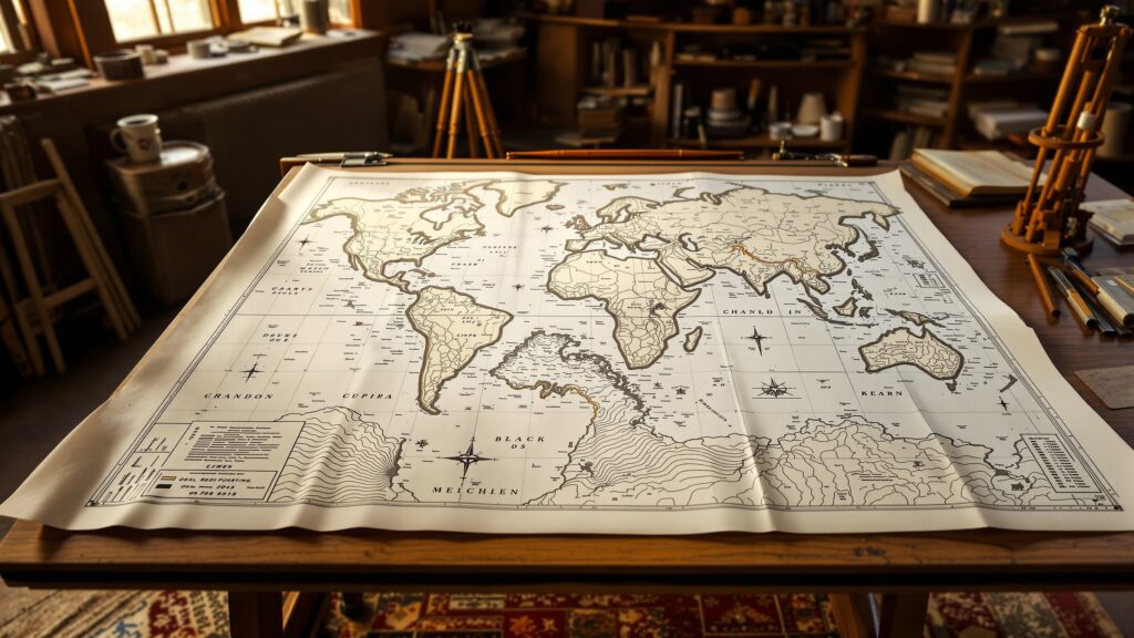
Map Projections and Why They Matter
One of the most misunderstood aspects of cartographic maps is projection. Because Earth is a sphere and maps are flat, every projection introduces distortion. Some projections preserve shape, others preserve area, and some preserve distance or direction.
The famous Mercator projection, for example, preserves direction and is excellent for navigation, but it dramatically distorts the size of landmasses near the poles. Greenland appears comparable to Africa, even though Africa is vastly larger. Other projections, like equal-area projections, sacrifice shape accuracy to represent land size more truthfully.
Choosing a projection is not just a technical decision. It is a cartographic statement about what matters most in the map’s purpose. A cartographic map designed for aviation, climate science, or education will each use different projections to best serve their audience.
Types of Cartographic Maps
Cartographic maps come in many forms, each designed for a specific use. Topographic maps show elevation, contours, and terrain, making them essential for hikers, engineers, and land planners. Political maps emphasize boundaries, cities, and administrative regions, helping users understand governance and jurisdiction.
Thematic cartographic maps focus on a single subject layered over geography. These maps might show rainfall patterns, population growth, economic activity, or transportation networks. By isolating one theme, they reveal patterns that would otherwise remain hidden.
Nautical charts and aeronautical maps are specialized cartographic tools designed for navigation at sea and in the air. They prioritize depth, hazards, currents, and airspace, reflecting the unique needs of their users.
Even artistic maps can be cartographic if they adhere to mapping principles while expressing creative vision. These maps often appear in books, museums, and digital storytelling projects, blending beauty with geographic truth.

The Role of Design in Cartographic Mapping
Cartographic maps are as much about design as they are about data. A well-designed map guides the viewer effortlessly, making complex information feel intuitive. Poor design can render accurate data confusing or misleading. Color choice plays a powerful role in cartographic design. Subtle gradients can represent elevation or temperature, while bold contrasts draw attention to key features. Typography must balance readability with hierarchy, ensuring that major cities stand out without overpowering smaller labels. Visual hierarchy is essential. The most important information should naturally attract the viewer’s eye first, followed by secondary and tertiary details. This hierarchy transforms a map from a static image into a visual narrative.
Cartographic Maps in the Digital Age
Modern cartographic maps often live on screens rather than paper. Digital mapping platforms allow users to zoom, pan, and interact with layers of information. Despite this interactivity, cartographic principles remain just as important.
A digital map still requires thoughtful symbolization, projection choices, and data generalization. In fact, the abundance of data makes cartographic judgment even more critical. Without careful design, digital maps can overwhelm users with clutter and confusion.
Cartographic maps also power geographic information systems, urban planning tools, disaster response platforms, and navigation apps. Every time someone checks traffic, tracks weather, or explores a city virtually, they are engaging with cartographic design, even if they don’t realize it.
Why Cartographic Maps Still Matter
In an era of GPS and real-time navigation, it is easy to assume that traditional cartographic maps are obsolete. In reality, they are more important than ever. Cartographic maps help us understand relationships, patterns, and context that turn raw data into knowledge. They allow scientists to track climate change, governments to plan infrastructure, educators to teach geography, and storytellers to visualize history. They remind us that how information is presented shapes how it is understood. Cartographic maps also preserve cultural perspectives. Indigenous mapping traditions, historical atlases, and artistic cartography offer alternative ways of seeing the world that challenge purely technical interpretations.
Cartography as Storytelling
At their best, cartographic maps tell stories. They show how cities grow, how rivers shape civilizations, how borders change over time, and how humans interact with the planet. A single cartographic map can communicate centuries of history or predict future trends.
Story maps, a modern evolution of cartography, combine maps with narrative text, images, and data. These immersive experiences demonstrate that cartography is not just about location, but about meaning.
Every cartographic map answers a question. Where are we? What matters here? How do things connect? The answers depend on the choices made by the cartographer and the needs of the viewer.
The Enduring Power of Cartographic Maps
A cartographic map is far more than a navigational aid. It is a bridge between the physical world and human understanding. Through symbols, scale, and design, it transforms complexity into clarity. Whether printed in an atlas, displayed in a museum, or embedded in a digital platform, cartographic maps continue to shape how we see the world. They invite exploration, inspire curiosity, and remind us that every place has a story waiting to be mapped. Understanding what a cartographic map is means appreciating both its technical precision and its creative soul. It is where science meets art, data meets design, and geography becomes a language we can all read.