
Custom Large Wooden Letters
Large wooden letters begin with typography, but they become physical objects with edge depth, counters, joins, floor contact, and mounting points. A word that works on screen may need adjusted spacing or stronger strokes when enlarged, cut, transported, and installed as individual letters or as part of a panel.
Discuss Large Wooden Letters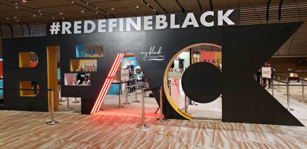
Prepare the word or initials for physical scale
Provide the exact text and approved typeface or vector outlines. Review thin strokes, small counters, sharp serifs, and closely spaced pairs at the proposed size. A digital wordmark may need fabrication-minded adjustments, but changes to protected brand artwork require the appropriate approval.
Decide whether the letters should be individual objects, connected as one word, cut through a panel, layered over a backing, or integrated into a larger display. That choice affects spacing, alignment, transport, installation, and how the edges are seen.
Compare panel-cut and freestanding arrangements
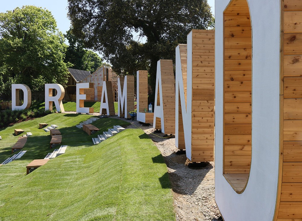
The completed panel project uses negative letter shapes within a larger wood surface. The freestanding source-page example treats the letters as separate dimensional forms. These configurations create different edge, support, and installation requirements.
Choose how the letters meet the display
The same typography can be built into several physical relationships. Select the arrangement before final spacing is approved.
Freestanding
Plan floor contact, letter-to-letter spacing, alignment, and any discreet base or rear support.
Panel cutout
Coordinate positive or negative letter shapes with panel size, border width, and the background visible through openings.
Wall mounted
Define projection, mounting surface, stand-off distance, template needs, and installation responsibility.
Layered display
Use a backing, shadow layer, or second material direction when the added depth serves the approved design.
Specify what viewers will see from the side
Set the face color or wood appearance, edge treatment, depth, and which sides require a complete finish. The project may call for visible wood character, a painted surface, applied graphics, or a coordinated panel. Treat these as design goals until the material and finishing approach is selected for the actual use.
Mark the normal viewing angle and distance. Deep letters make their edges more prominent, while shallow letters depend more heavily on front-face contrast and mounting shadow. If guests may touch or move the letters, identify that expectation before support and packing are planned.
When individual letters travel separately, plan numbering, protective spacing, and an installation template that restores the approved word spacing onsite. Long words may also need more than one case or backing section. Those divisions should be coordinated with the letter sequence and the available setup crew rather than decided only from shipping dimensions and case limits.
Details that shape a large-letter quote
Exact typography and installation conditions are more useful than a general request for oversized text.
- Exact text and approved vector artwork
- Overall width or individual letter height
- Individual, connected, or panel-cut layout
- Letter depth and edge direction
- Face color or wood appearance
- Freestanding or mounted placement
- Access and installation responsibility
- Packing, destination, and deadline
Request pricing for custom large wooden letters
Send the exact text, vector letterforms, desired dimensions, depth and edge direction, layout, face treatment, mounting or floor plan, access measurements, installation responsibility, shipping destination, and required date.