
Custom Cursive Big Letters
Cursive big letters turn a connected wordmark or handwritten phrase into a dimensional display. The central challenge is preserving the rhythm of the script while giving thin strokes, joins, counters, and long swashes enough physical presence to read from the intended distance.
Plan Cursive Lettering
Keep a script word readable after it becomes dimensional
A script outline needs to work as a complete physical silhouette, not only as a flat logo.
Connection path
Identify every stroke that must touch so the word remains visually and physically continuous.
Counter openings
Protect the interior spaces in letters such as e, a, o, and loops so they do not close at the target viewing distance.
Baseline behavior
Decide whether the word rests on one support line, rises through a flourish, or mounts independently to a background.
Swash envelope
Measure long entry and exit strokes as part of the total display width and clearance, not as decorative afterthoughts.
Translate flat script artwork without losing its cadence
Start with clean vector artwork whenever possible. A raster image or photograph can show the desired look, but it may leave stroke boundaries and overlaps open to interpretation. Mark intentional gaps, joins, terminals, and areas where one stroke crosses another.
The approved front outline is only one view. Depth adds side surfaces at every curve, and those edges become more visible as viewers move off axis. Confirm the primary face, the important angled view, and whether the script should appear equally finished from the back.
Compare a standalone word with script inside a larger display
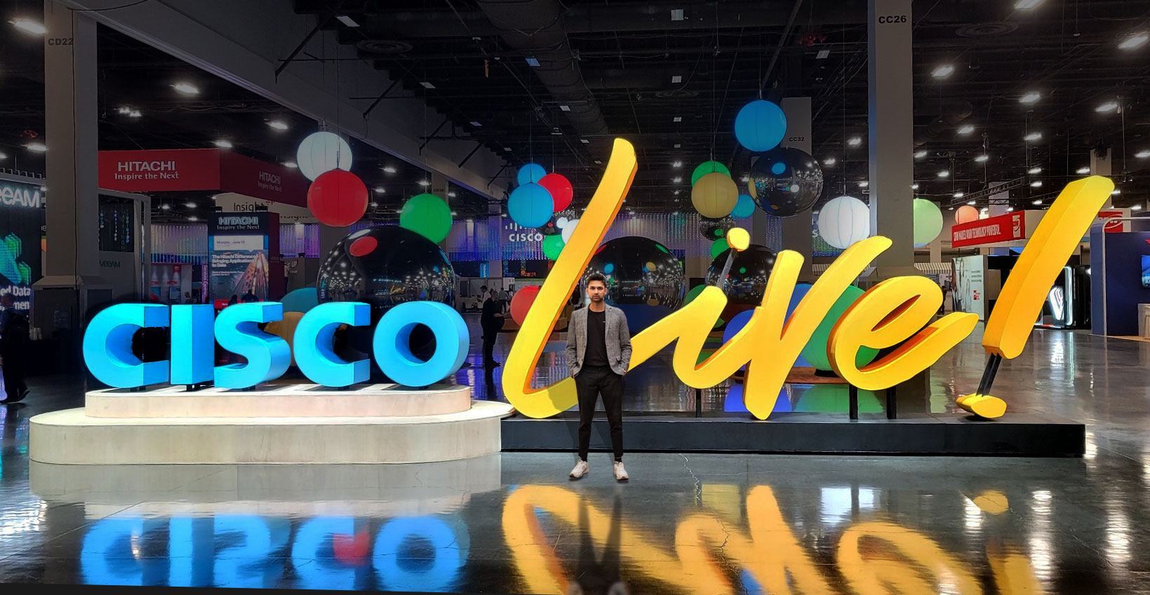
The Thrive project uses one connected word as the main dimensional form. The Cisco Live display places a flowing script word inside a broader event composition. Together they show why stroke weight, hierarchy, and available width should be resolved for the exact phrase rather than borrowed from generic alphabet samples.
Reference files that prevent cursive ambiguity
A complete script package answers the places where handwriting and fabrication can diverge.
- Exact spelling, capitalization, and punctuation
- Vector outlines or a high-resolution approved wordmark
- Required joins and intentional breaks
- Minimum open spaces inside loops and counters
- Entry stroke, exit stroke, underline, and flourish limits
- Face, side, and back color direction
- Target height, maximum total width, and depth
- Primary viewing side and longest viewing distance
Plan the base or mounting around the connected word
A script word may touch a base at only a few low points, so the support approach should be considered alongside the artwork. Share whether the display is freestanding, wall mounted, suspended, placed on a stage, or integrated with another scenic element. Do not crop the lowest strokes from the site plan.
For temporary use, include doorway, elevator, loading, storage, and setup limits. For a fixed location, provide wall or floor information and identify who controls installation. These inputs allow the letterform and presentation to be discussed without assuming one standard construction method.
Request pricing for custom cursive big letters
Send the exact word, vector script artwork, intended size, viewing distance, primary and secondary views, base or mounting preference, lighting direction if any, placement conditions, access limits, destination, and required date.