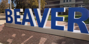
A Bold Statement at the New Power and Mechanical Center
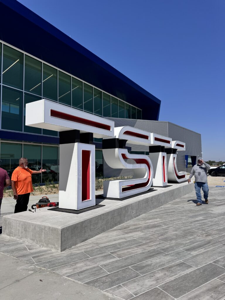
When Texas State Technical College (TSTC) set out to open its new Power and Mechanical Center, the goal was more than just constructing another campus facility. It was about showcasing innovation, precision, and an enduring commitment to technical education. Part of that vision came to life through monumental 8-foot illuminated metal letters designed and fabricated by WhiteClouds. These weren’t just letters. They were a landmark installation, a beacon of creativity and strength that embodied TSTC’s energy, grit, and forward-looking mission. The sheer size and style of the project meant it would be one of the most noticeable features of the new center. Rising eight feet into the air, with a depth of two feet and lighting that radiates even after sunset, these letters were designed to both inspire and endure. From day one, it was clear this wasn’t a simple signage job. It was about creating a lasting identity marker that would merge engineering, artistry, and branding into a single build.
Designing Letters That Speak for a Campus
The first challenge was turning TSTC’s custom font into something larger than life. Fonts are made to look good on screens and paper, but scaling them up to eight feet tall introduces a host of structural and visual questions. How do you preserve the sharpness of the typeface at such a scale? How do you make sure the letters remain legible and impactful from every angle? The design team at WhiteClouds tackled these questions by carefully analyzing the proportions of each stroke and curve in TSTC’s font.
The design also had to capture the essence of the TSTC logo, which features floating internal elements. To achieve this, the letters incorporated black accent areas that gave the illusion of suspended inner shapes. This created a striking depth effect, one that blends perfectly with TSTC’s branding while also offering visual intrigue.
Adding to the personality of the letters, the interior was painted a vibrant red, while the exteriors, fronts, and backs received a pristine white finish. This red-and-white interplay was not only bold but also directly tied into TSTC’s institutional colors, creating instant recognition and pride.
The Strength Beneath the Surface
When you’re building letters this large, aesthetics are just one piece of the puzzle. Strength and durability become just as important. Each letter was constructed from durable aluminum sheets, a material known for its resistance to corrosion and its balance of strength with manageable weight. However, simply cutting and welding sheets of aluminum together wouldn’t have been enough to withstand years of Texas weather.
Internal supports were built into the framework, ensuring the letters wouldn’t bow, warp, or weaken over time. Every joint had to be carefully welded to hold under both stress and environmental exposure. On top of that, the entire structure was coated in polyurea—a specialized finish known for its ability to resist impact, UV radiation, and moisture. Polyurea added an additional layer of resilience, protecting the letters from everything from scorching summer sun to heavy rainstorms. Beneath the clean exterior, the hidden framework was every bit as impressive as the glowing face the public sees. This inner skeleton transformed the letters into architectural objects, engineered to stand strong while giving the appearance of effortless lightness.
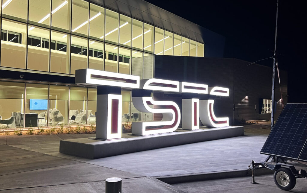
Bringing Light to Life
Illumination was a defining feature of this project. A set of massive letters is already imposing during the day, but at night, they needed to transform into radiant symbols of the campus. Integrated LED lighting was chosen for its efficiency, longevity, and brightness. Unlike older lighting methods, LEDs provided a crisp and even glow across the front faces of the letters without hotspots or fading edges.
The red interiors paired with the white illuminated faces created an eye-catching glow that made the letters appear almost alive after dark. From a branding perspective, this wasn’t just lighting. It was storytelling—showing the college as a beacon for students pursuing careers in power, mechanics, and technology. It conveyed energy, progress, and a sense of belonging. Careful planning also went into the placement of the LEDs to ensure accessibility for maintenance while minimizing energy usage. Every component had to work seamlessly, as these lights would become part of the Power and Mechanical Center’s identity for years to come.
From Fabrication to Finish
Fabricating these letters was an exercise in precision and scale. Each piece of aluminum was cut to exacting specifications before being welded into form. Once the structural framework was secure, finishing touches like sanding, smoothing, and priming gave the letters their polished appearance. The painting process required particular care to maintain color consistency between the red interiors and white exteriors. Even the black accent areas, which might seem like a small detail, demanded a meticulous hand to ensure the illusion of floating internal shapes was perfectly executed.
The LED lighting system was installed last, carefully integrated into the structure to provide maximum visibility without distracting hardware. Once assembled, the letters were welded to sturdy metal base plates, making installation smoother and safer. These plates allowed the letters to be secured to their foundations without visible anchors, ensuring the visual effect remained clean and unobstructed. The build process was a balancing act between artistry and engineering, where every step carried equal weight. Too much focus on the visuals without the structural integrity could have jeopardized durability. Too much focus on function without the aesthetics would have lost the magic of the installation. The result struck a perfect middle ground.
The Installation: A Defining Moment
When it came time to install the letters at TSTC’s Power and Mechanical Center, the project shifted from the workshop to the field. This stage required not just craftsmanship but also logistics and coordination. At eight feet tall and two feet deep, each letter had to be transported with care, lifted into place with heavy equipment, and anchored securely to its prepared foundation. The moment the first letter was set into place was more than just a construction milestone—it was a moment of transformation for the campus. Suddenly, the new building had a voice. It didn’t just say “TSTC” in plain lettering. It declared it in monumental form, glowing with pride and permanence. The installation brought the design vision into reality and gave the college a landmark that would serve as a backdrop for countless photos, events, and memories. Students and faculty alike were quick to respond to the installation with enthusiasm. The letters didn’t just stand outside the building. They became part of its identity, a centerpiece that conveyed the spirit of technical education and progress.
Why Projects Like This Matter
On the surface, giant illuminated letters may seem like just another design project, but their impact goes far deeper. For TSTC, these letters represent resilience, ambition, and a commitment to excellence. They serve as a daily reminder to students that they are part of something larger than themselves, something built to last. From a branding standpoint, such large-scale signage becomes a landmark—not just for the campus, but for the community around it. Visitors, prospective students, and families all encounter the letters before even stepping inside the Power and Mechanical Center. That first impression matters, and it tells them this is a place of scale, professionalism, and pride.
For WhiteClouds, this project was also a chance to demonstrate how engineering and artistry can come together in monumental form. Building something that stands tall, glows brightly, and endures harsh conditions is no small feat. It requires trust between client and fabricator, as well as a shared vision of impact.
Illuminating the Future
The 8-foot illuminated metal letters at TSTC’s Power and Mechanical Center are more than just signage. They are a legacy installation, one that will inspire students and faculty for generations. They highlight what’s possible when technical skill, creative design, and durable engineering come together in one project. As students walk by these glowing letters on their way to classes, they’ll see more than aluminum, paint, and LEDs. They’ll see the embodiment of their college’s values—strength, brilliance, and innovation. At night, when the letters shine brightly against the Texas sky, they’ll act as a beacon, guiding students toward futures filled with potential. Behind the build is a story of collaboration, craftsmanship, and commitment. And in front of it stands a symbol of technical excellence that will continue to inspire.
Check out WhiteClouds’ Metal Letters for more information.
Contact us today to learn more about our 3D services and how we can help you achieve your goals.