Data Visualization 3D Models
We build custom 3D Data Visualization models for Tradeshows, Museums, Galleries, Corporations, Government Agencies and Educational Institutions.
Table of Contents
Data Visualization 3D Models + Technology
Everyone loves show and tell. That’s exactly what data visualization means. By showing a physical model of the data, rather than just telling others about it or reading it off your paper, you let the model do the explaining. When you can see what is trying to be conveyed, it’s much easier to comprehend than just reading about it or seeing an image on a flat 2D screen. 3D printed data visualization is improving communication all over the globe – visually.
Museums, art galleries, corporations, small companies, scientists, government agencies and educational institutions use data visualization through 3D printing to enhance presentations and communicate simple and complex data sets.
A majority of the population (approximately 65%) use visual learning, or a combination of visual learning & words as their preference.
Features & Benefits
- Presentations and displays are more effective.
- Helps to avoid information dumps of data and makes it easier to understand.
- Enhances insight into the data.
- Allows for quicker understanding of data.
- Enables hands-on experiences and collaboration.
- Models can be displayed in a variety of places to benefit more people, i.e. boardroom, museum, home, office and classroom.
- People can experience the data visualization model together versus individually just looking at the data on a computer screen, tablet or mobile device.
Data Visualization Applications
Business
Many types of business data can be condensed into a single 3D printed data model that contains a multitude of data rather than having that same information on numerous slides, leading to a more memorable experience for the attendees. Audiences are more receptive to what’s being presented when they can see it up close.
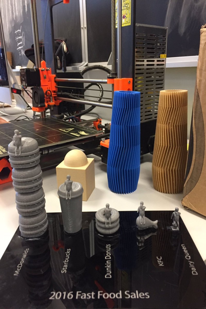
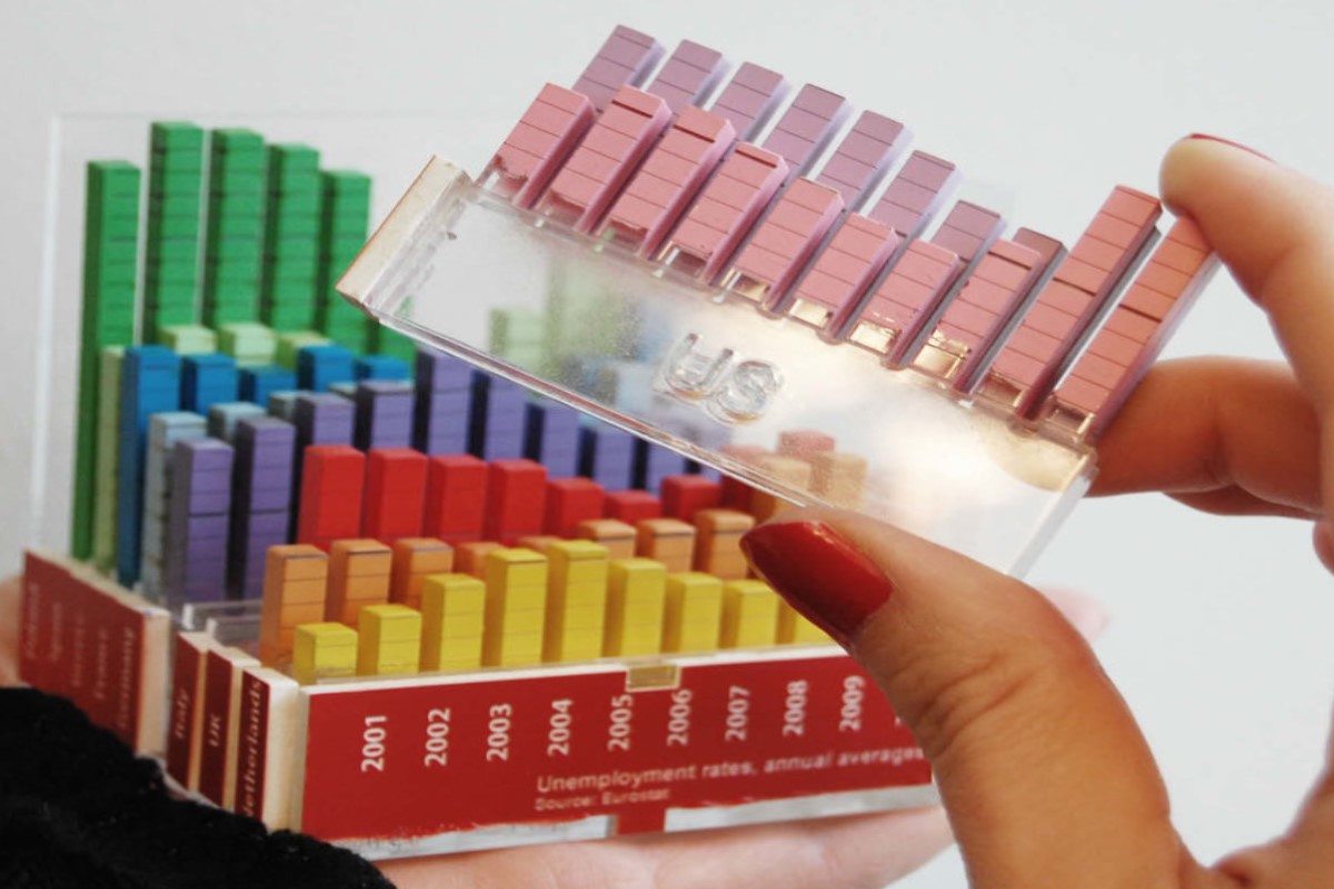
All areas of your business can benefit from models that include data like sales revenues/losses, growth, product sales and product comparisons. Here’s an engaging model for 2016 Fast Food Sales that measures the data in hamburgers, cups of coffee, donuts, and chicken legs.
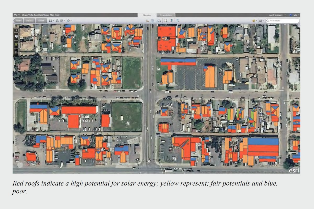
Another example is printing a 3D tangible data height map that can help make certain decisions easier for consumers. Some questions it may facilitate and answer: Is your area beneficial for pursuing solar? How much can you save? How long until it pays for itself? How much does it cost to install by state? What tax credits are involved by state?
All of these pieces of information can be included in a single 3D data model allowing you to quickly dissect the data visually as opposed to relying strictly on researching the words and numbers in a report. This also enables you get immediate feedback from your target audience.

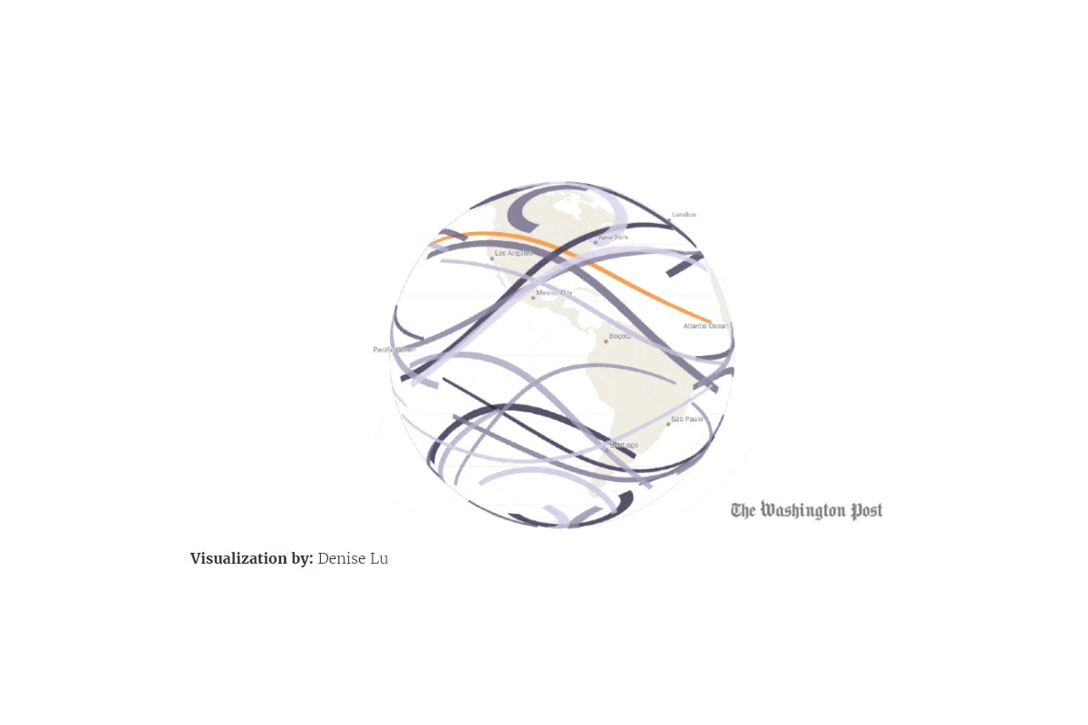
Museums and Expos
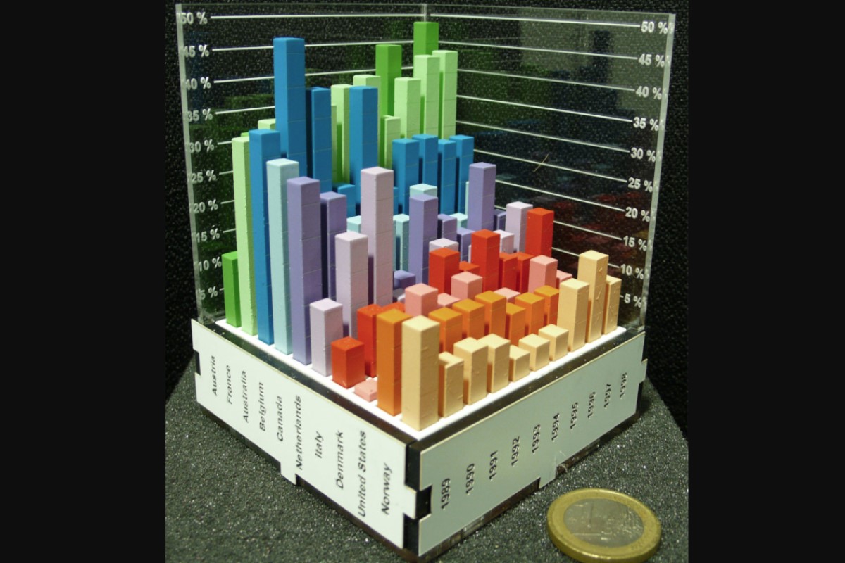
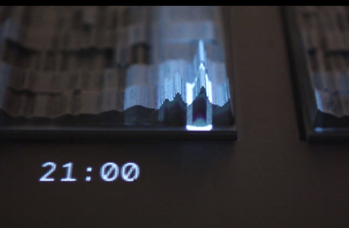
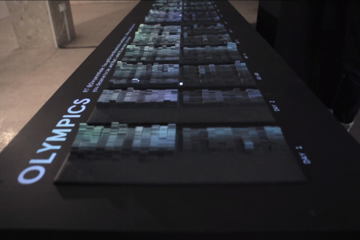
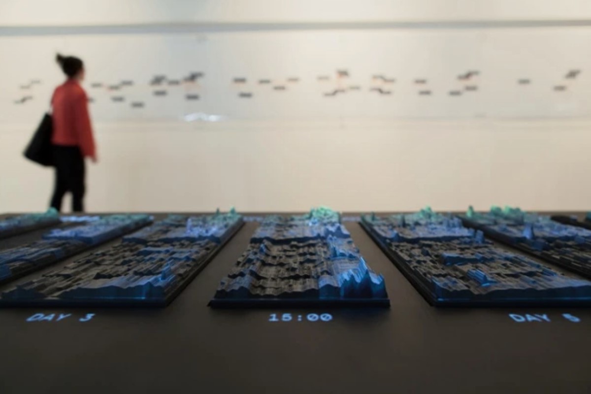
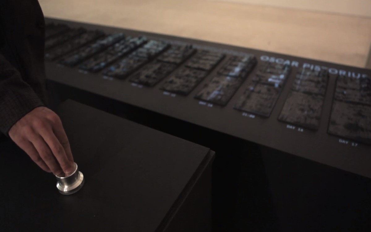
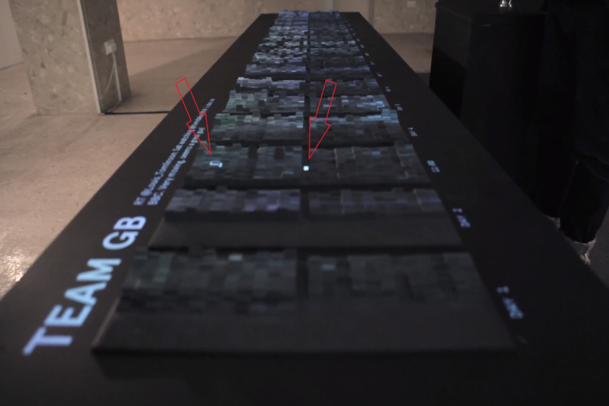
Museums and expos are using interactive sculptures like these data visualization models as fun and informative ways to display data. Timelines like this one are displayed when museums host exhibits on a particular theme. There are also tablets and computers with touchscreens available so visitors can interact and learn more about the subject.
The emoto project (pictured below) captured and analyzed tweets in real time during the London 2012 Olympics and then created an interactive model that enabled users to see the tweets of the most interesting themes and who tweeted them at what time of the day.
Education
Statistics like graduates in a school district over the last decade or since the turn of the century. High school dropouts by district, state and country, test results comparisons, enrollment increase/decrease in any given time period, etc. can all be presented as a physical model along with interactive technology to increase awareness to issues facing education today.
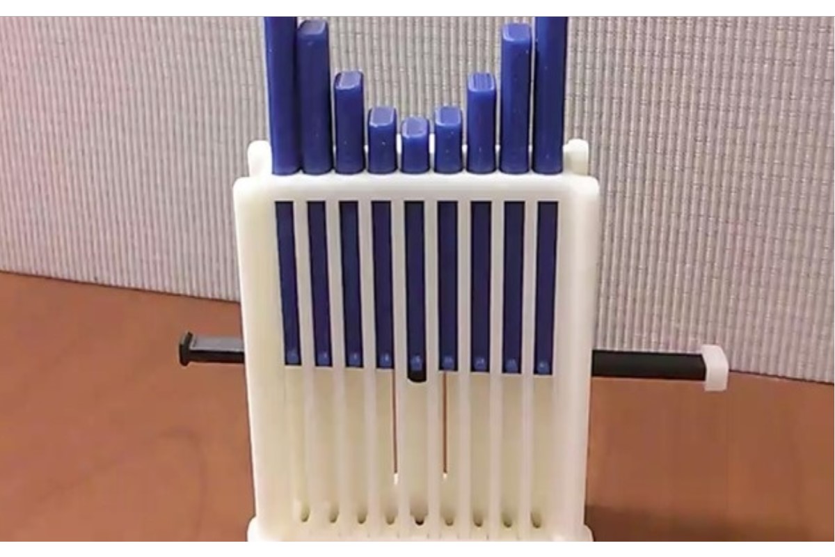
Manipulatives, which are toys and tools used to teach math, can be 3D printed to enhance the learning environment. Many kids learn best if they play with blocks and tools they can touch. Customized manipulatives are generally cheaper to 3D print, so more kids can make use of them in the classroom.
Classrooms are starting to implement 3D-printed models they can print themselves or externally printed 3D models in their lesson plans. The above image is a 3D-printed manipulative used to illustrate mathematic equations that can be operated by the student.
Manufacturing Process
Data models can also be applied by analyzing manufacturing and consumer data on how products are used, possible break points or areas of high stress, possible grip points and its impact on the structure itself through frequent usage. Parts and Prototype manufacturing such as structural integrity and damage prevention/reduction.
Taking data on how the consumer will or has used similar products in the past can visually show the designers where they might need to focus their attention more before they even start designing. This will save both time and money, allowing manufacturers to build products that are stronger, more durable with higher efficiency.
Memorialize Events
We each have fond memories of those we love, our accomplishments and major life events. Having a physical representation of that time is another way to use data visualization. We can also pay tribute to others like the brave people who survived, lost their lives, rescued others and all of us who were affected by the events at the World Trade Center on September 11, 2001.
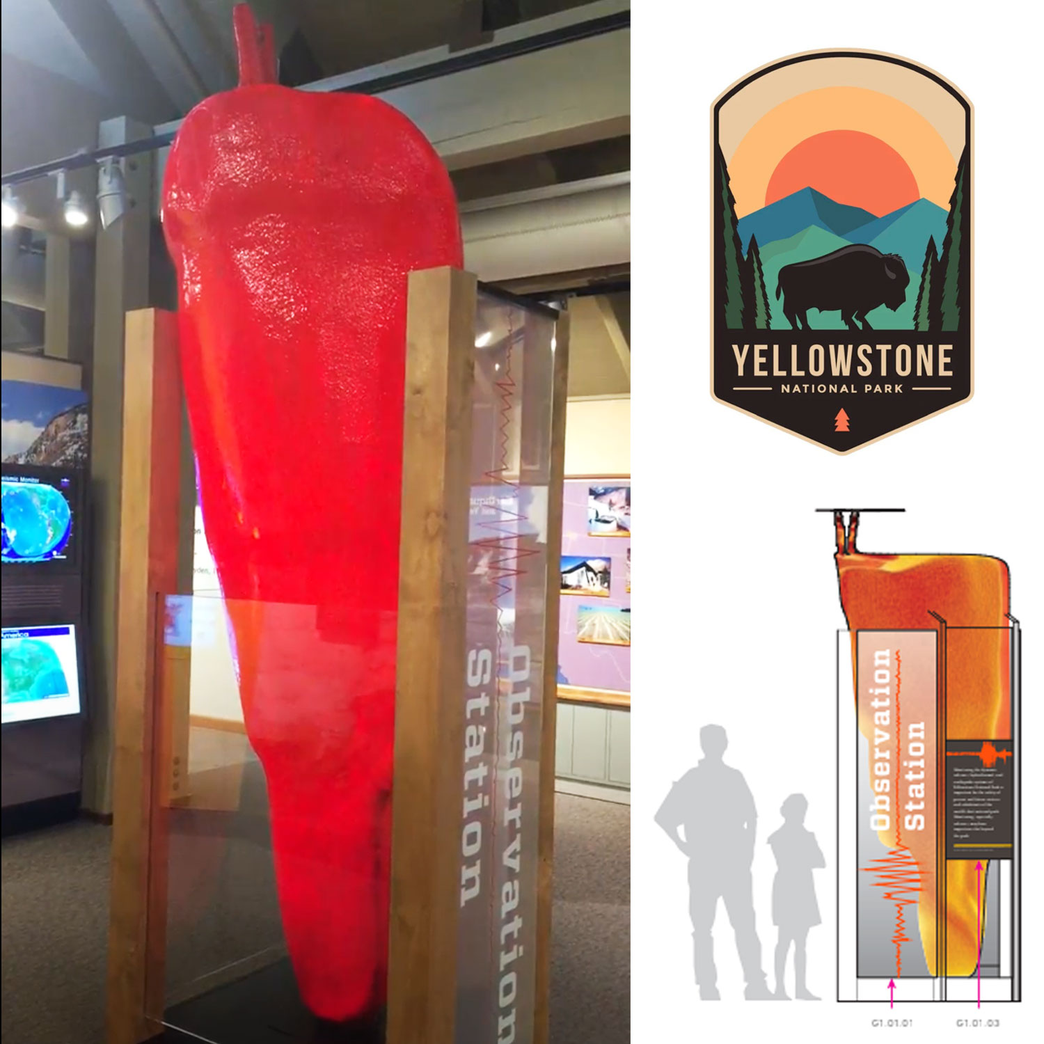
3D-printed data of man-made and natural disasters enables research and understanding to help prevent or reduce these tragic events in the future.
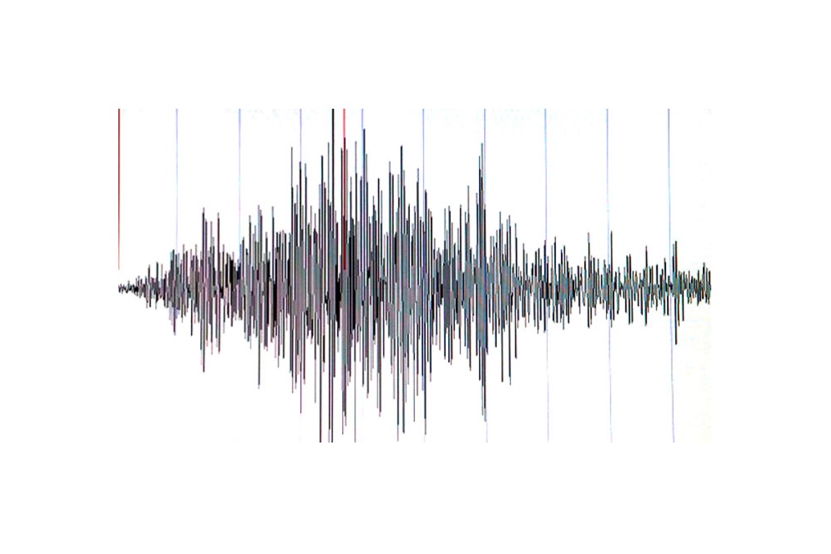
This data visualization model of the 2014 San Francisco Earthquake was created by Doug McCune to see how it compared to earthquakes that hit San Francisco in 1906 and 1989. The US Geological Survey built models for the earlier earthquakes and he was able to get them all together for the side-by-side comparison.
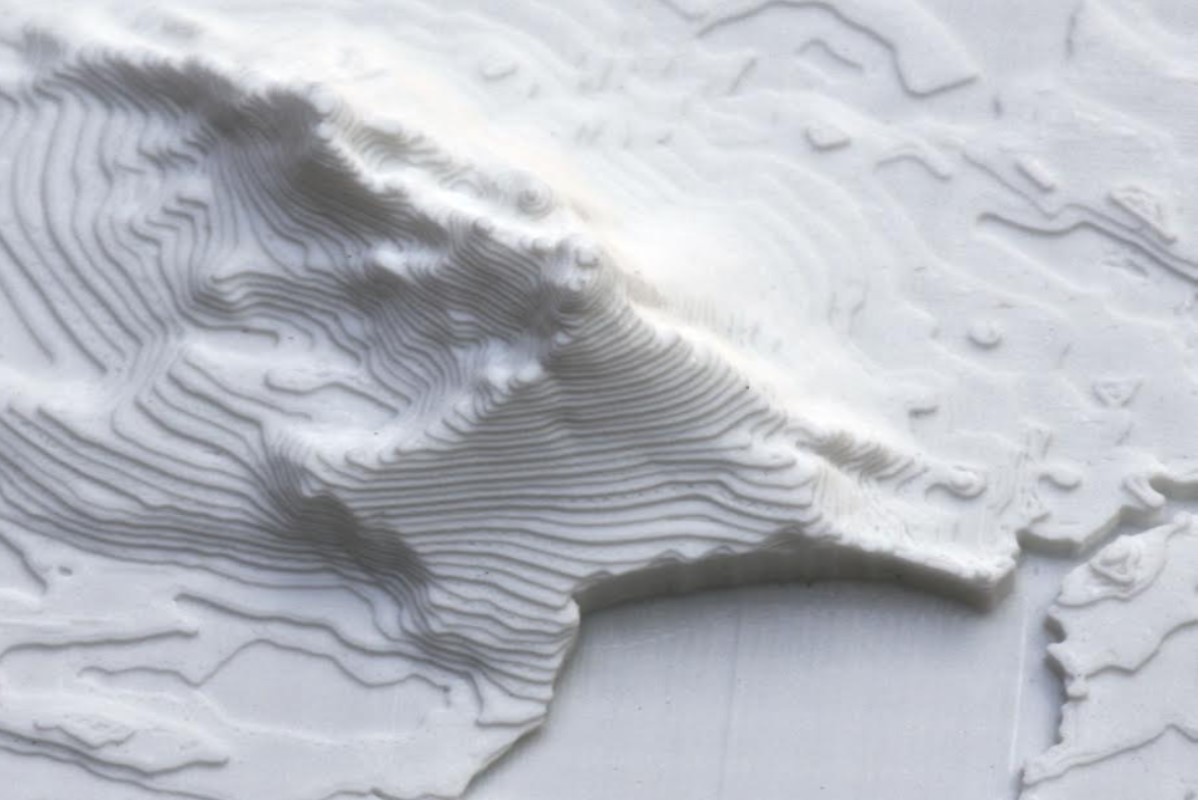
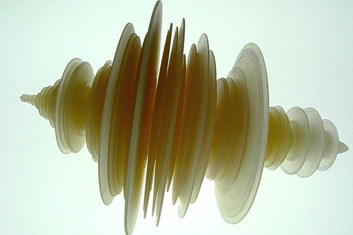
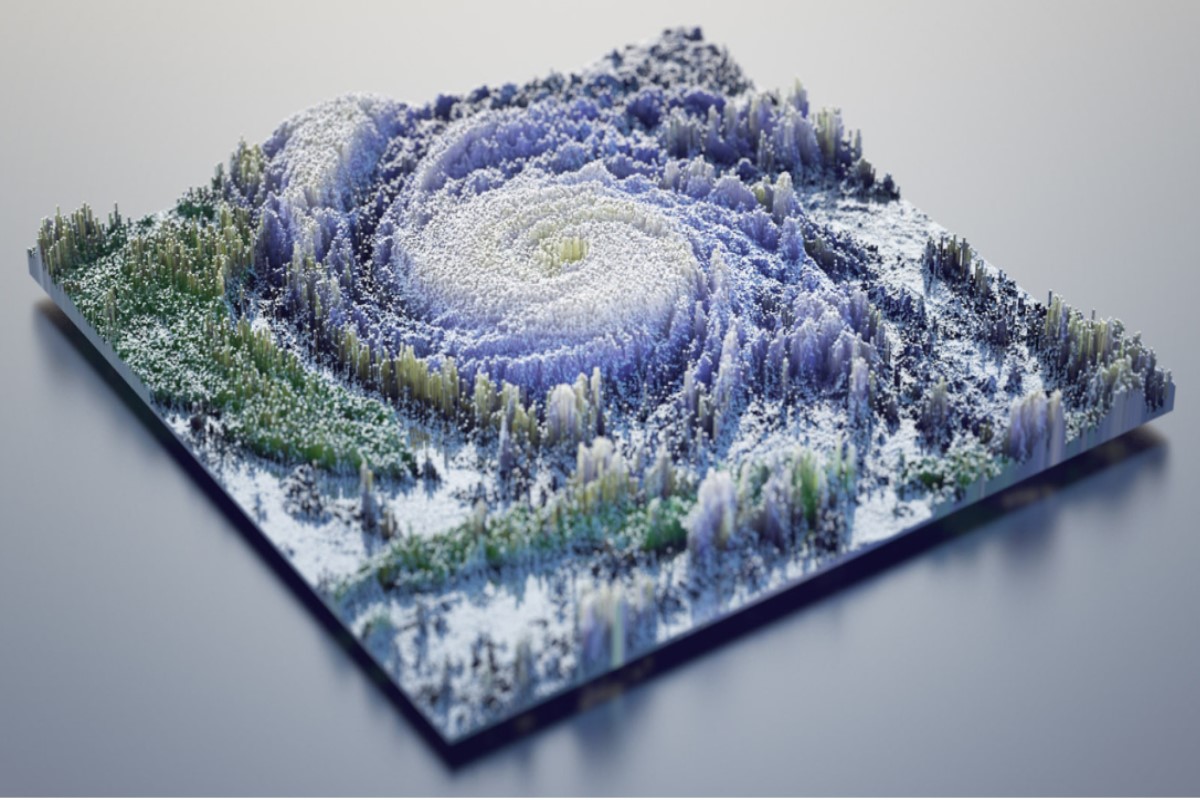
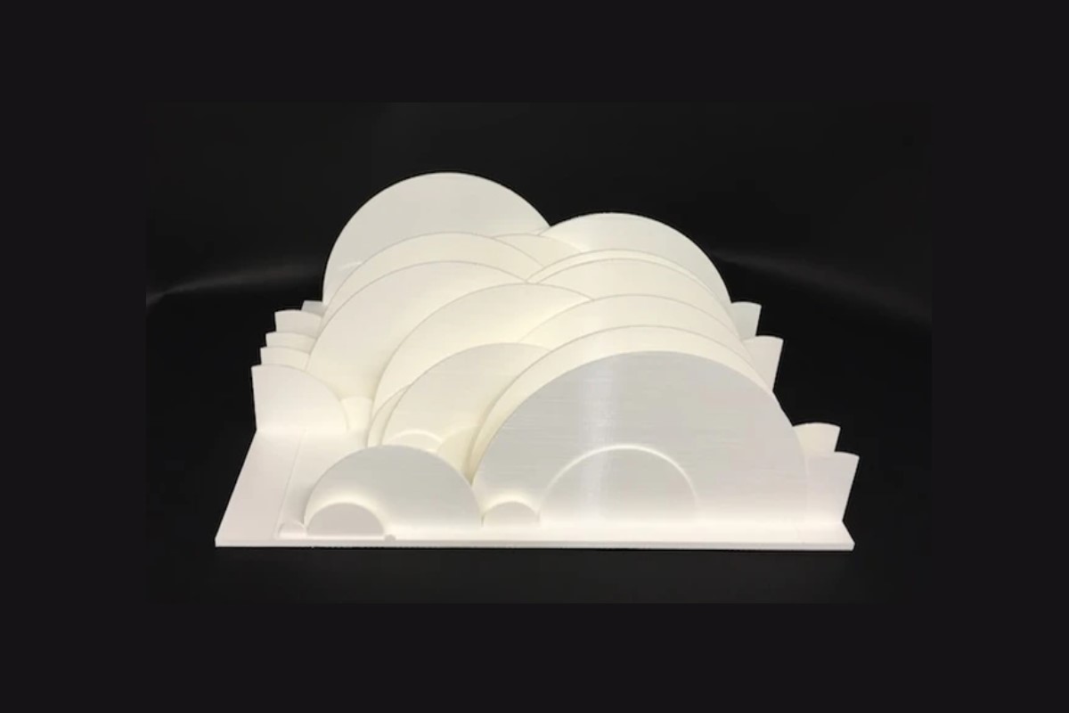
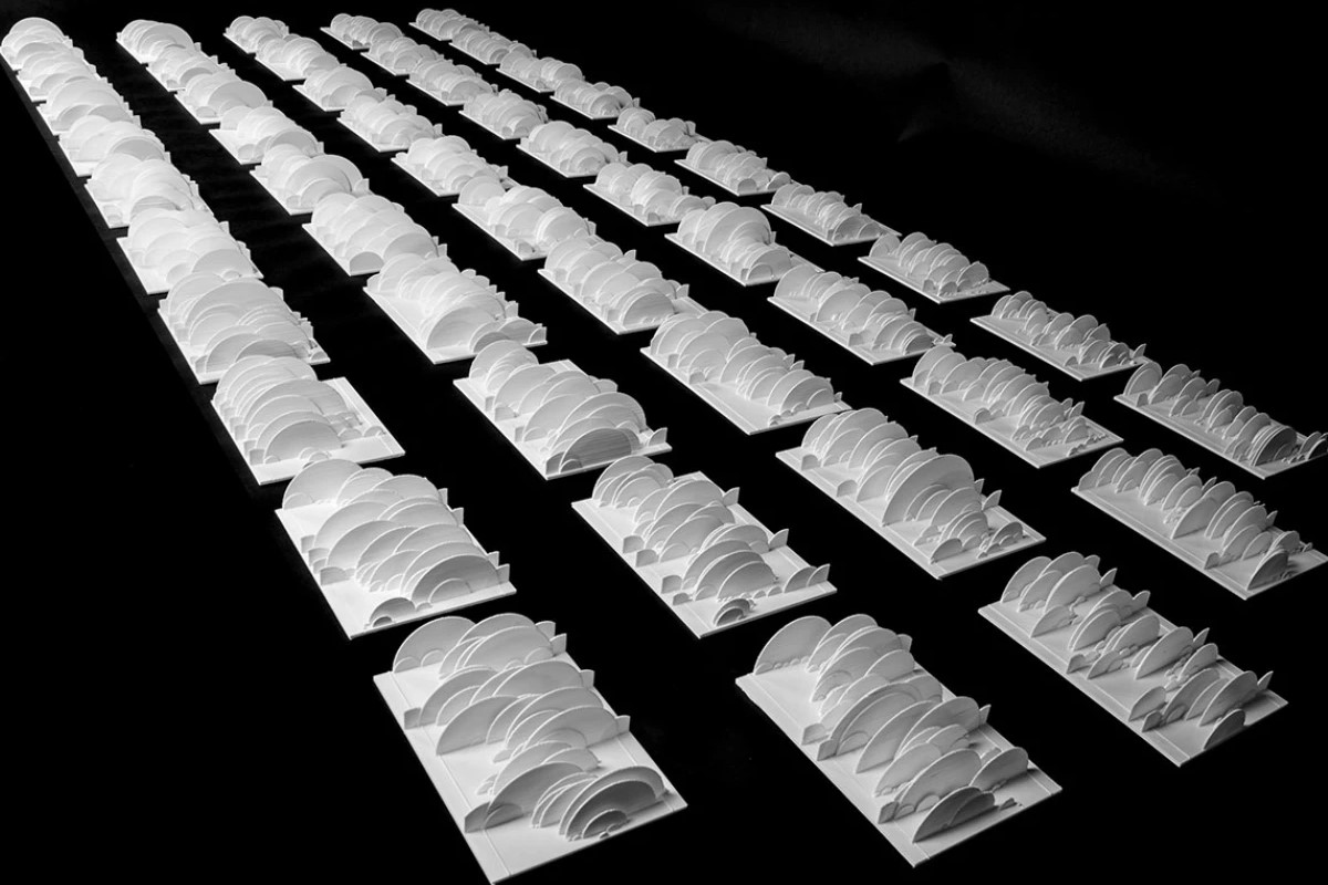
On March 11, 2011, a 9.1 magnitude undersea megathrust earthquake hit Tōhoku Japan and the tsunami that followed was more than 131 feet tall. The quake struck offshore and had worldwide effects. Covering 11,000 miles, the tsunami waves traveled across the pacific to Alaska, Hawaii and Chile. They were nearly 7 feet high when they reached the shore in Chile and they tore a huge chunk of ice off of Antarctica.
The 3D data sculpture below was created by Luke Jerram to explore how data is read, represented and interpreted. It measures 11 13/16 in x 7 7/8 in and represents the 9-minute duration of the quake. It’s amazing how a stunning piece of art can be created from an event so terrifying.
Science
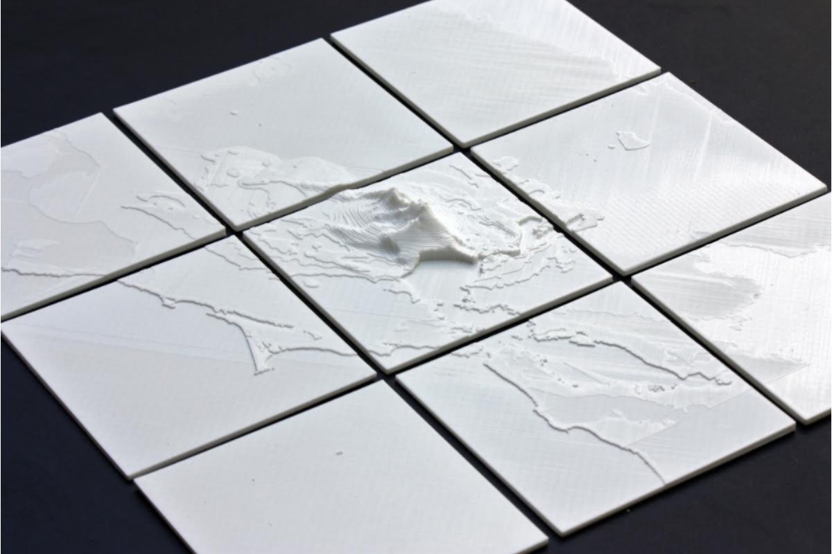
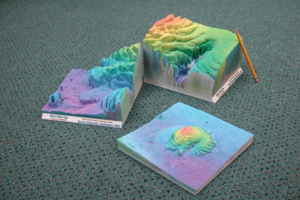
Scientists in all fields use 3D printed data for training, assessing patterns, presentations and more. Meteorologists use physical three-dimensional models to show a plethora of data including tornado paths yearly, by decade and areas affected the most, rainfall by county, state, country and globally. NASA also uses topography models for educational purposes and to help scientists better understand the Earth and its solar system.
The data that can be 3D printed is endless but here are a few more possibilities: carbon emissions in big cities, the effects of weather on crops by region, molecules, atoms, land and water, pollution, population and census data, cityscapes, noise simulation, and sound waves.
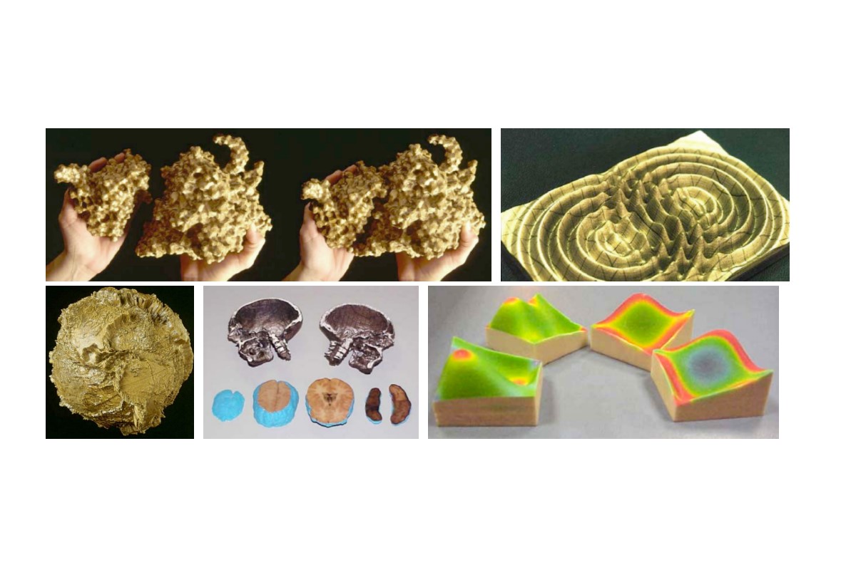
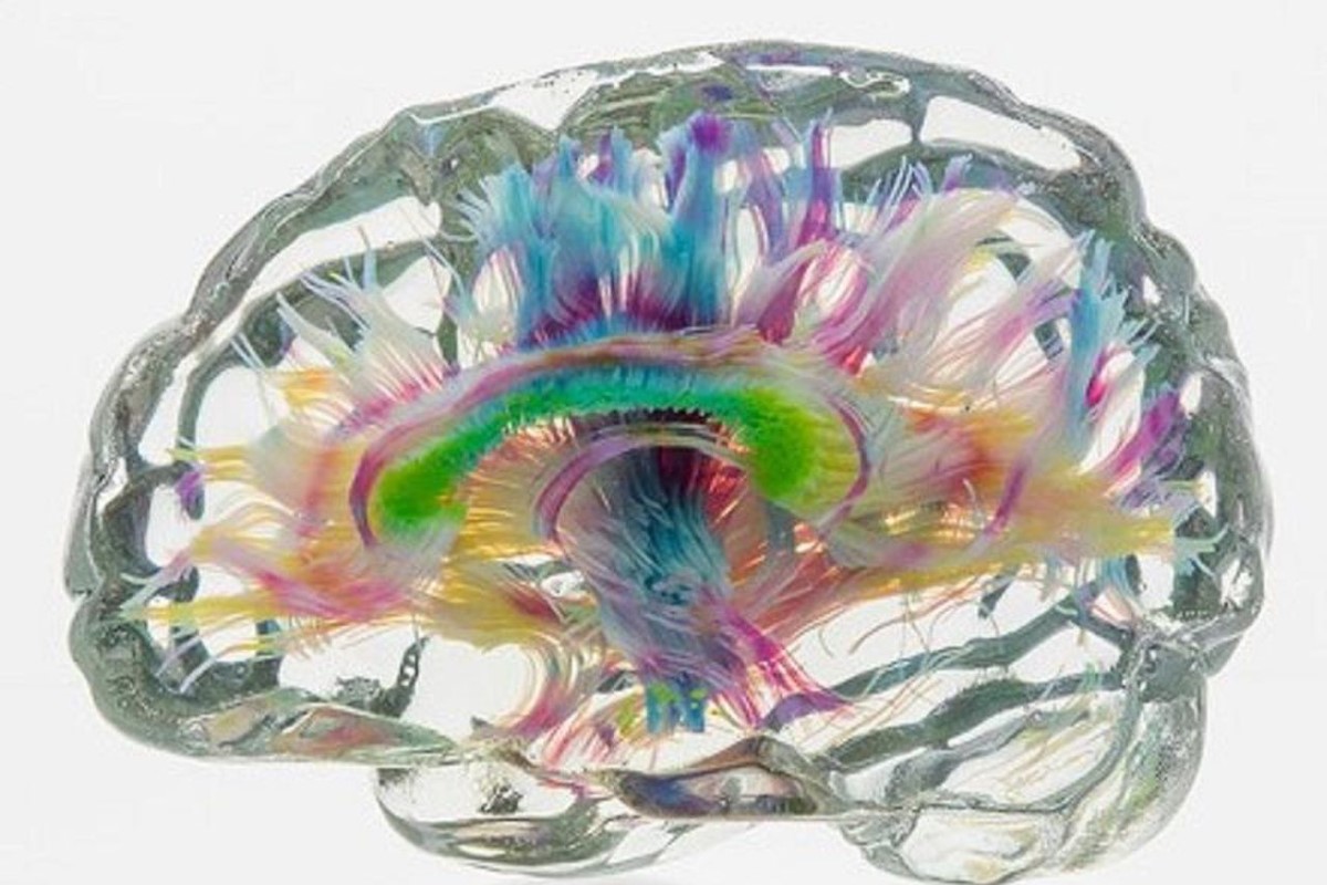
Tractography models are used for studying the brain and for preoperative planning for brain tumors and vascular malformations. The models visually represent the electrical impulses around the brain. The data used to create these physical models is collected by combining magnetic resonance imaging (MRI) and CT-Scans.
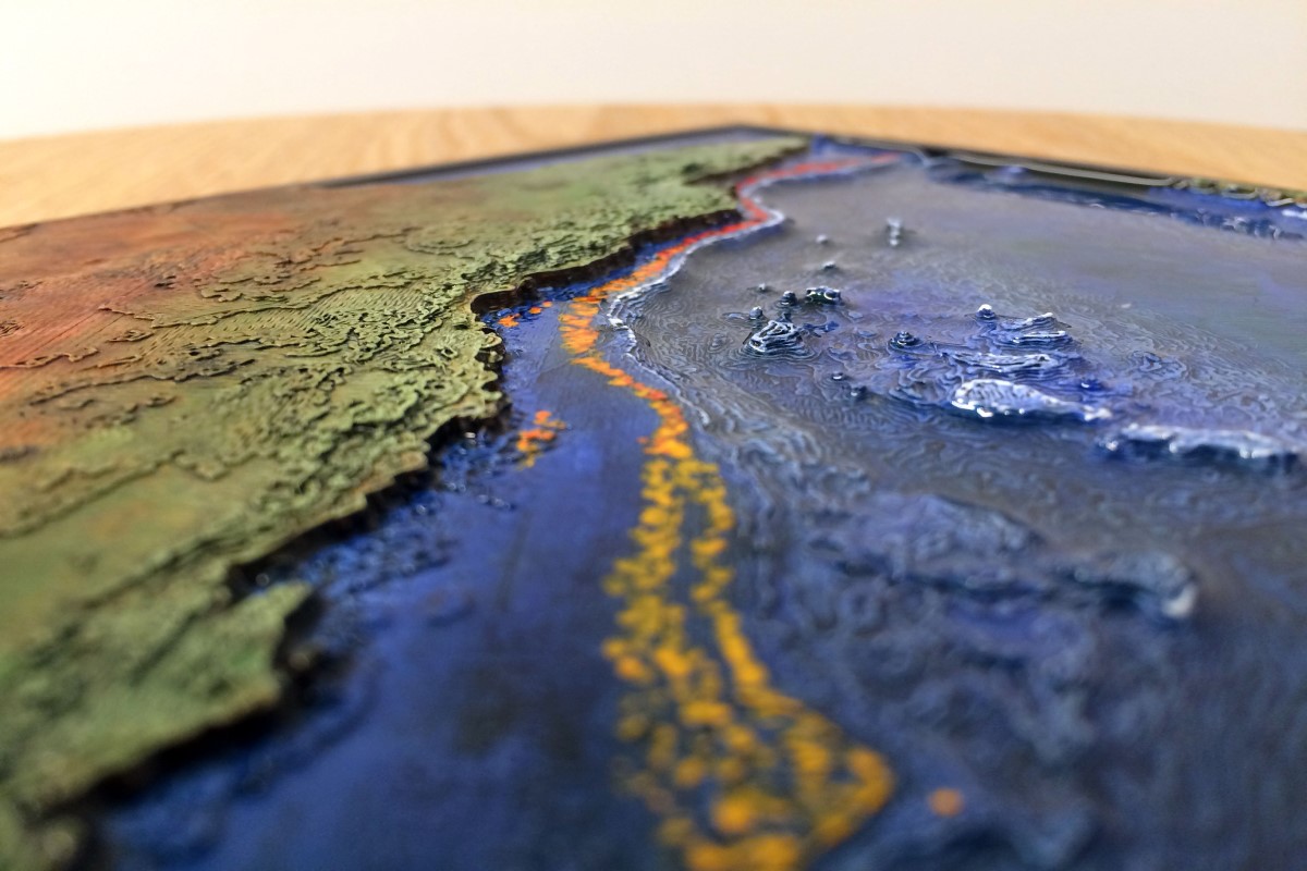
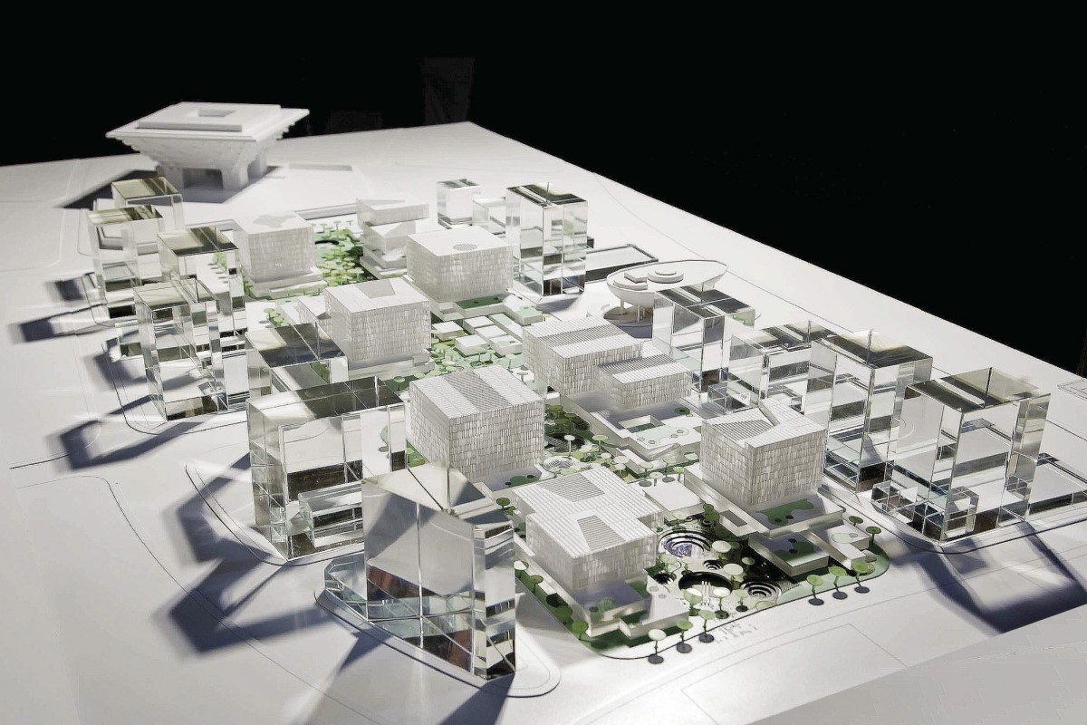
Government Agencies
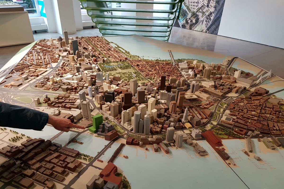
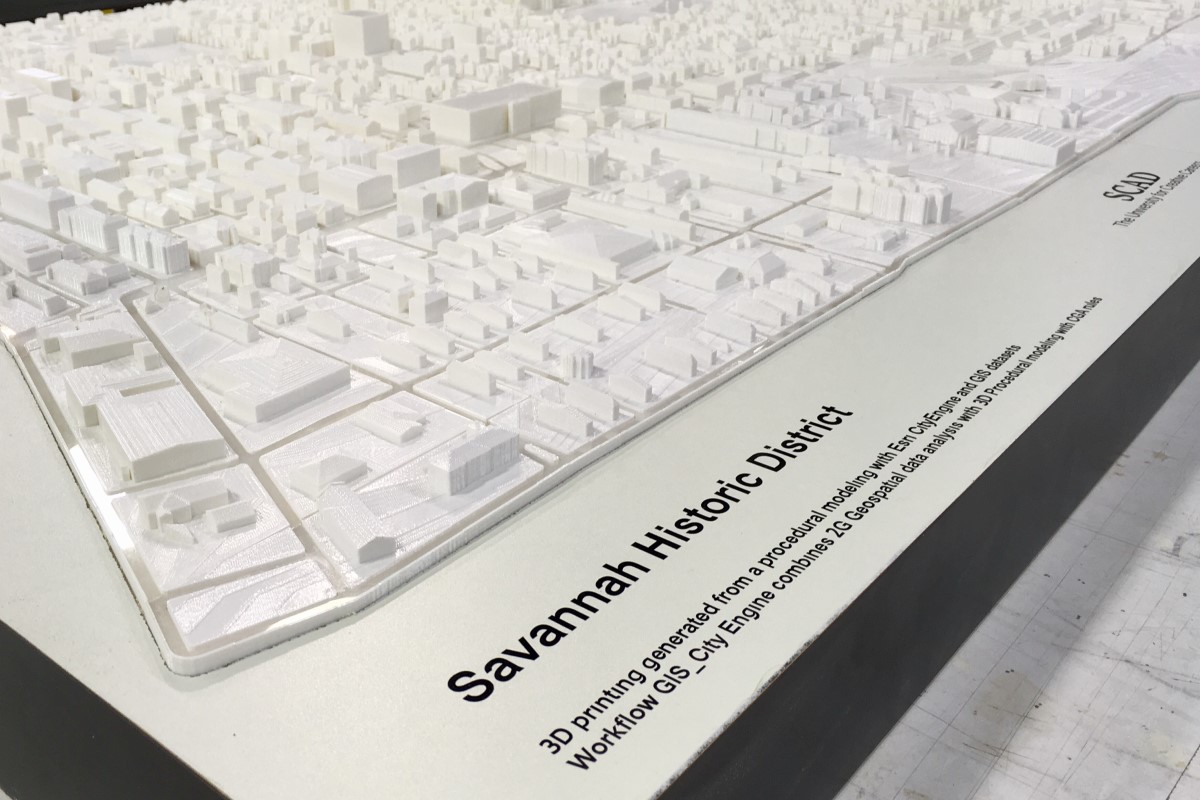
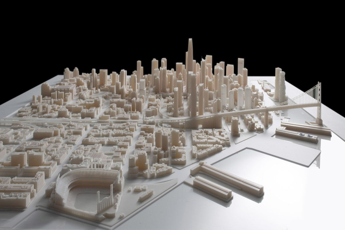
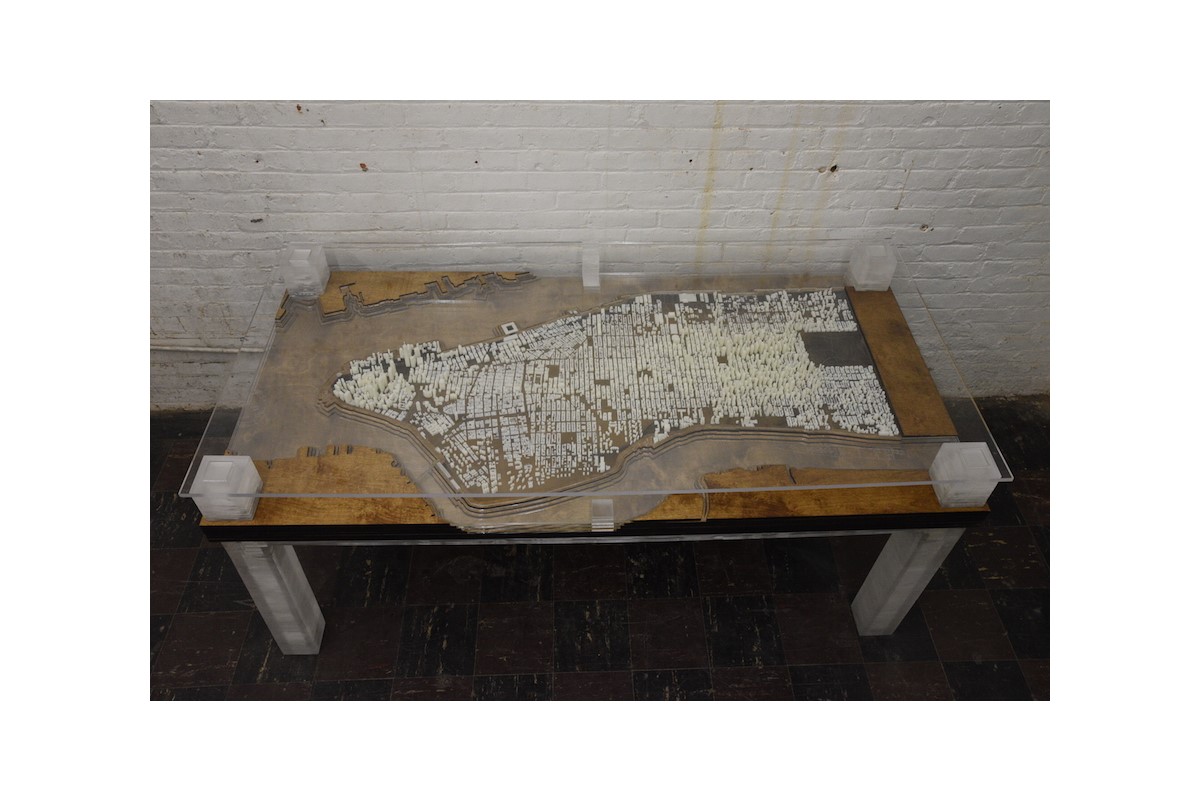
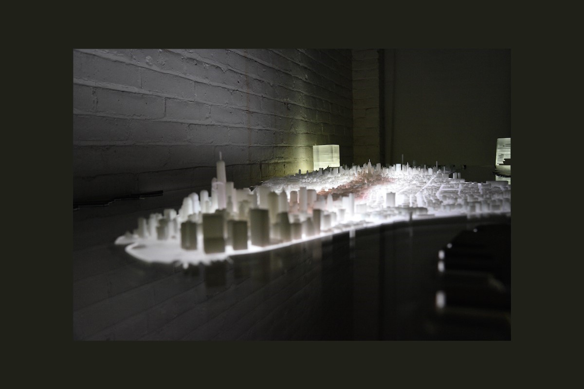
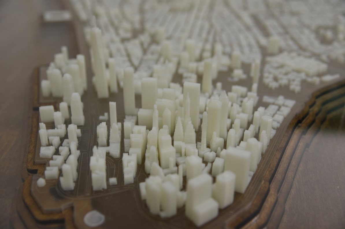
City Planning also benefits from 3D-printed data visualization. Using housing DATA with geospatial overlays, physical models assist builders and city planners on how to best implement emergency plans and strategies to deal with natural disasters like floods, hurricanes, tornados, earthquakes (structure stability), mudslides.
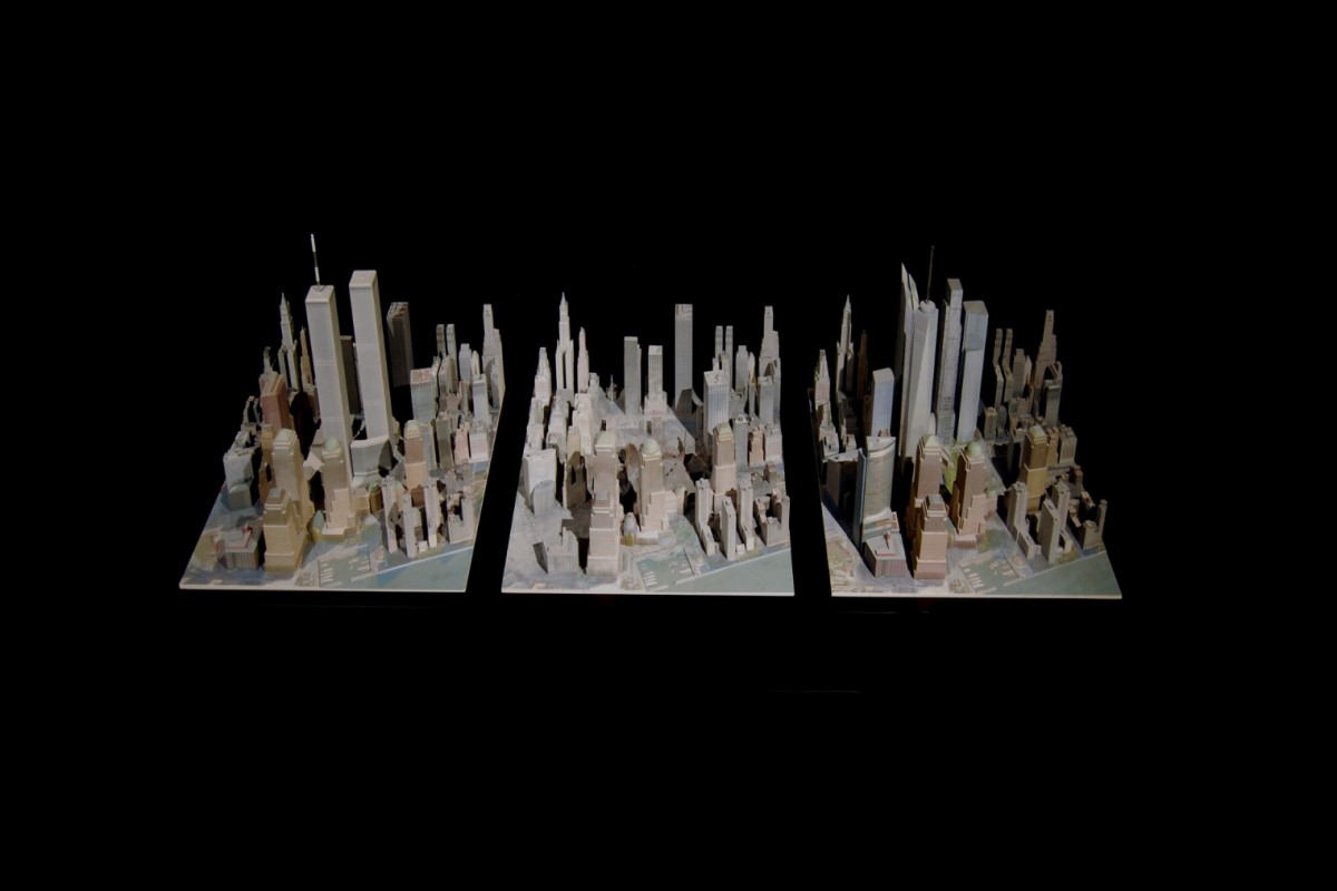
Urban planning also benefits from data visualization and can include the effects of proposed construction on historical sites, impact of growth on rural communities, environmental planning like the shoreline changes due to global warming and the affect high-rise buildings have in downtown areas such as humidity, sunlight, temperature and wind tunnels. These models are useful for comparisons of past urban space, as it exists today and what it might look like in the future after new construction or developments are made.
Department of Defense could use this technology to assess 3d printed statistical information on terrorist cells’ location, population density, and movement for a given period of time. To better predict future movement, growth rate, and threat level.
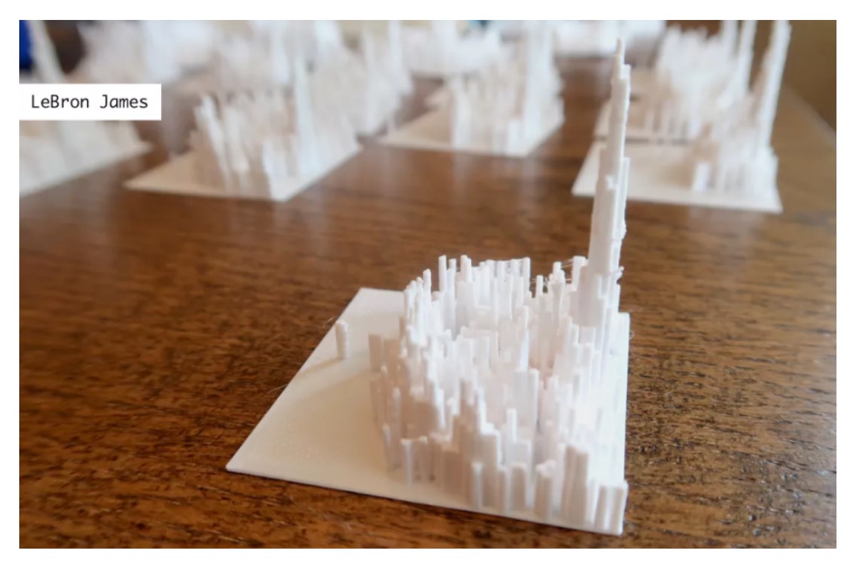
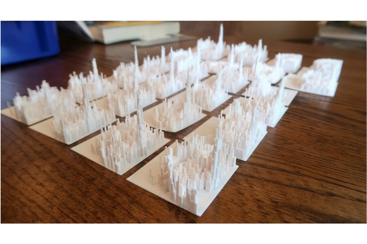
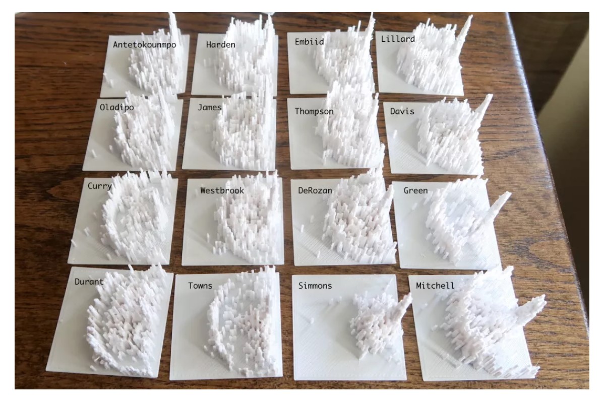
Creative Industry
Some people refer to this technology as 3D printed data sculpture. Artists and sports enthusiasts take data from sporting events like the Super Bowl to create dynamic pieces of 3D art. The images below represent the passing stats of Super Bowl I in 1967 to Super Bowl 50 in 2016.
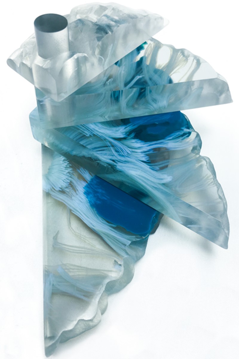
Technology and Materials
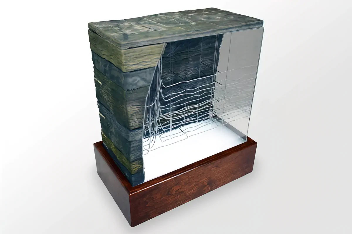
- With 3D printing technology, you aren’t limited to straight lines and boxes. A 3D printer can easily print jagged edges, curves, and intricate details. Other technologies include foam fabrication, hot wiring, CNC cutting, laser cutting, and welding.
- We can 3D print data visualization models in different materials including UV-cured resin. The type of model you’re looking for determines which material will produce the best results. We can help you choose the material that is best for your project.
- 3D printed data visualization models show incredible detail. The resolution of our printers is finer than a human hair.
- Data visualization models can be 3D printed in full-color (over 750,000 variations of color) for awe-inspiring presentations and displays. No painting required!
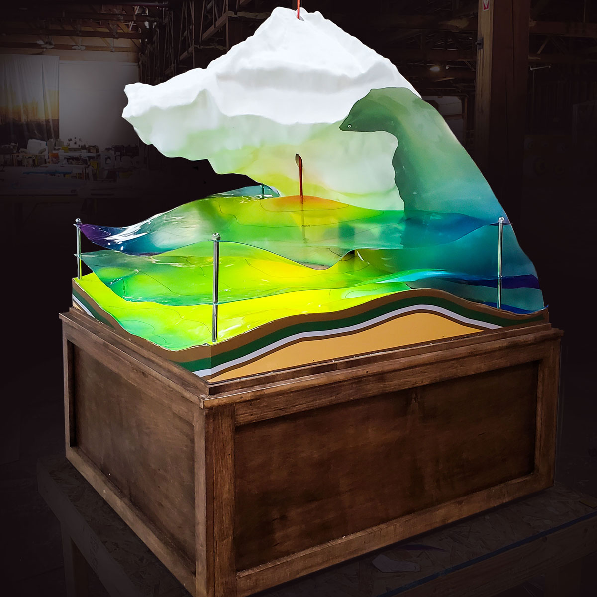
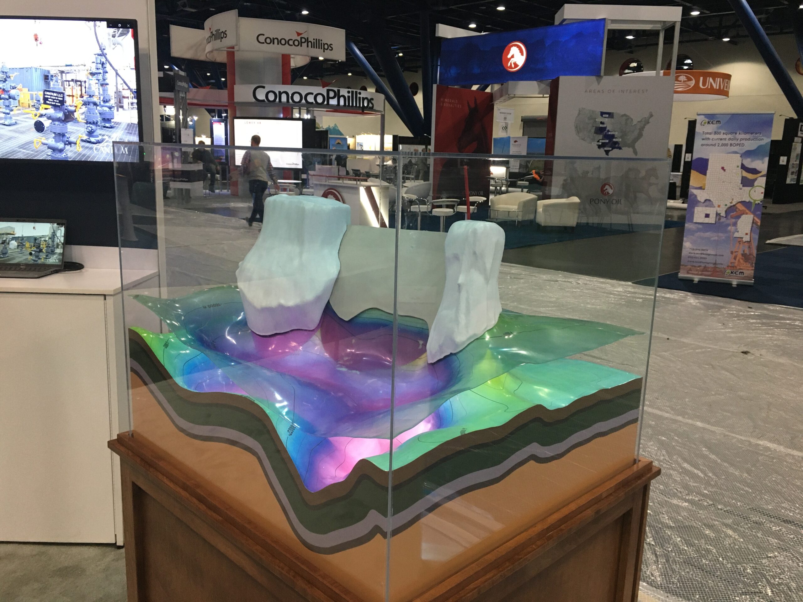
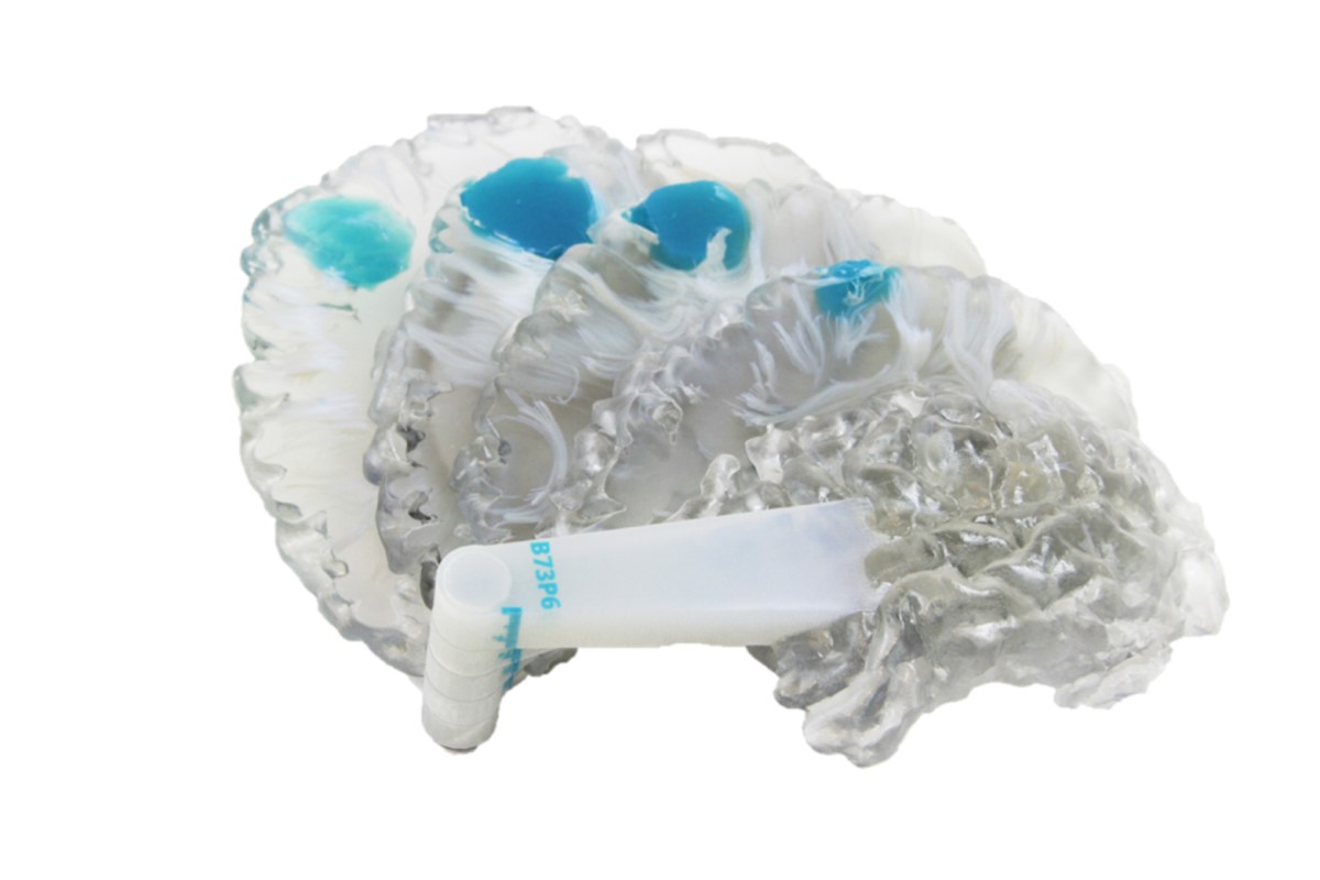
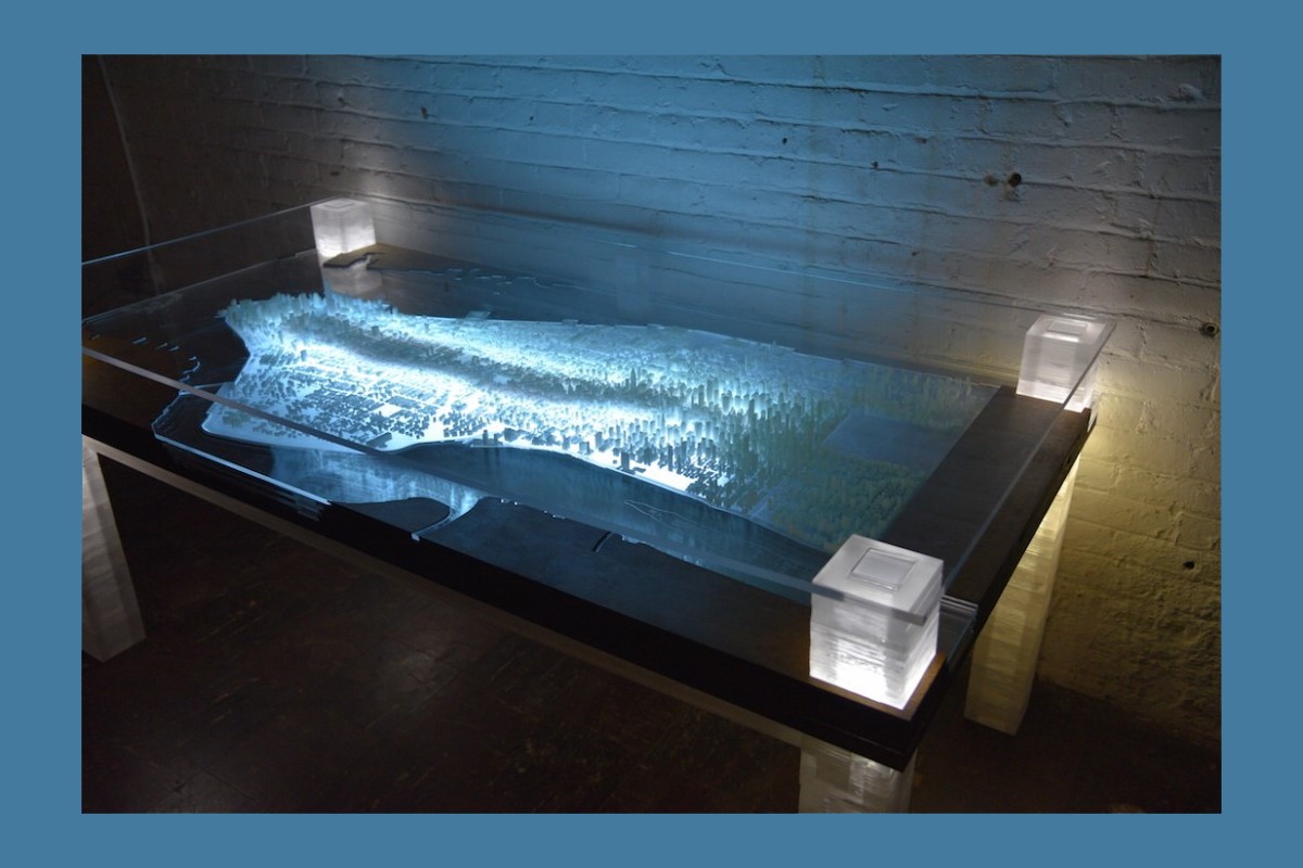
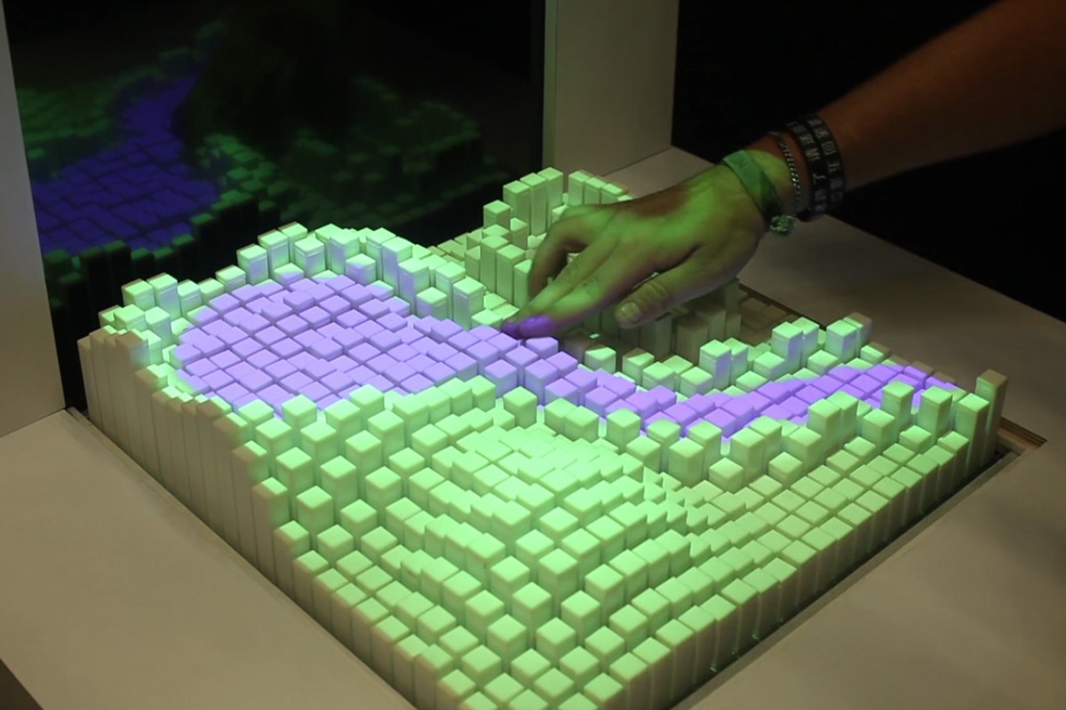
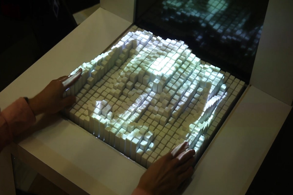
Using translucent plastic, data can be programmed to light up from beneath the model with different colors via a projector that’s connected to a laptop or iPad. The program beams an image onto the model from below. This kind of model can facilitate multiple samples of data because it’s made of clear material. So all you need to do is pull other data from your device and project it from underneath the model.
Pricing
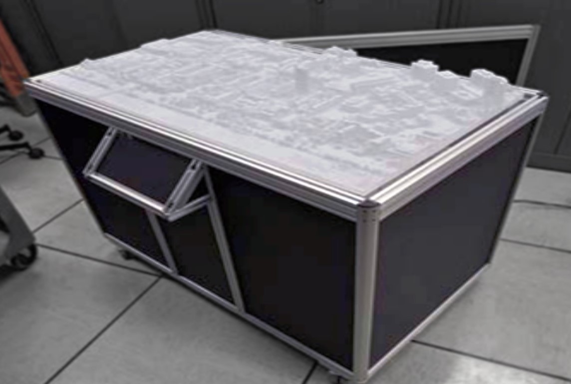
The cost of a data visualization model is based on the volume of materials (size of the model), type of materials, the time it takes to create the 3D design, production labor, and installation time and materials, as well as other specific elements unique to the project. Each model is bid individually and the best way to determine cost is to email us, call us at 385-206-8700, or fill out the form below and let us bid on your project.
Get a Free Price Estimate for a Custom 3D Data Visualization Model
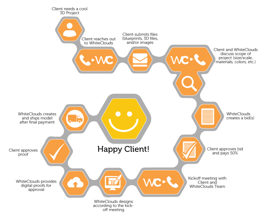
Custom Fabrication Workflow
Common Questions & Answers
What file type is required to make 3D-printed data visualization?
We work with all architectural CAD programs including AutoCAD, Revit, and Maya just to name a few. If you design in 3D, we will start with your 3D files. If you have 2D blueprints and elevations, or artist sketches, we can build a model from these files as well.What technology do you use to fabricate/print 3D data visualization models?
It can be a number of different technologies, individually or combined. These range from 3D foam, 3D printing, CNC cutting, laser cutting, laser etching, casting, molding, sculpting, painting, airbrushing, laminating, vinyl printing, and woodworking – all meant to produce high quality models.What is the material used?
We match the correct material and fabrication process to your requirements in terms of presentation, size, and transportability. We fabricate in our model shop using different types of foam, wood, metal, resins, and acrylics. We can also 3D print in UV-cured resin, plastic, rubber-like acrylic, and nylon.What is the largest model you can 3D print?
There is no limit to the size of model. Transportability will be your only concern on an extremely large model.What is the turnaround time for a 3D-printed data visualization model?
This depends on the features of the design itself as well as the scale of the model. We usually ask for six to eight weeks from the time we take the order to when you will receive the model. Large projects can be four to six months or longer. We understand that sometimes deadlines are tight and we can accommodate rush orders.If I want a second model, is it cheaper?
Our pricing is based on the fabrication costs and the time it takes to prepare your design. The second model is less money because the design portion is complete.
Do you have a question we didn’t answer? Don’t hesitate to contact us at 1-385-206-8700 or [email protected].
Worldwide Delivery
WhiteClouds has delivered models around the world.
History of Data Visualization Models
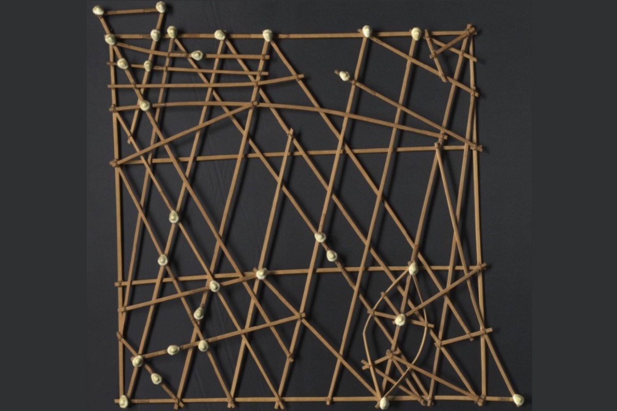
For thousands of years, civilizations have made data visualizations with things they had on hand: clay, sticks, and other physical objects. Anciently, the Sumerians used pieces of clay to represent units of measure. Native Micronesians from the Marshall Islands used stick maps to show ocean swell patterns. Women from the Yakama Native American tribe used strings made of hemp as personal diaries of life events. Each being represented by a knot, bead or shell. It is called an Ititamat or time ball which grew in size as time passed.
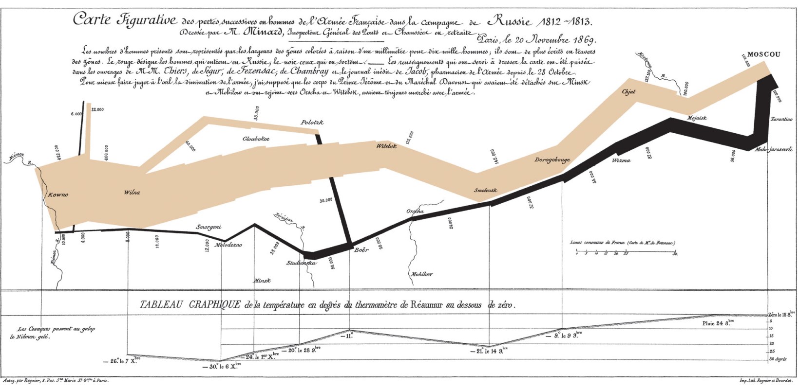
And as early as 1812 when Napoleon marched to Moscow to conquer the city, charts were created to show others what happened. This campaign, charted by Charles Joseph Minard, was a disaster and the 470,000 soldiers Napoleon started out with, were reduced to just 10,000. He even included the winter temperatures the soldiers had to deal with along the way.
In 1854, John Snow – no, not the one from Game of Thrones – created a dot map visualization that showed the number of cholera deaths by household in a London neighborhood. Because of this data, they were able to find out that those dying all got their drinking water from the same well. Turns out it had been contaminated by sewage. This led to the solution of building sewage systems and protecting the wells from further contamination.
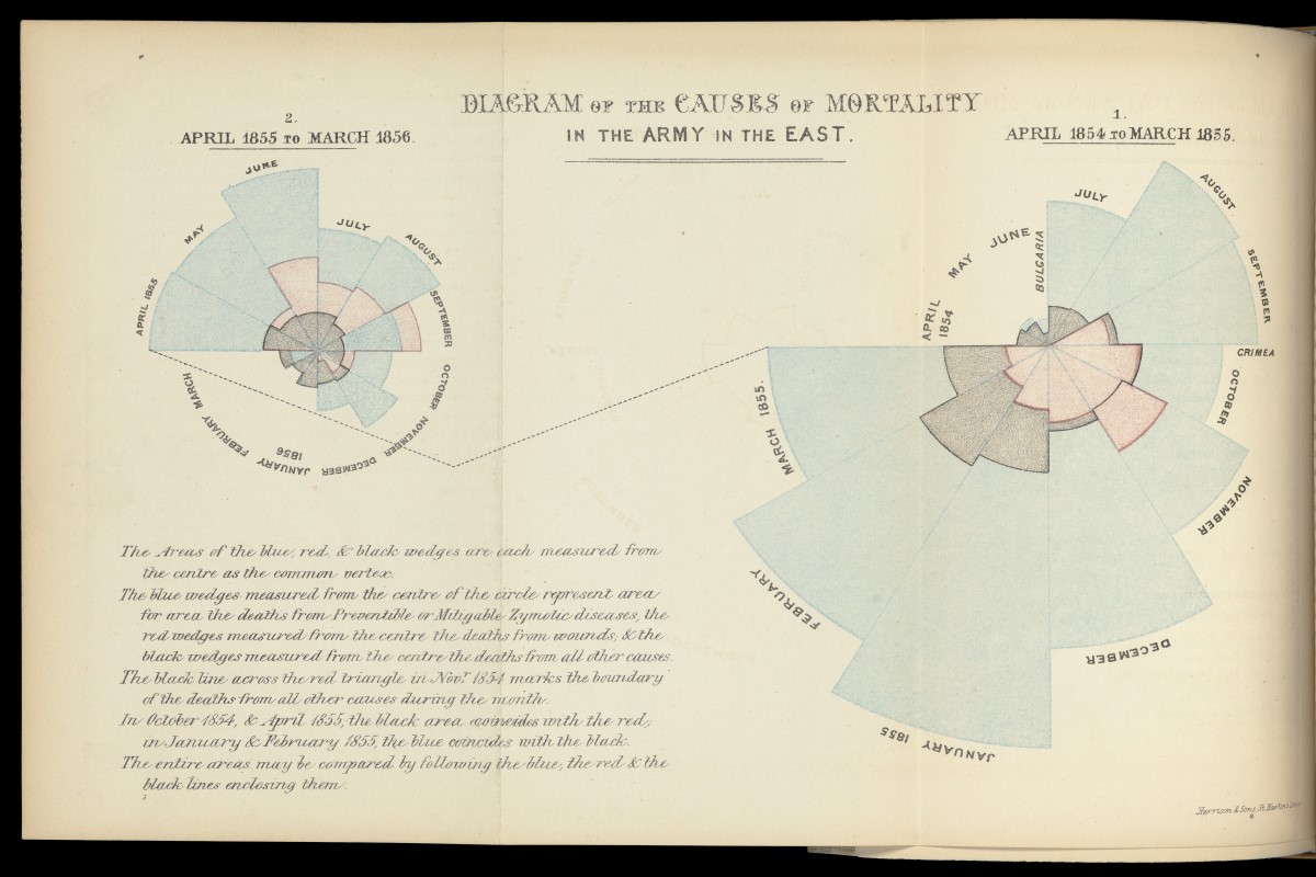
Florence Nightingale used them in 1855 – 1856 to determine that the soldier mortality rates in the Crimean War were high and soaring higher due to the poor hospital practices, not just because of the battles that were going on. Her research was part of a Royal Commission. Her colleague, a statistician named William Farr, wasn’t a fan of including the visualization but she stood her ground. As a result, it’s one of the most famous records of data in the world.
In 1995, Mike Bailey created the San Diego Supercomputer Center’s TeleManufacturing Facility to help scientists visualize their data with a physical model. One of the first digitally-fabricated molecular models was created using laminated object manufacturing. This enabled biochemists to get insights not otherwise available from on-screen 3D models. Their conclusion was that physical models are important tools that greatly increase the understanding of data available from 3D computer graphical analysis. After moving the facility to Oregon State University, it was renamed the Center for 3D Hardcopy and uses a ZCorp Z406 3D printer to fabricate its physical models for the scientific community.
One of the pioneers of the data visualization concept, Volker Schweisfurth, took 3D printing technology further than building objects, models and prototypes. He developed a way to bring data to life via 3D printing or data physicalization. Others have followed suit and now there are myriad ways to display data.
With computer technology, data visualization has evolved to include interactive and automated graphs and charts that rotate 360 degrees, enlarge key elements when you hover over them with your mouse, like this amazing 2013 budget visualization in the New York Times and move like an ocean wave, like this one by Pew Research Center that shows solar eclipses until the year 2080. However, this data is still only in the two-dimensional field.
These data visualization models have been used to display data like this image of the Google Eye that was created by Andrej Boleslavský that shows the number of page visits for 2012. Other data that has been made into physical models represented marine trade, scientific research, electricity usage, engineering, genealogical and generational tracking, traffic flow, crime rates, sound waves, molecules, DNA, population, travel logging, weather patterns, finances (personal and business), food consumption, keyboard frequency, and sleep patterns. However, this list does not exhaust all the possibilities. Adding the physical 3D element data can really bring the WOW factor you’re looking for and create a data visual like no other.